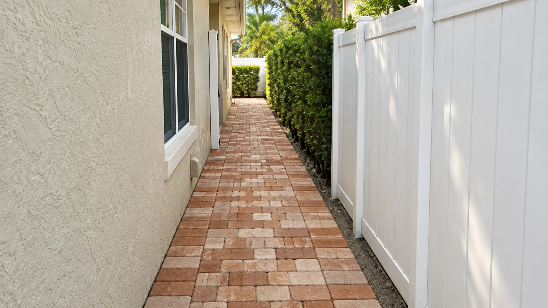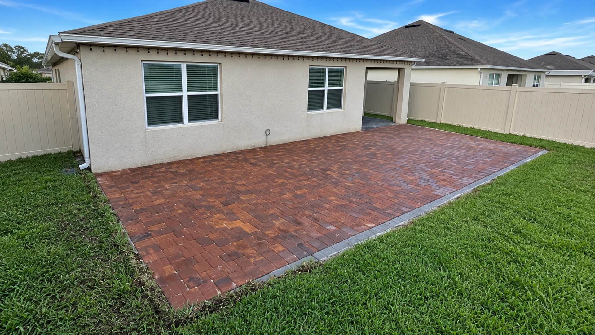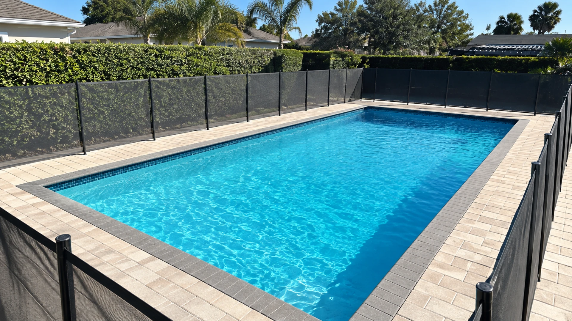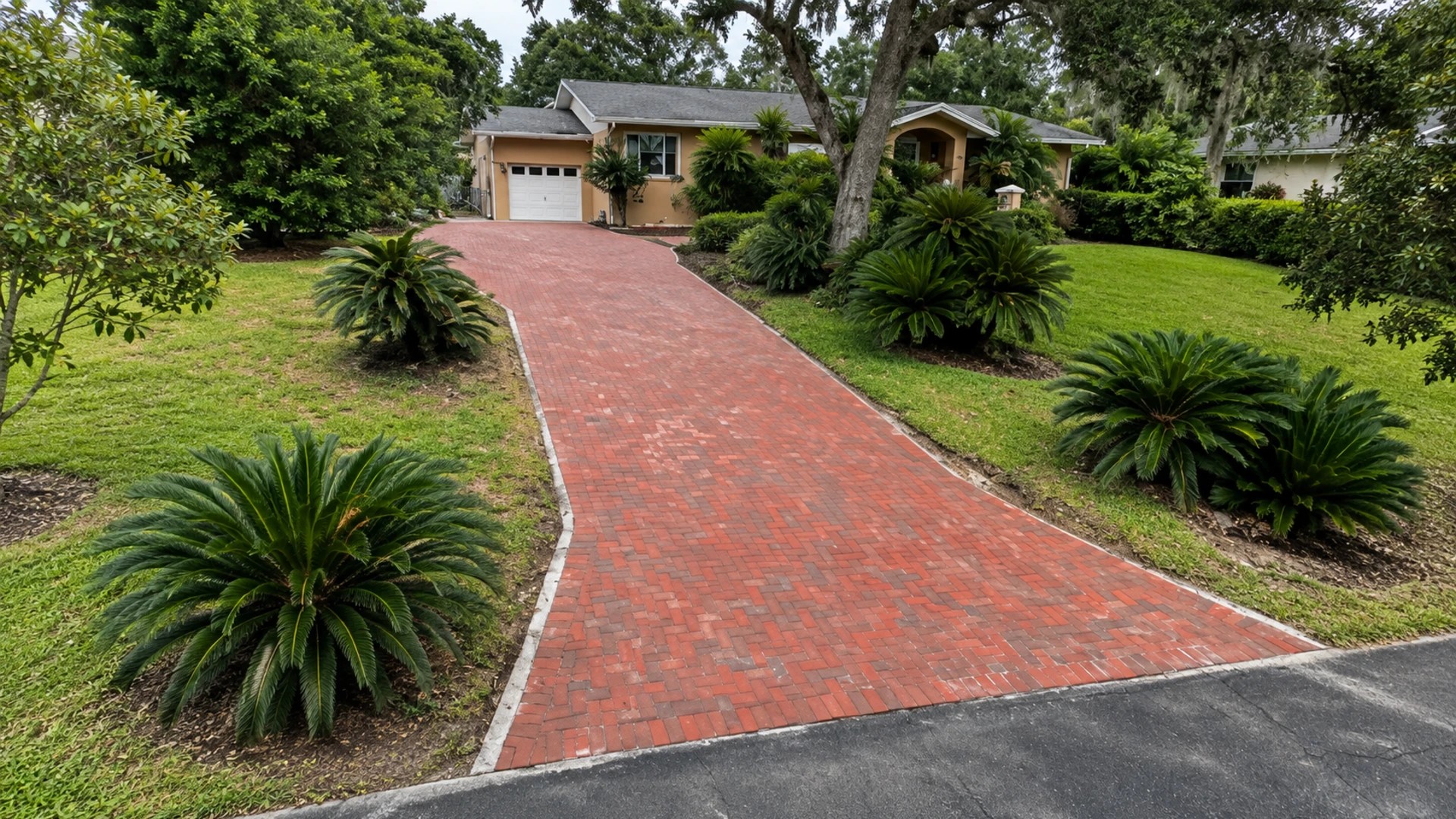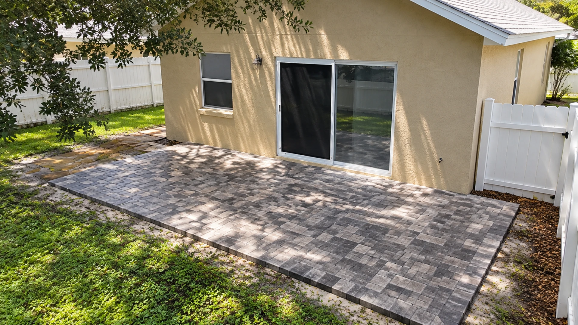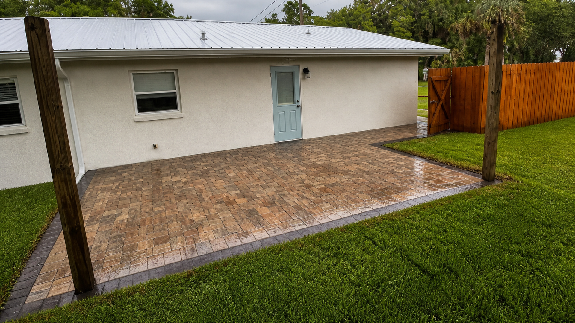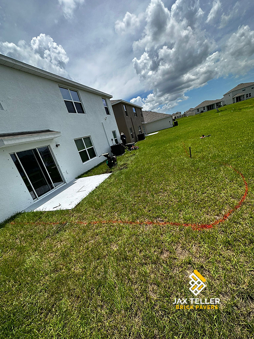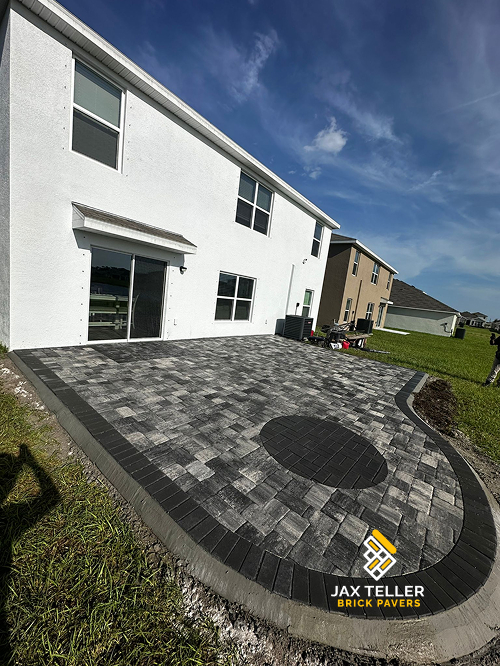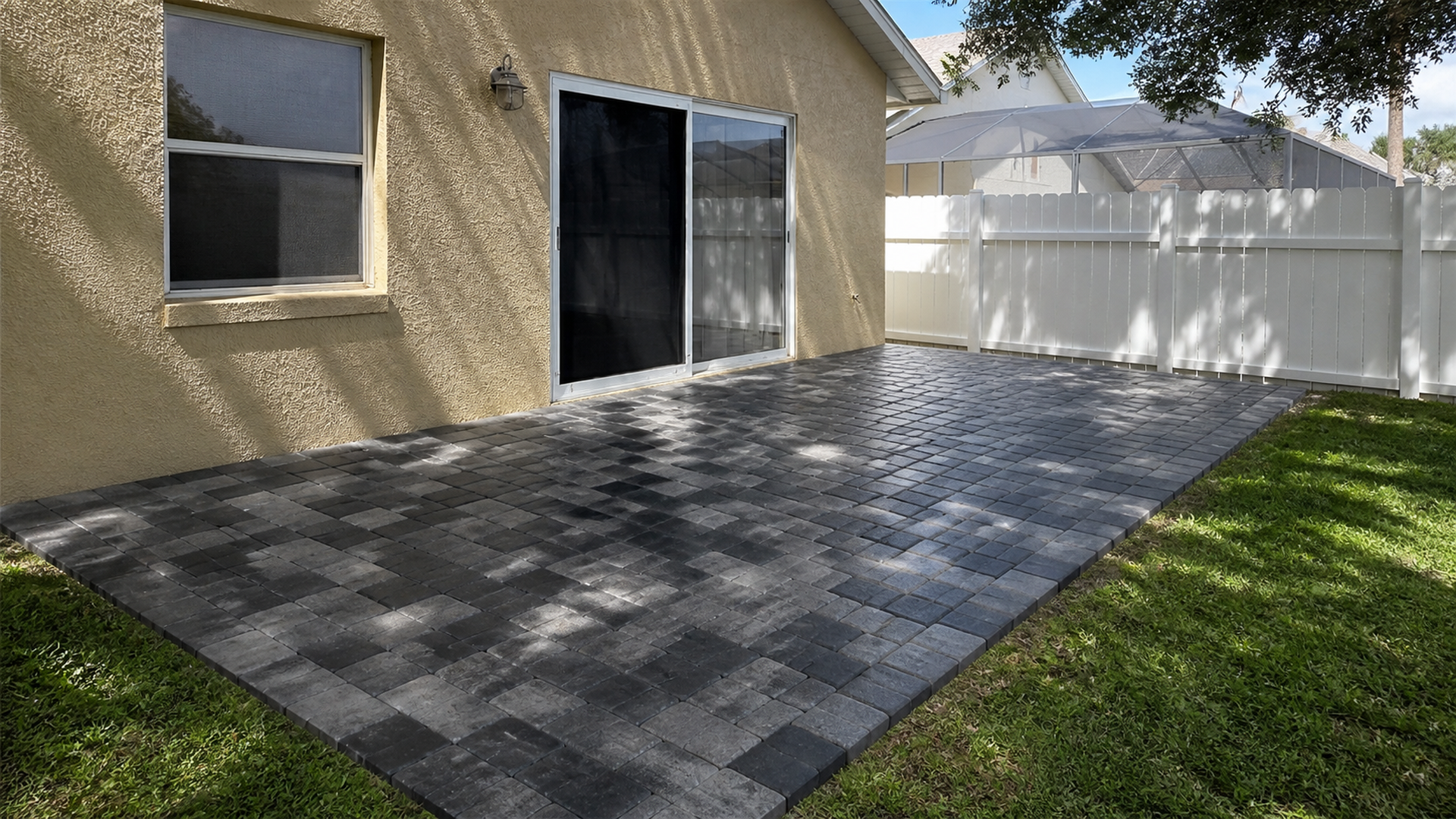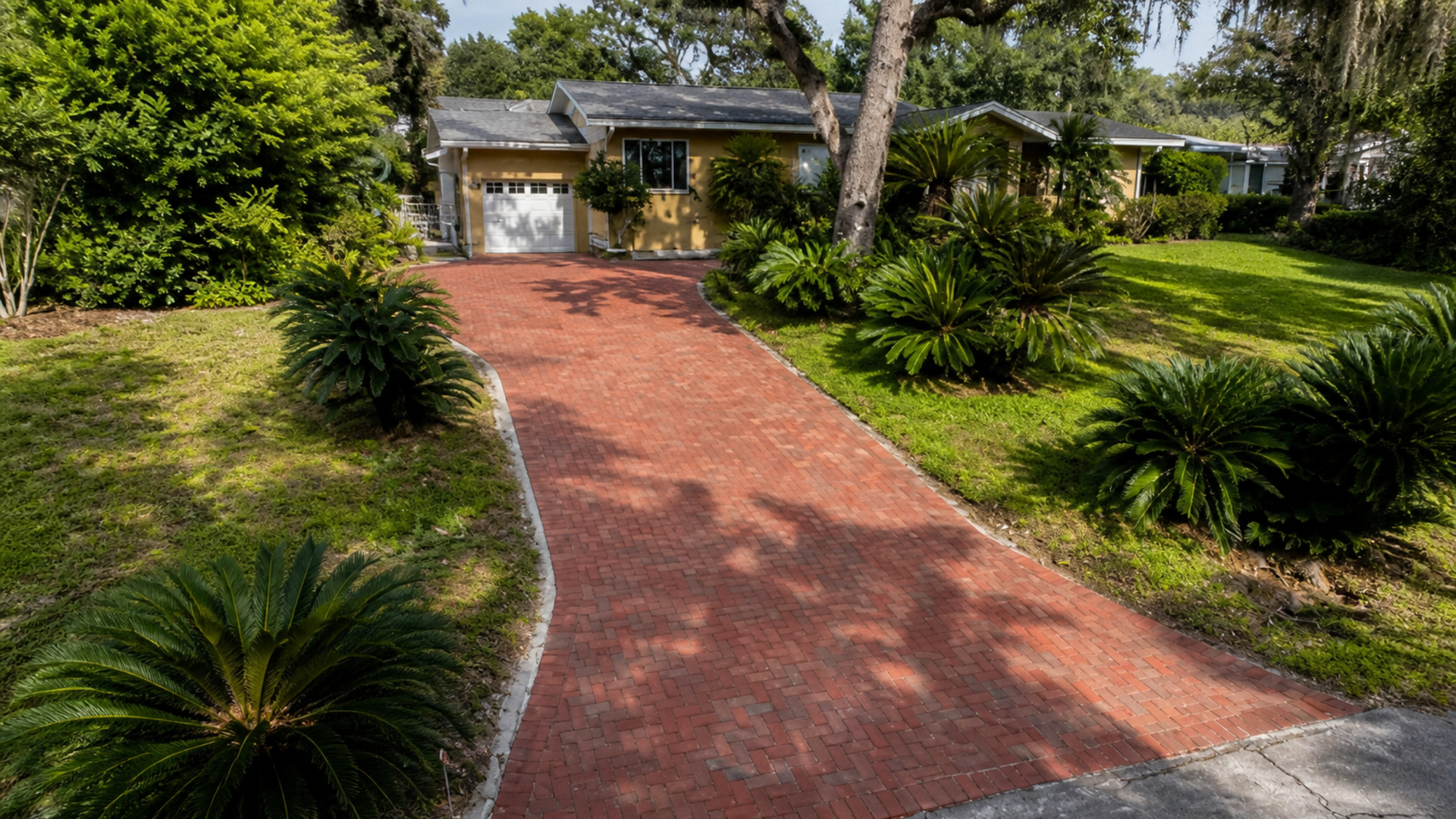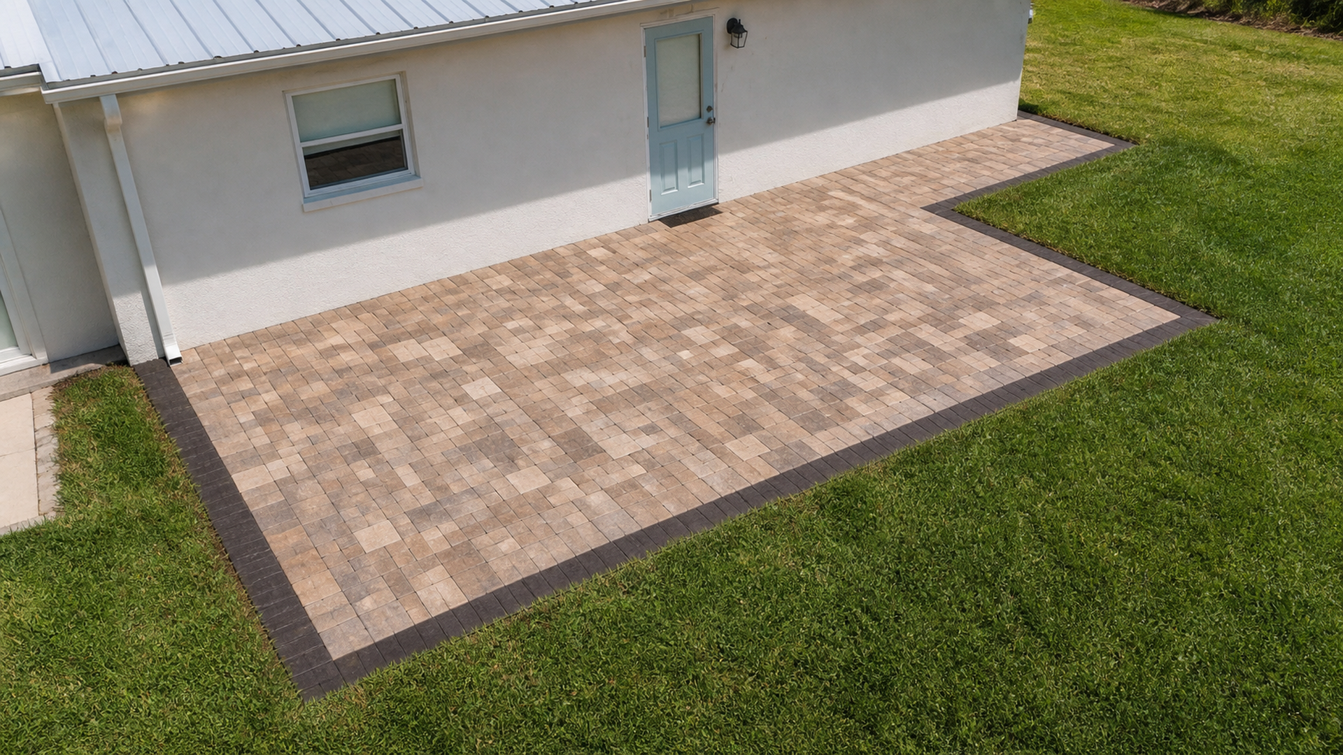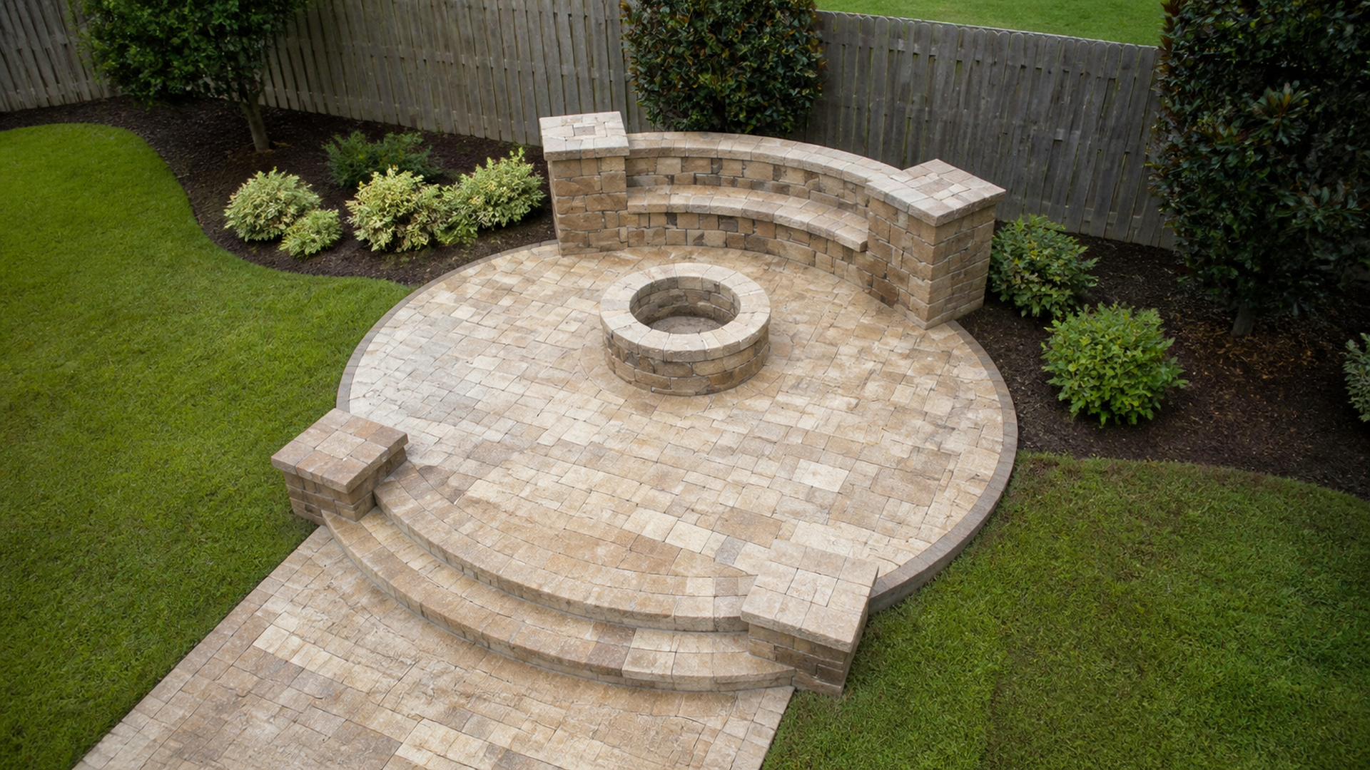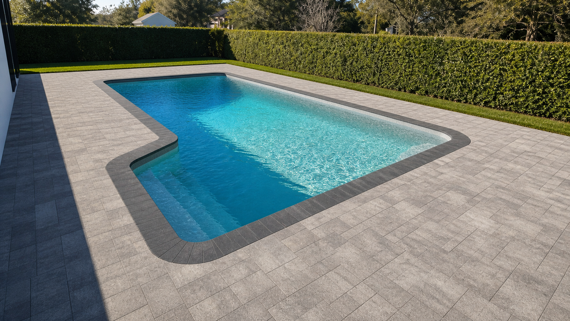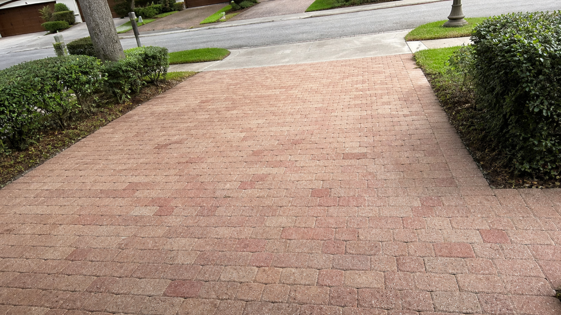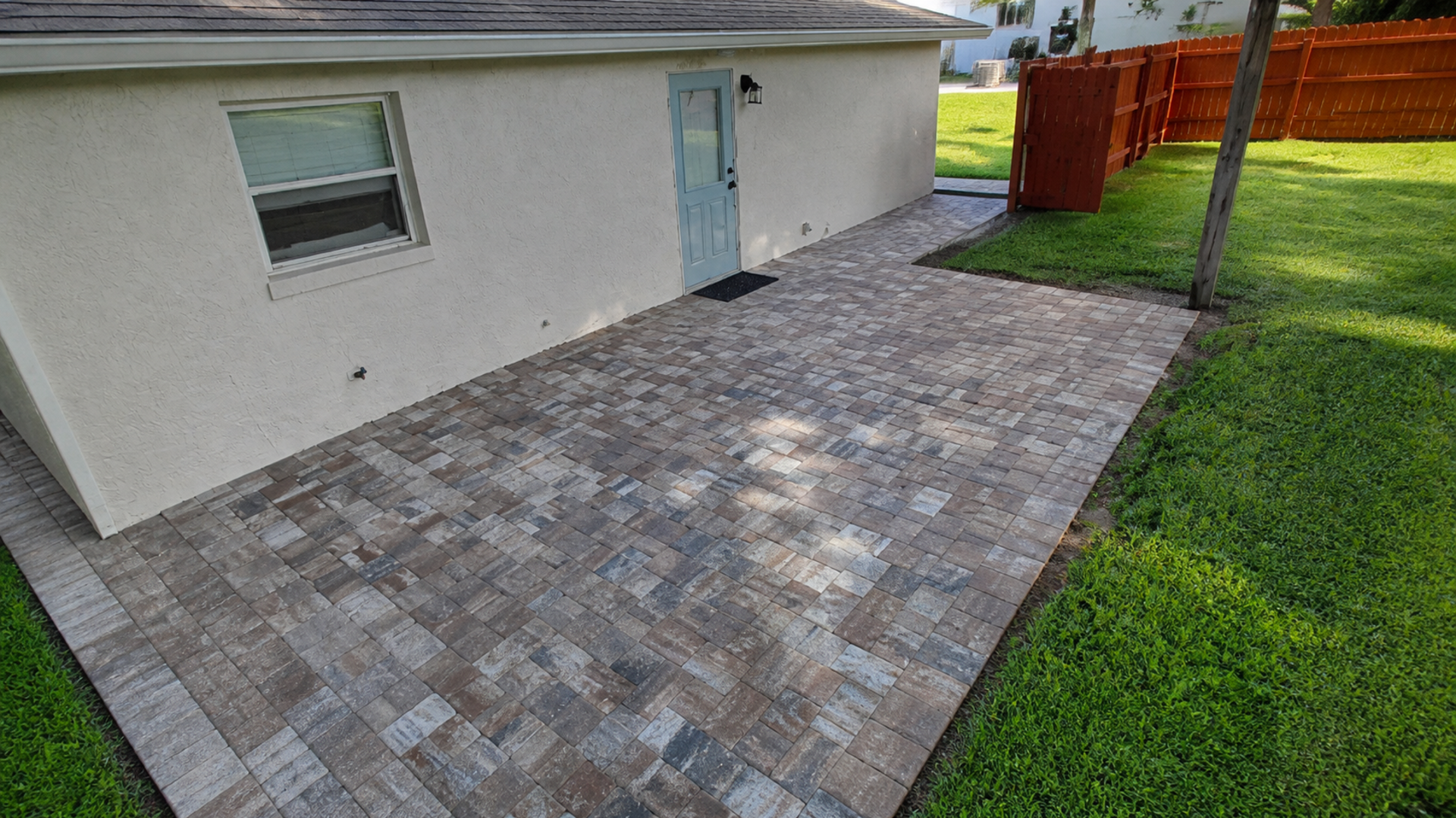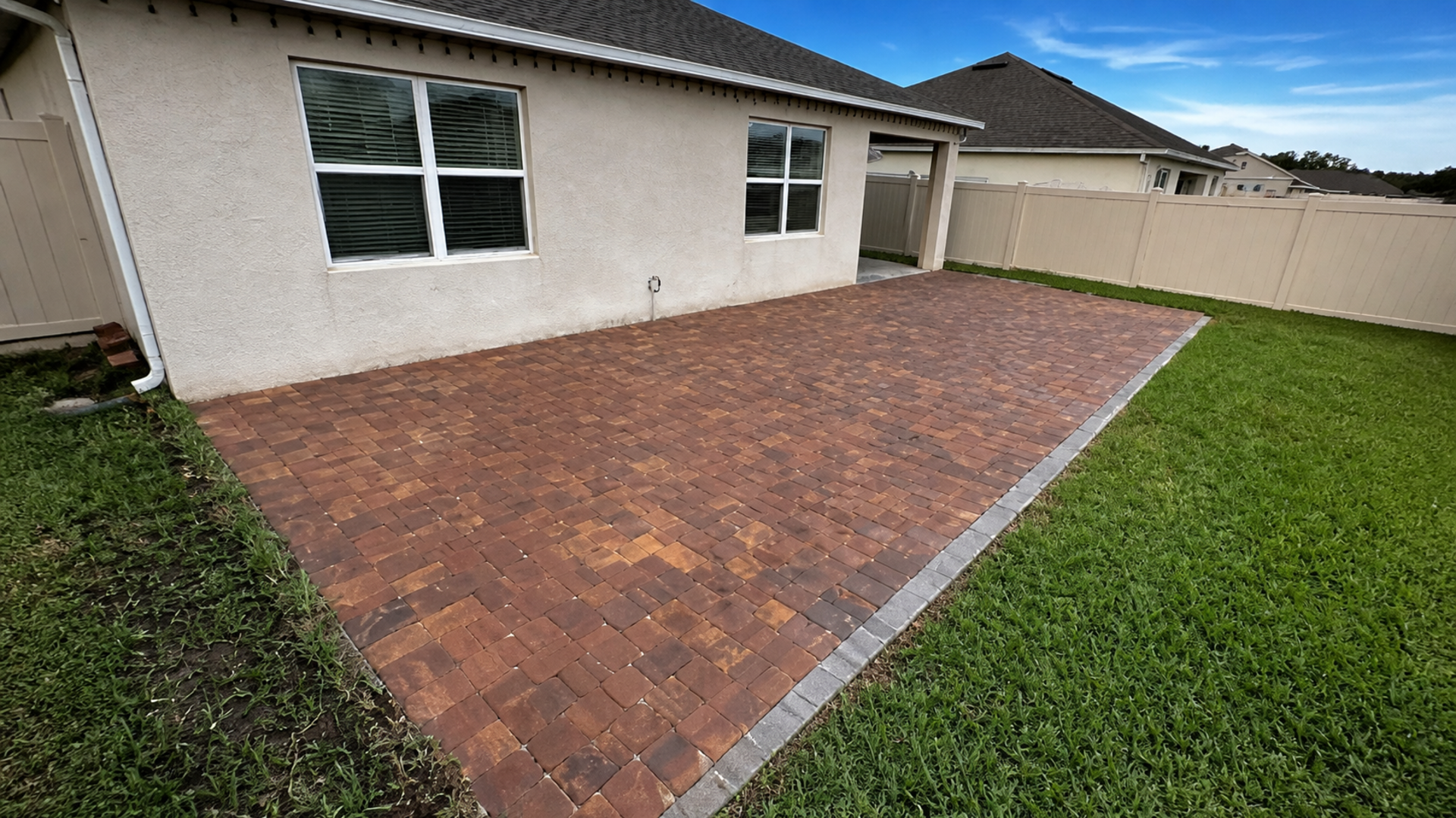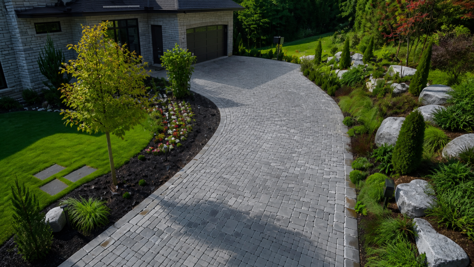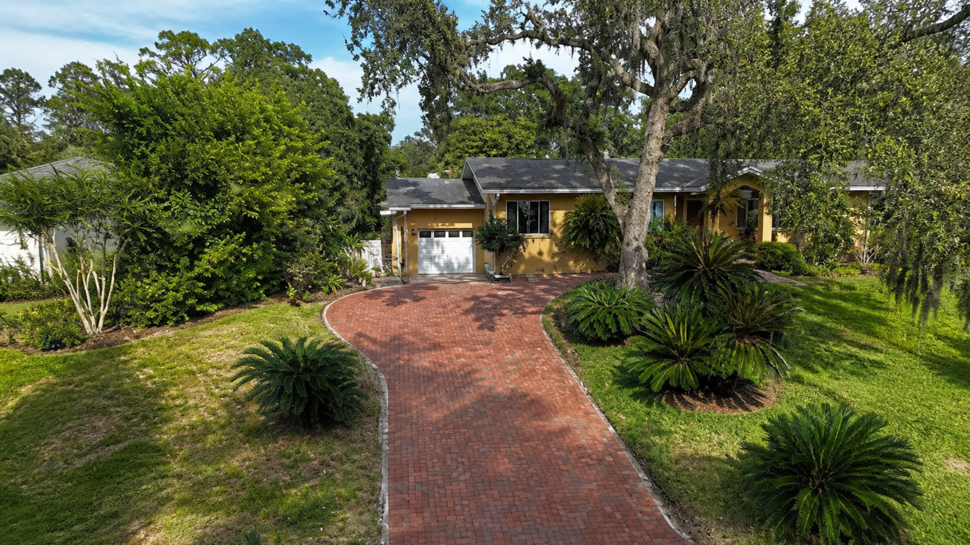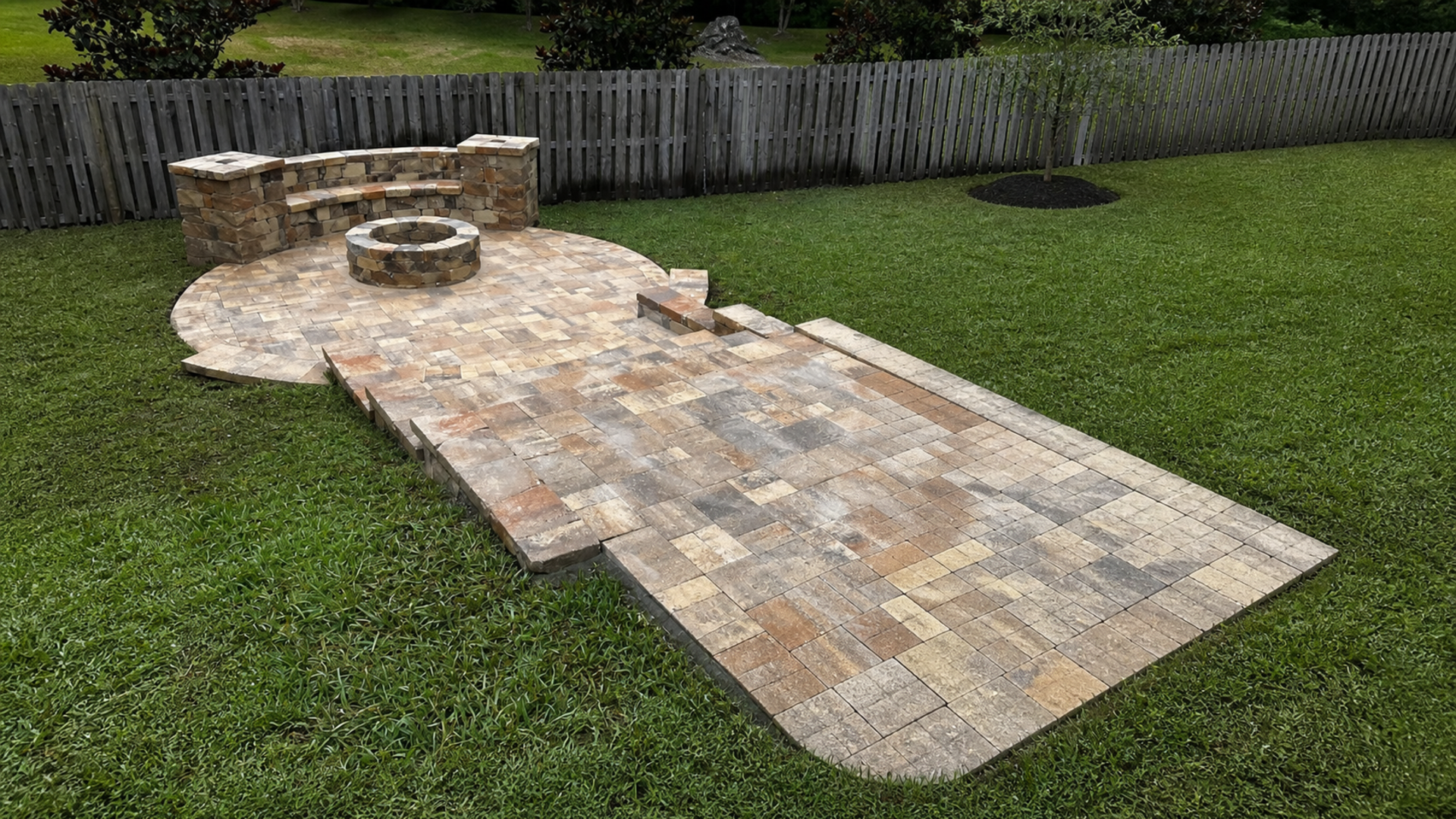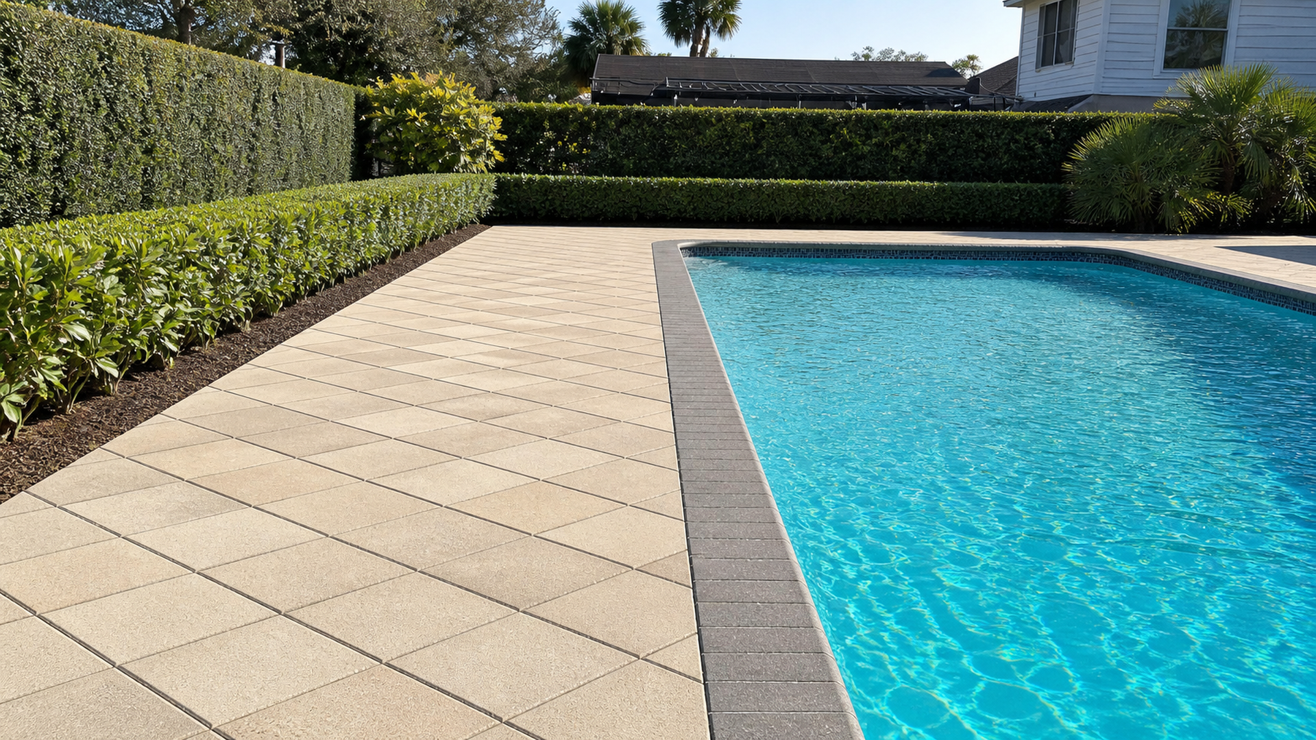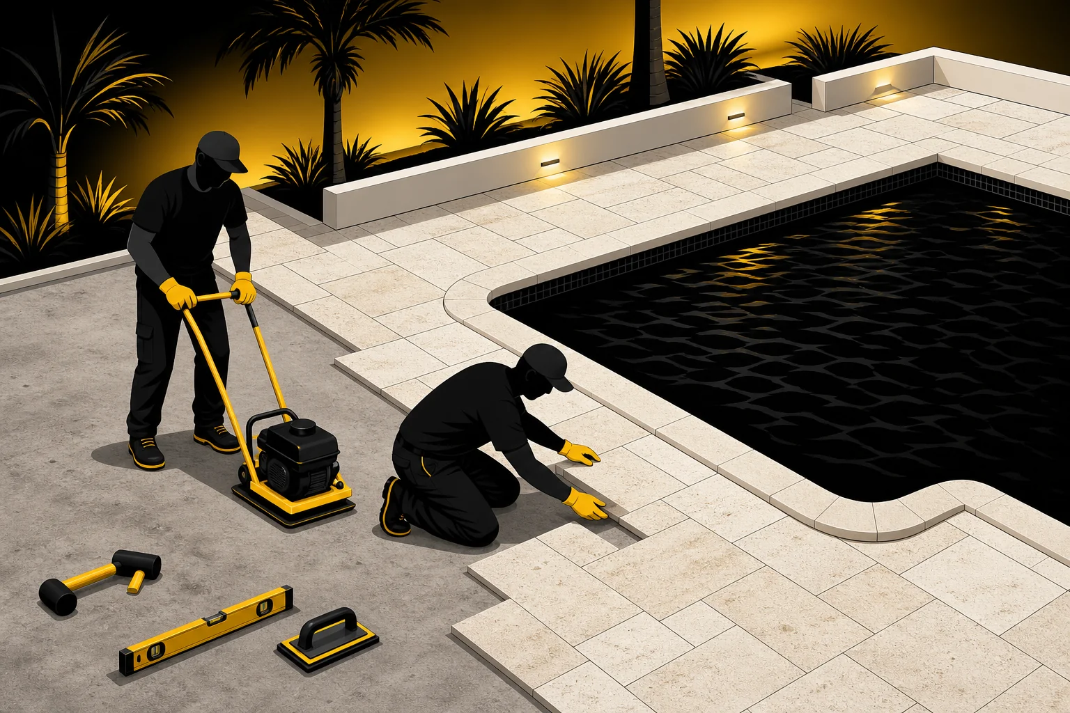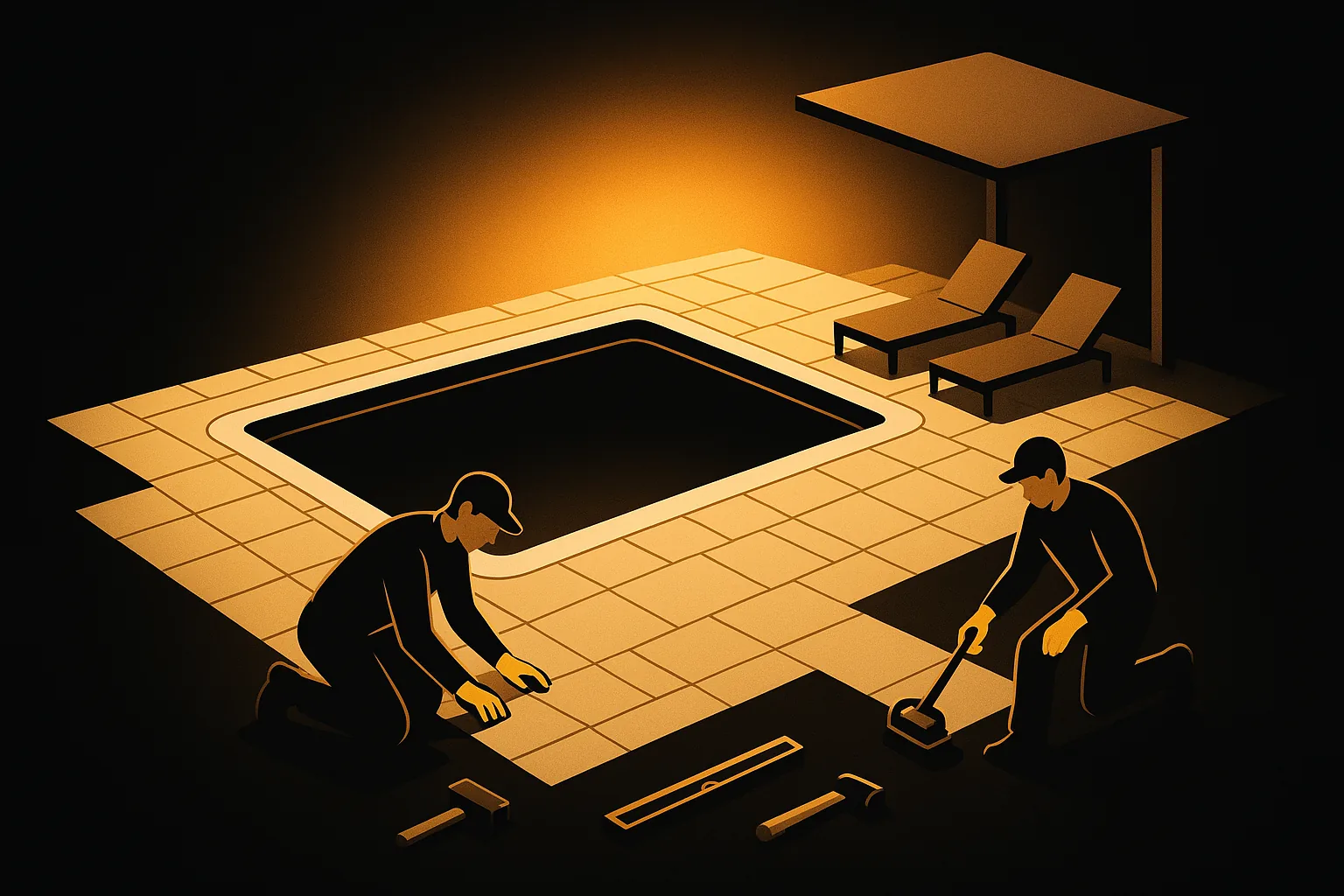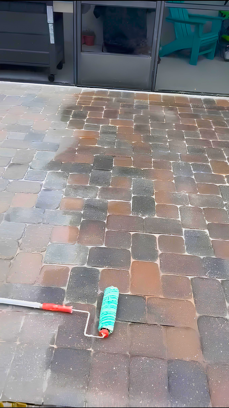

Low glare travertine pavers Florida pool areas can use successfully are not defined by one palest sample or a marketing label. The full palette still matters. Instead, visual comfort comes from the relationship among stone finish, color value, variation, sun angle, water reflection, architecture, and shade. When those elements work together, a bright pool setting can feel luminous without becoming visually harsh.
This design problem differs from asking whether a surface feels hot or how it behaves when wet. Therefore, the discussion here stays focused on brightness, reflected light, contrast, and the experience of looking across the deck throughout the day. Visual balance remains the goal.
Glare is a relationship, not a stone color
A surface becomes visually uncomfortable when bright reflections and strong contrast occupy important sightlines. For example, a very light, smooth stone viewed toward the afternoon sun may appear more intense than the same material seen under open shade. That relationship needs field review. Consequently, sample approval should include orientation and expected viewing position, not color alone.
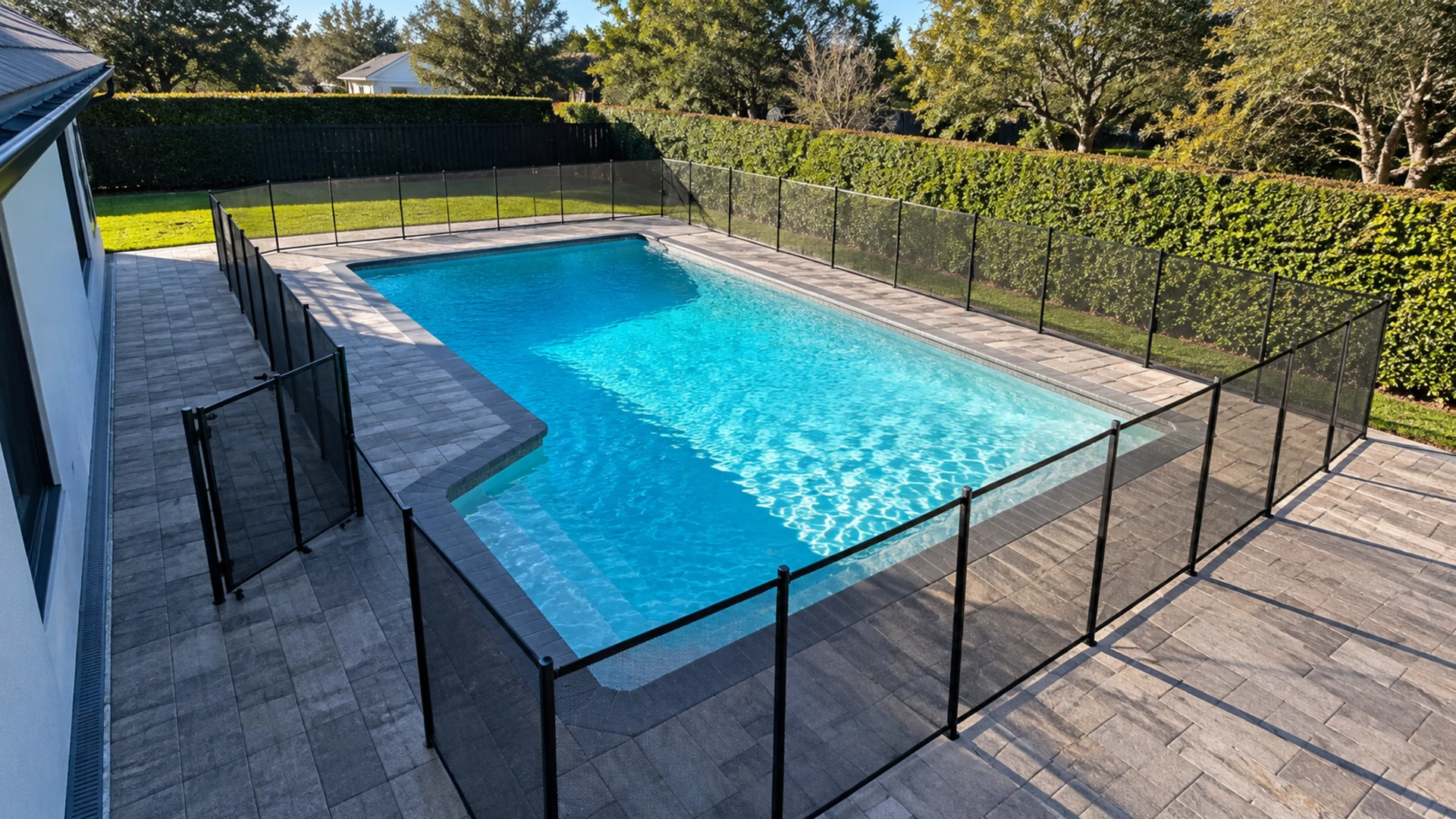
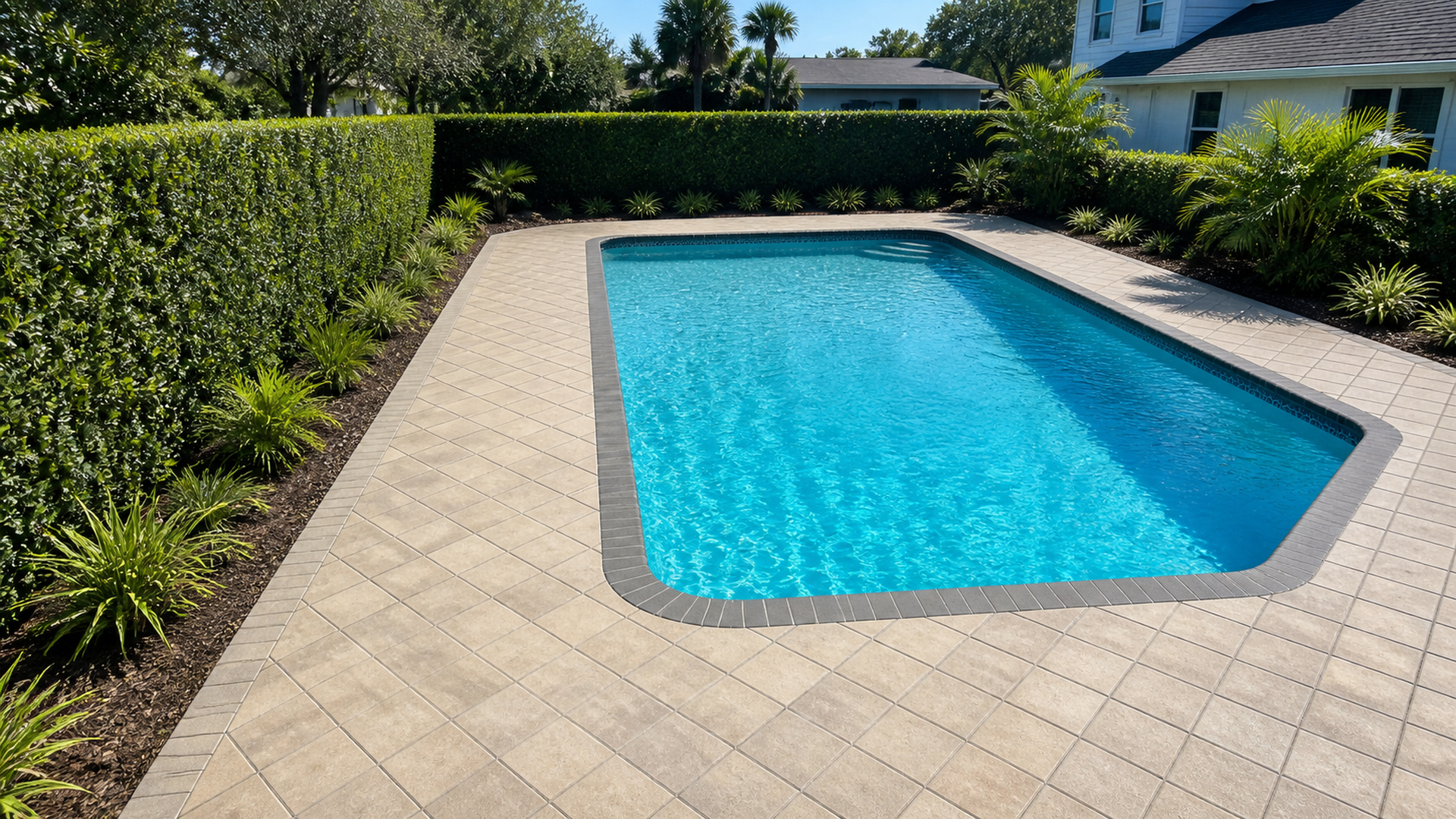
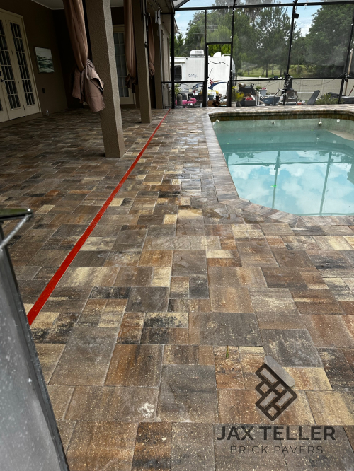
Pool water adds another reflective plane. In addition, pale walls, glass doors, white furniture, and polished metal can multiply highlights around the deck. The designer should read the complete scene because reducing contrast in one material may have little effect if another large surface dominates the view. Clear documentation helps here.
Observe the deck from real-use positions
- From the primary indoor room looking through glass doors
- From lounge seating at morning and afternoon use times
- From the pool steps and shallow-end gathering area
- From outdoor dining seats facing the water
- From an upper window or balcony when applicable
- From the main approach used by guests
- From the camera position used for property photography
These views reveal which reflections affect daily experience. Moreover, they prevent a design team from judging the deck only while standing over a sample. A comfortable palette should work across the most important sightlines, even if minor highlights remain elsewhere.
Low glare travertine pavers Florida finish planning
Finish influences whether light appears as a sharp highlight or a softer field. Generally, a surface with controlled texture scatters light differently from one with a visually polished character. Therefore, homeowners should compare actual finish samples outdoors rather than infer appearance from a small indoor photograph.
Texture should still suit the complete pool-deck specification and installation. However, the visual question is straightforward: does the finish create concentrated flashes or a diffuse glow from the main view? Moving the same sample through several angles can make that difference visible.
Edge treatments contribute as well. For instance, a broad smooth coping face may catch light differently from the deck field behind it. Consequently, the coping, borders, step faces, and vertical accents should join the mockup rather than receive separate approval under unrelated lighting. Natural movement should stay controlled.
Low glare travertine pavers Florida sample test
Place several full-size pieces on a portable neutral backing and orient them as the proposed field will run. Then, view the group from low and seated eye levels during morning, midday, and late afternoon. As a result, the evaluation captures directional reflections that an overhead glance can miss.
The test should include dry stone, surrounding wall colors, and nearby fabric or furniture finishes. In addition, photograph the arrangement with exposure settings that preserve highlight detail. A phone image should not replace human observation, but it can document how the palette behaves from a fixed viewpoint.
Color value needs balance rather than extremes
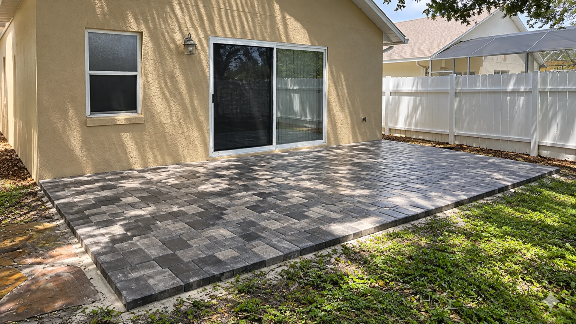
Color value describes how light or dark a tone appears. Therefore, a deck made entirely from the highest-value pieces can become a broad bright plane beside blue water and a pale house. The flow path remains central. A slightly more varied mid-light blend may preserve the airy character while breaking the uninterrupted visual intensity.
Going too dark can create the opposite problem: dramatic contrast against coping, walls, or pool interiors. Instead, the most restful composition often uses neighboring values with subtle movement. The eye then reads natural depth rather than a hard boundary between large bright and dark shapes.
Undertone matters alongside value. For example, cream, beige, silver, and warm gold can all look light while relating differently to stucco, roof tile, trim, and waterline materials. The outlet still matters. Consequently, color approval should ask whether the stone belongs to the house, not merely whether it appears bright enough.
Controlled variation softens a large pool deck
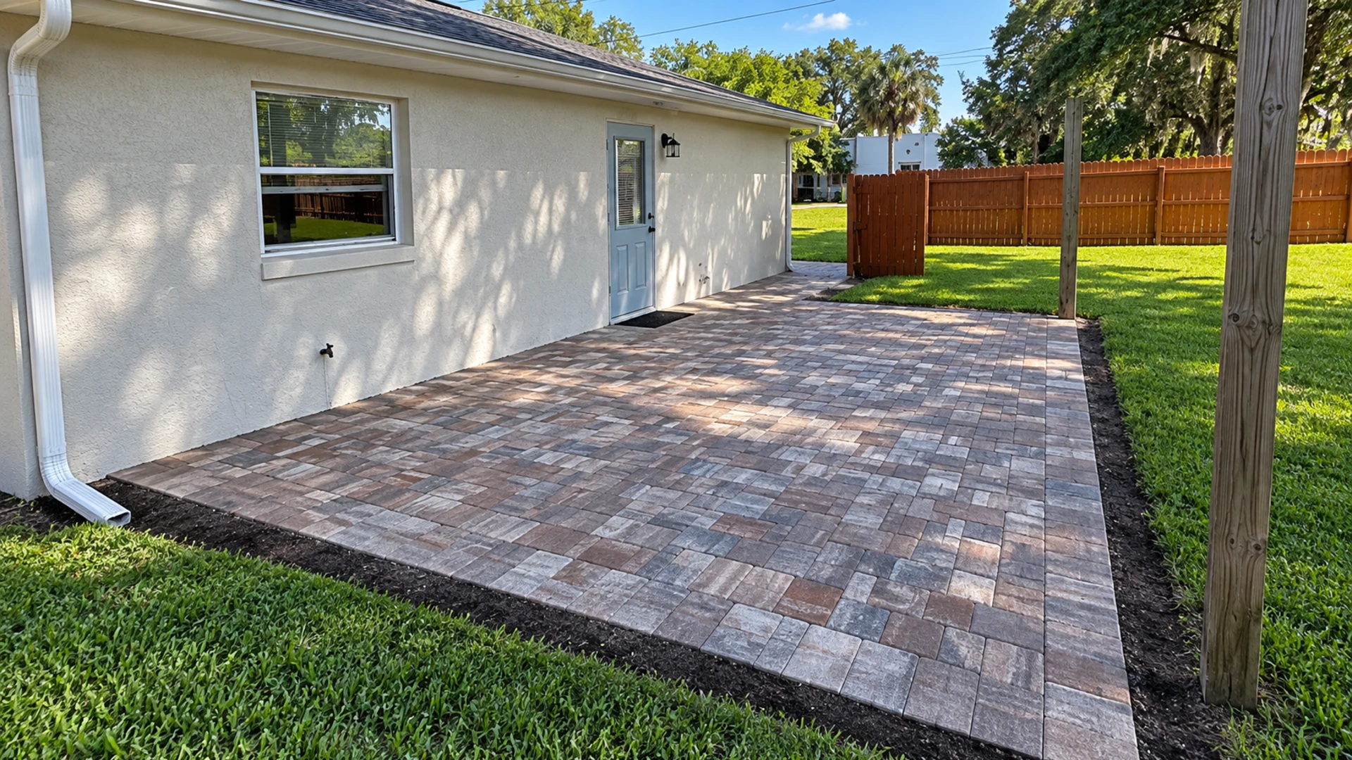
Natural variation can interrupt a single reflective field without producing a busy patchwork. However, the effect depends on distribution. If installers cluster the palest pieces in one area and warmer mid-tones in another, the deck may show visible islands that increase contrast. The broader composition remains important.
A project-specific blend allows the team to define acceptable light, medium, and accent ranges. In addition, installers can draw from multiple crates and review the field from a distance as work progresses. This controlled mixing preserves the character of stone while avoiding abrupt tonal blocks.
Variation should not become a reason to reject every distinctive piece. Instead, a few well-placed markings can add depth when their position supports the overall rhythm. The goal is intentional composition rather than artificial uniformity.
Sun orientation should guide the layout
Florida pool areas can receive changing light from multiple directions as the sun moves past the house, screen enclosure, and landscaping. Scale changes the visual effect. Therefore, a designer should mark when the deck serves breakfast, swimming, lounging, or evening gatherings. The most important glare issue may occur during a short but heavily used period.
Pattern direction can influence the perceived reflection. For instance, long joints or elongated units may emphasize a strong line toward the sun when viewed from seating. In contrast, a more balanced modular pattern can distribute visual movement. The effect remains site-specific, so a scaled plan and outdoor mockup work better than a universal rule.
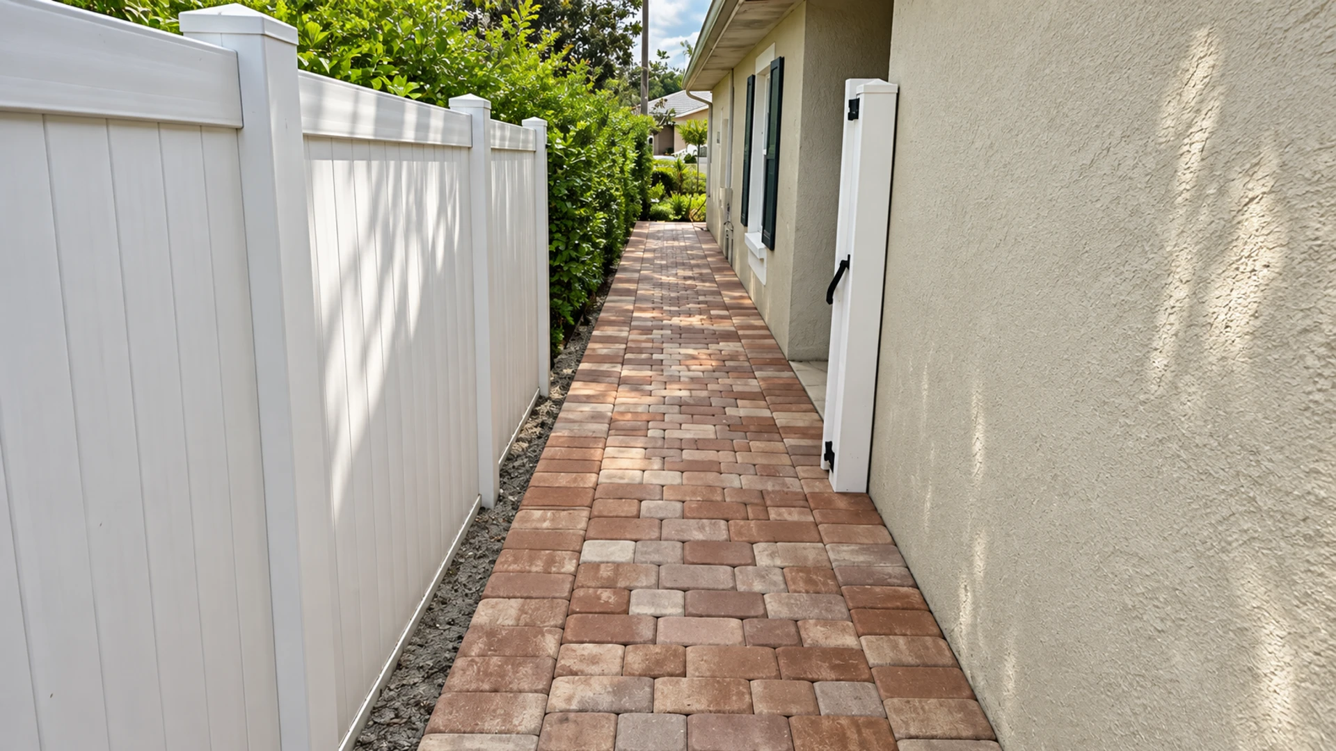
Architecture may already provide useful shade at certain hours. Consequently, the deck can place primary seating within that changing shadow line while keeping circulation open. This strategy uses the site’s existing geometry before adding new structures or accessories.
Create a simple sun-and-use map
- First, mark north and outline the house, pool, enclosure, trees, and covered areas.
- Next, record direct sun and shade during the hours the pool area receives the most use.
- Then, add main views, seating, walking routes, and photo angles.
- Afterward, identify surfaces that create the strongest highlights from those positions.
- Finally, test stone finish, value range, and shade interventions against that map.
This map does not need to simulate every day of the year. Instead, it gives the project team a common reference for observed conditions and priorities. Seasonal sun paths change, so homeowners should also explain when the space matters most to them.
Shade should support the composition
Shade reduces the area exposed to direct light and can lower visual contrast at a seating zone. Nevertheless, an isolated dark canopy beside an otherwise brilliant deck may create a sharp boundary that strains the eye when people look back and forth. Therefore, shade design should consider transitions as well as coverage.
Pergolas, roof extensions, umbrellas, and planting each produce different shadow patterns. For example, a pergola can create graphic stripes that become part of the architecture, while a tree canopy may cast softer moving shade. That distinction guides the next step. The choice should coordinate with pool access, wind exposure, roots, maintenance, and applicable approvals.
Furniture placement can provide a smaller intervention. In addition, matte fabrics and restrained frame finishes can prevent extra sparkle at eye level. The deck material does not carry the entire responsibility for visual comfort.
Coordinate water, coping, and vertical surfaces
The pool interior influences the light that returns toward the deck. Consequently, a vivid waterline, pale plaster, or reflective glass tile may change how the same stone palette feels. A deck selection should sit beside those samples whenever pool finishes are part of the project.
Coping forms the immediate frame around the water. Therefore, a high-contrast coping band can produce a bright outline even when the field remains quiet. Using a related value with enough distinction for intentional framing can create continuity without erasing the edge visually.
House walls create the largest vertical backdrop on many properties. For instance, bright white stucco under direct sun may dominate the view from the pool. Because of this, exterior paint, trim, doors, and shaded recesses belong in the visual assessment rather than serving as fixed neutral assumptions. The approved range remains the guide.
Design for cameras without designing only for cameras
Real-estate images and project photography often use wide angles that include water, deck, house, and sky. As a result, very bright stone can lose texture if the scene contains extreme contrast. A finish with visible tonal depth gives a camera more material detail to record, provided the exposure and lighting remain thoughtful. Context determines the final appearance.
Photography-ready does not mean arranging the deck as a static set. Instead, circulation, furniture clearances, shade, and family use must lead. Once the functional plan works, the designer can identify uncluttered views, align pattern lines, and place distinctive stone movement where it enriches the frame. Outdoor light reveals the difference.
Temporary styling should not hide permanent contrast issues. Therefore, review the bare materials before relying on rugs, umbrellas, or planters to correct the composition. Accessories can refine a calm foundation, but they should not rescue an unresolved palette.
Avoid common low-glare design mistakes
- Choosing the palest piece available: One sample cannot represent a full field or its reflections.
- Viewing samples indoors: Interior light hides the directional intensity of outdoor sun.
- Ignoring the water plane: Pool reflections alter brightness from seated and standing views.
- Approving coping separately: The edge can become the brightest uninterrupted band.
- Clustering stone values: Poor blending creates patchy high-contrast zones.
- Using shade as an afterthought: Shadow placement affects the entire visual composition.
- Trusting a filtered photo: Edited images may suppress highlight and color information.
- Designing for midday only: Low-angle morning or afternoon sun may create the important reflection.
Each mistake separates one choice from the complete environment. In contrast, a comfortable design links material, orientation, architecture, and use. That integrated approach also gives installers clearer approval criteria.
Low-glare pool palette checklist
- Primary views: Mark indoor, seated, pool-entry, and dining sightlines.
- Time of use: Record the hours when direct light creates discomfort.
- Finish: Compare full-size pieces outdoors at low and high viewing angles.
- Value range: Approve a balanced light-to-mid-tone blend rather than one piece.
- Undertone: Coordinate stone with stucco, roof, trim, coping, and waterline materials.
- Distribution: Define crate mixing and distance-review procedures for installation.
- Shade: Map existing shadows and planned pergolas, umbrellas, or planting.
- Photography: Test key frames while preserving real circulation and furniture space.
- Field review: Establish who can pause installation if the blend becomes uneven.
A low glare travertine pavers Florida checklist creates an approval process that installers can follow. Furthermore, it turns a subjective request for less glare into observable design decisions. The final result still depends on actual site light, but the team can evaluate it with shared criteria.
Connect the visual plan to the larger August travertine cluster
If the project replaces an aging concrete surround, start with the guide to travertine pool deck remodeling benefits. In particular, that article explains removal versus overlay constraints, finished elevations, drains, and edge transitions. Those construction decisions should be settled before a low-glare palette receives final approval.
Next, use the project guide to travertine paver color variation to plan blend ratios and field distribution. Consequently, natural tonal movement can soften a large surface without turning into random patches. The two design layers—visual comfort and controlled variation—should share the same sample board.
Request a pool-specific finish consultation
JaxTeller Brick Pavers can review the site’s sun exposure, architecture, pool geometry, and stone range through its paver pool deck service. Distribution shapes the finished field. Therefore, homeowners can compare finish and color choices in the context of real sightlines rather than selecting from a disconnected indoor sample. The viewing angle changes perception.
The U.S. Department of Energy’s cool roofs resource offers authoritative background on how solar reflectance and surface properties matter in sun-exposed materials. However, roof guidance does not predict pool-deck glare or specify travertine. A site-specific outdoor mockup remains the appropriate way to judge visual comfort for this application.
Frequently asked questions
Is the lightest travertine always the lowest-glare choice?
No. Instead, finish, viewing angle, sun direction, surrounding contrast, and stone distribution influence the visual result. A slightly deeper or more varied blend may feel calmer than one uninterrupted pale field, so test full-size samples outdoors.
Does a textured finish remove all bright reflections?
No finish eliminates every highlight in a sunny pool environment. However, surface texture can change how light appears compared with a visually smoother finish. The project team should evaluate the actual stone from important seated and standing views.
Should coping match the deck exactly?
Not necessarily. For example, coping can use a related tone that frames the water without creating a harsh bright band. Geometry, finish, stone range, and pool details should guide the relationship rather than a rule requiring exact matching.
When should we test samples?
Test them before ordering and revisit the approved range before installation begins. In addition, observe samples during the hours when the pool receives its strongest or most troublesome light. A short indoor selection meeting cannot replace that review.
Can landscaping solve a glare problem?
Landscaping can add shade and soften contrast, yet species, roots, wind, debris, and long-term growth require planning. Therefore, planting should support a balanced material palette rather than serve as the only solution for an overly bright deck.
Ready to transform your pool deck? First, request a sun-exposure and stone-finish consultation and explore JaxTeller’s completed projects. Then, follow design work on Instagram and Facebook, or discuss your bright pool area through WhatsApp.
Finally, call +1 407-907-8308, email jaxtellerbrickpavers@gmail.com, or locate the team through Google Maps. Contact JaxTeller Brick Pavers at +1 407-907-8308 or jaxtellerbrickpavers@gmail.com for your free estimate!