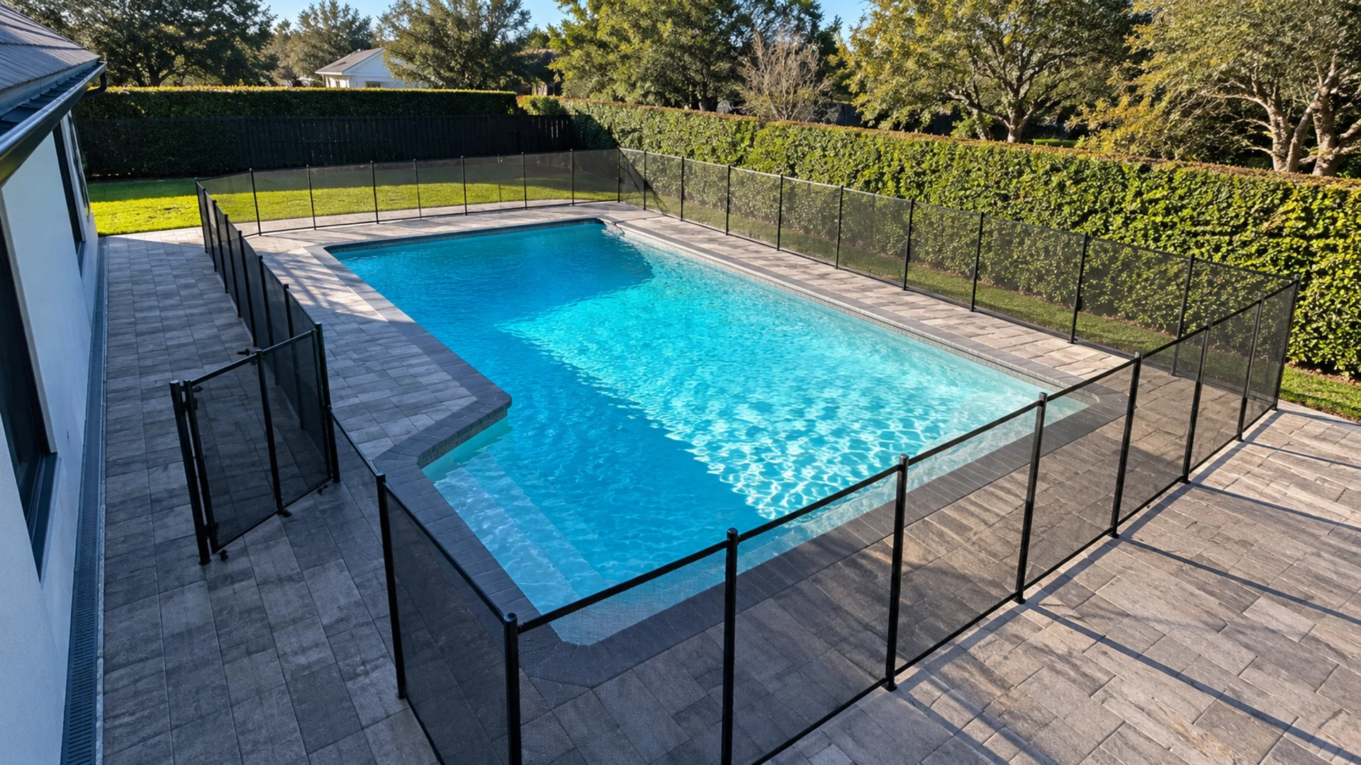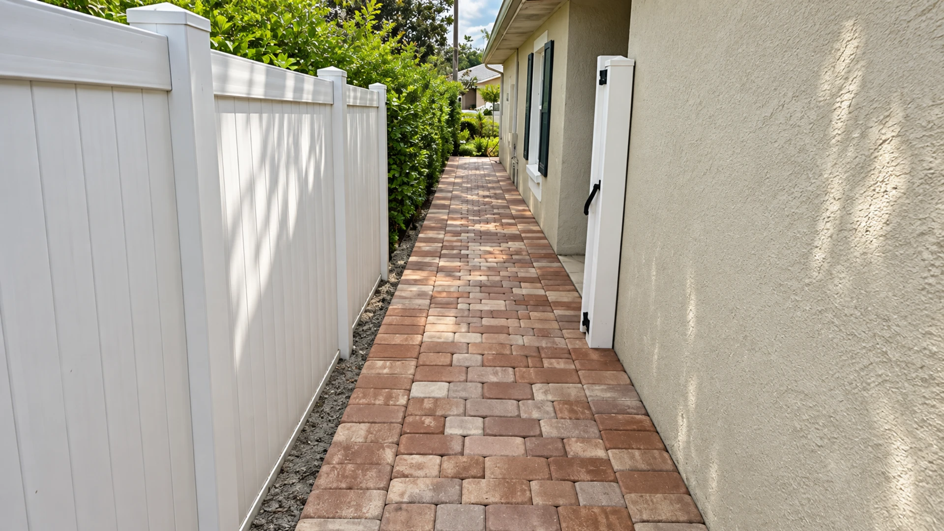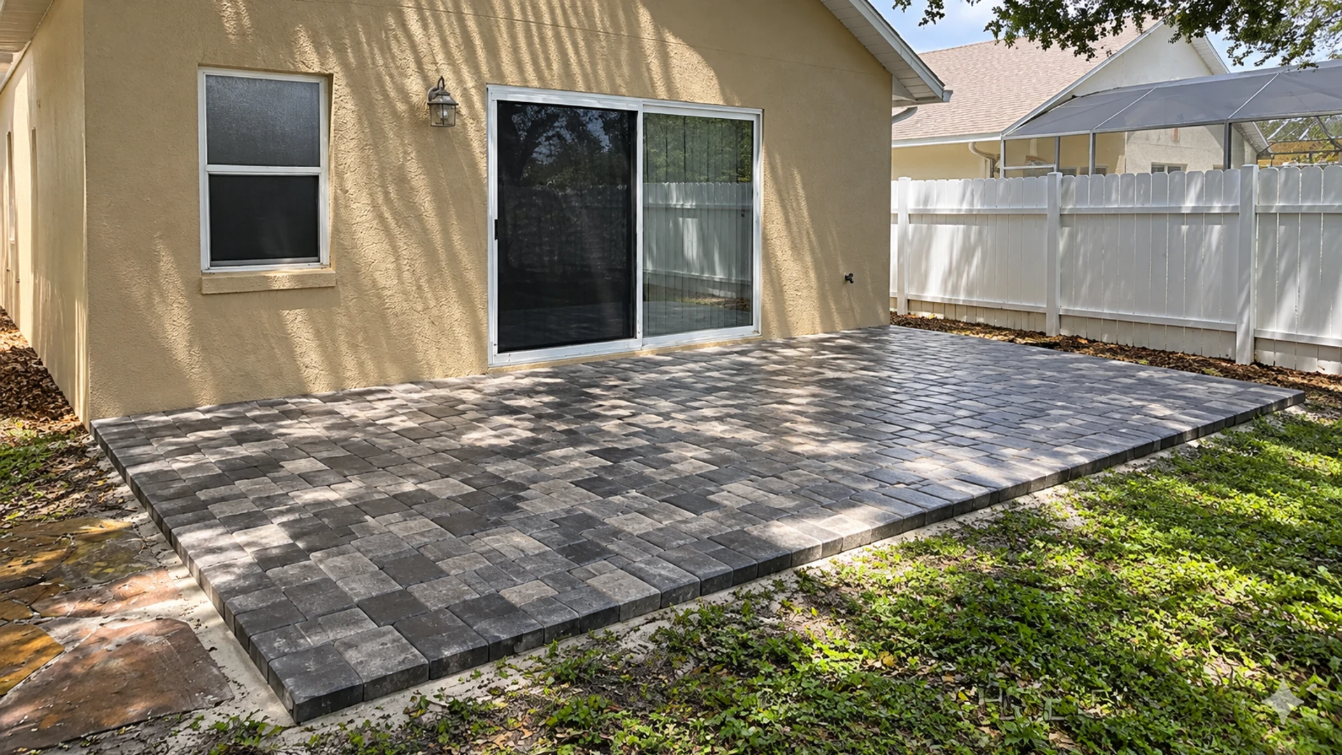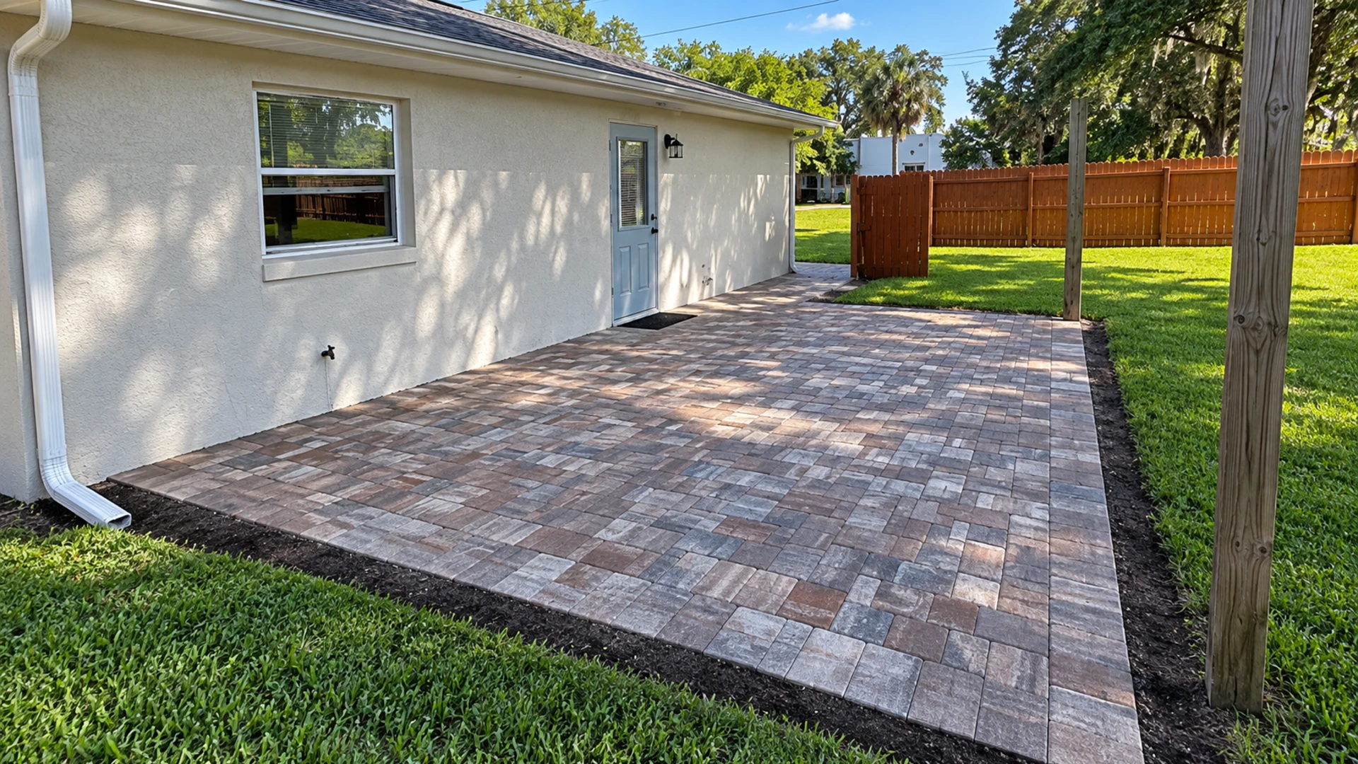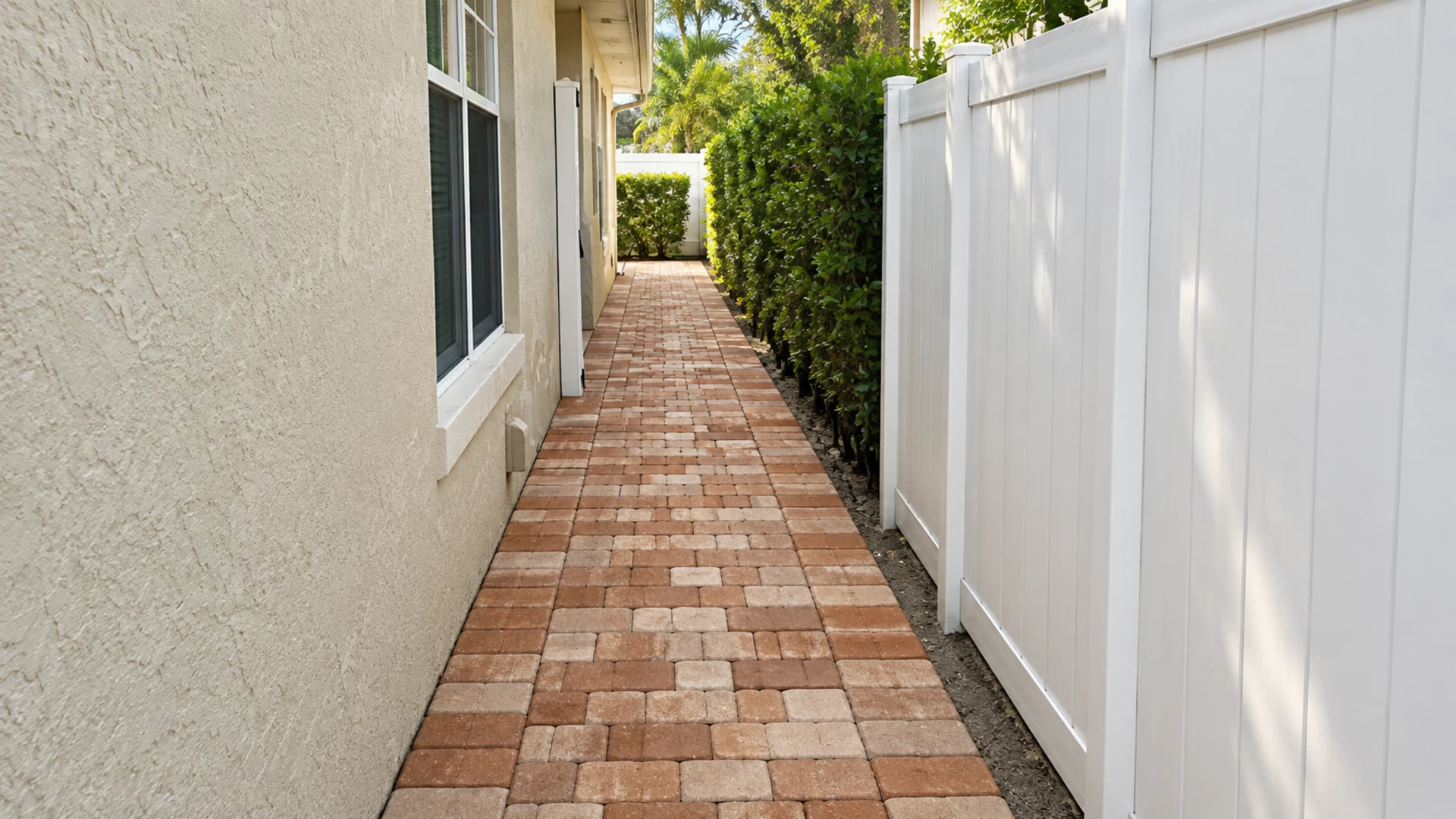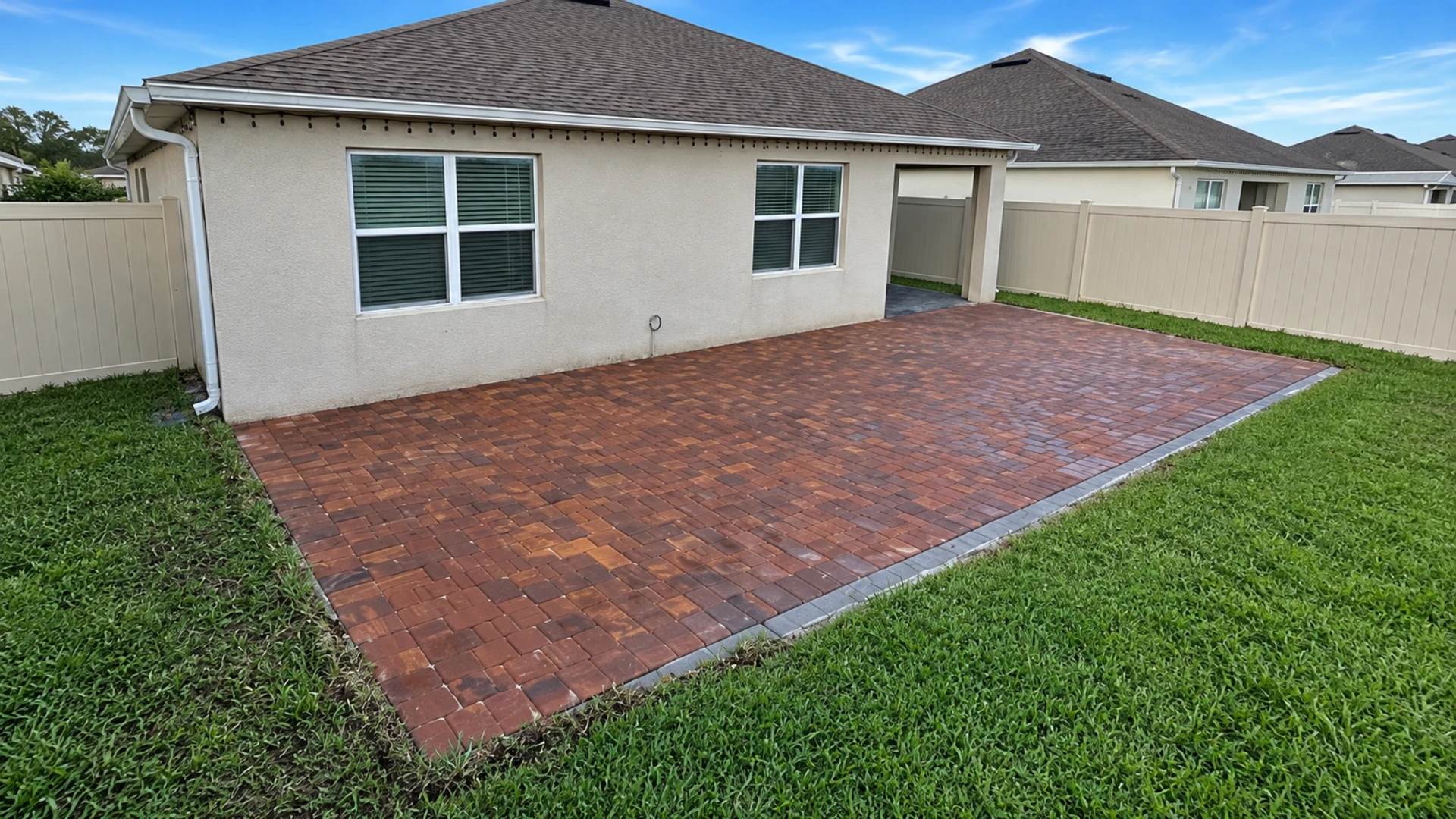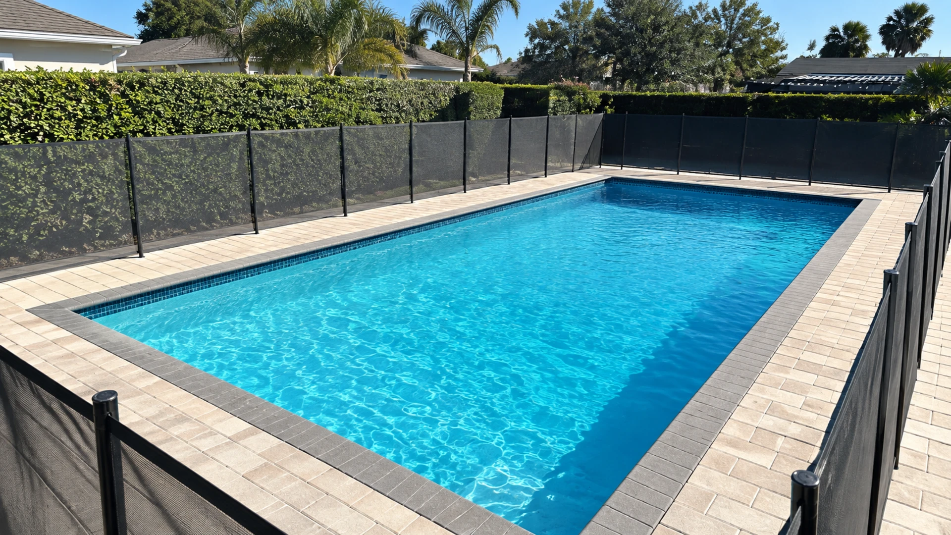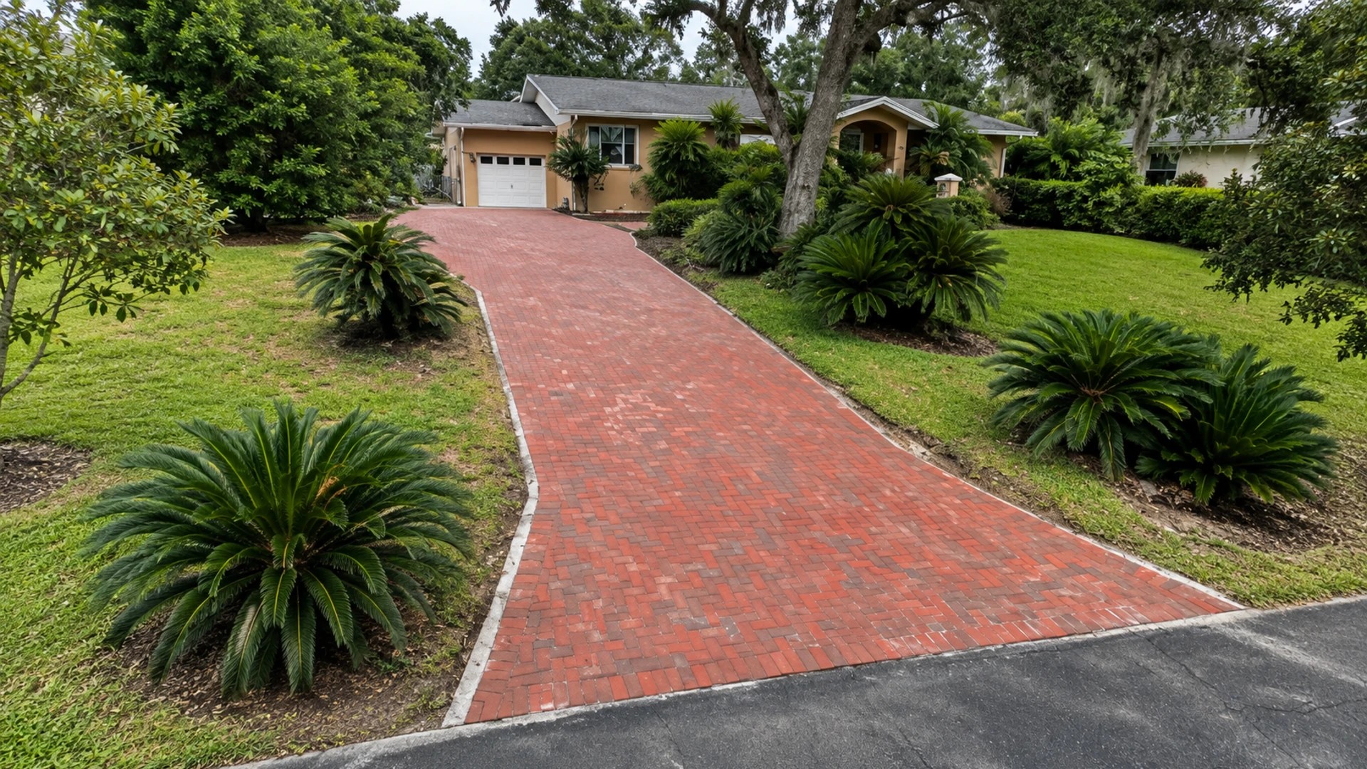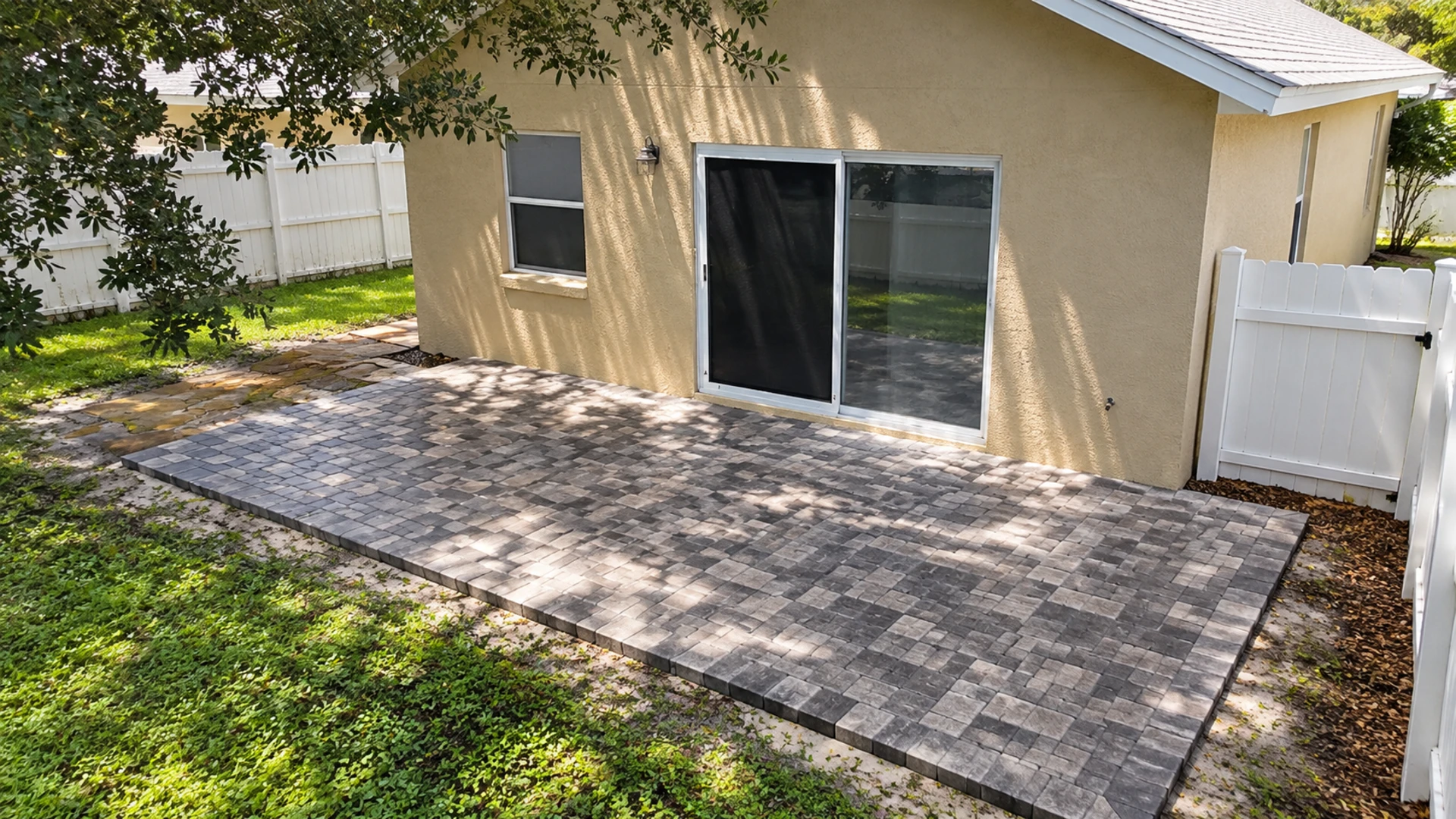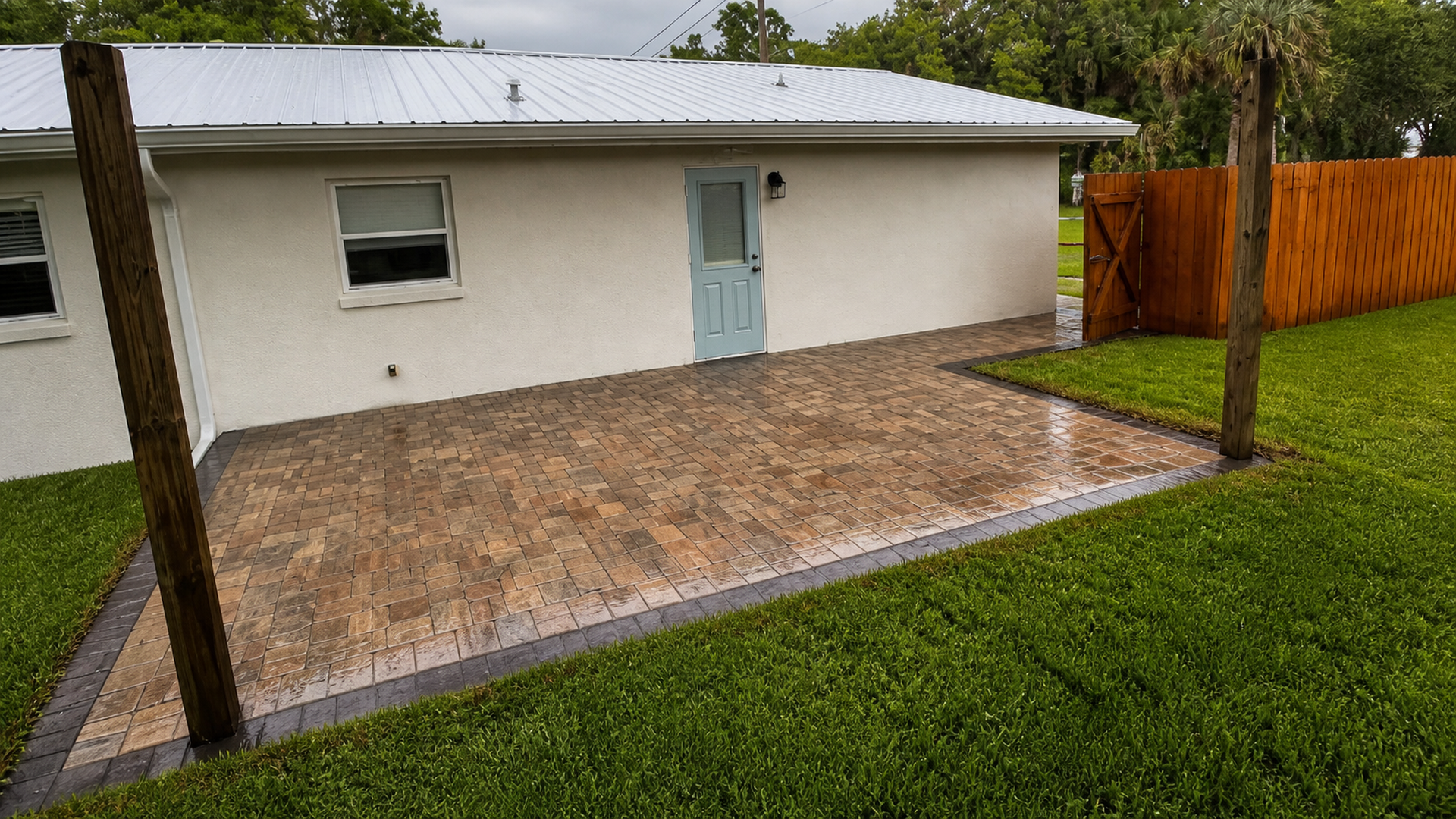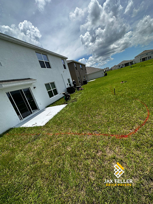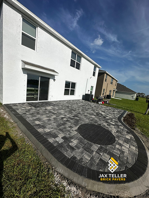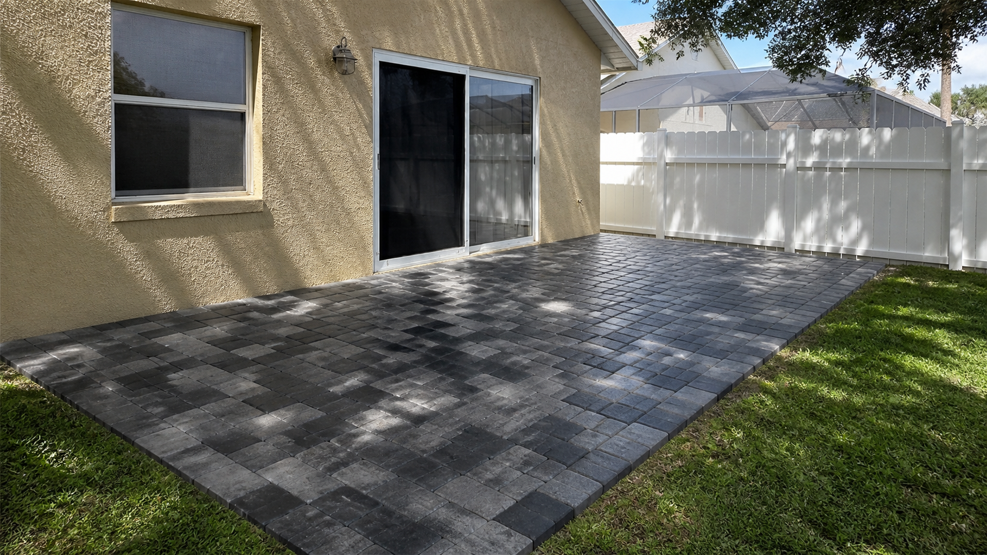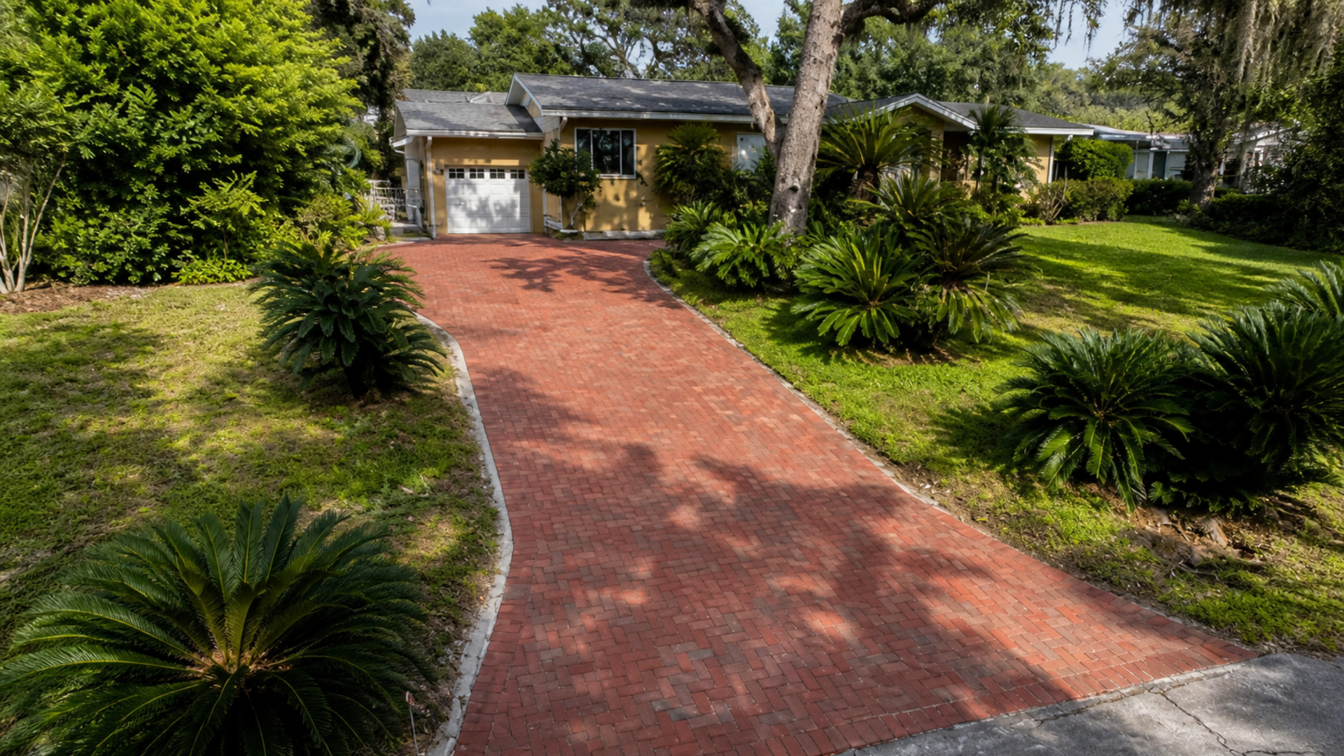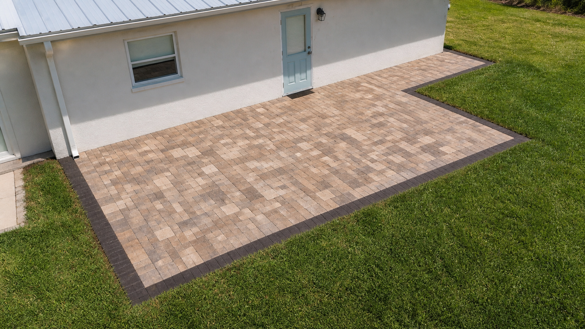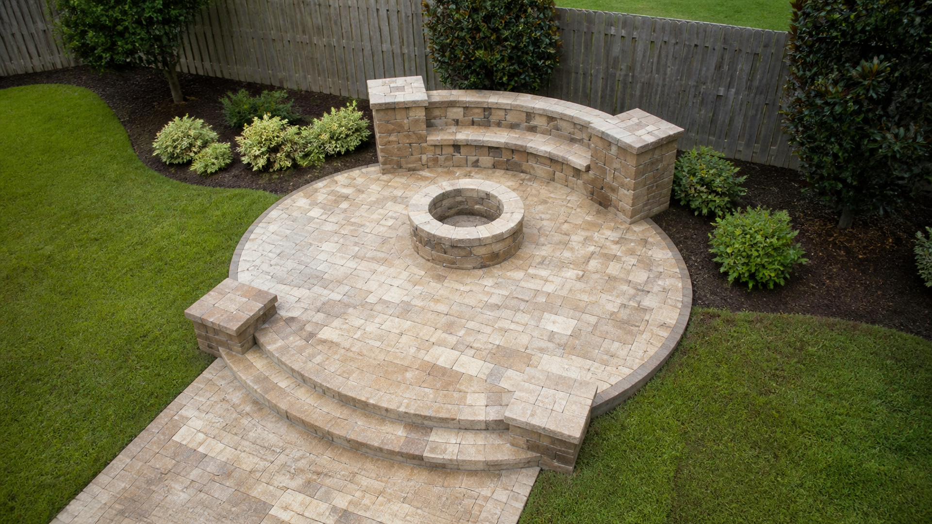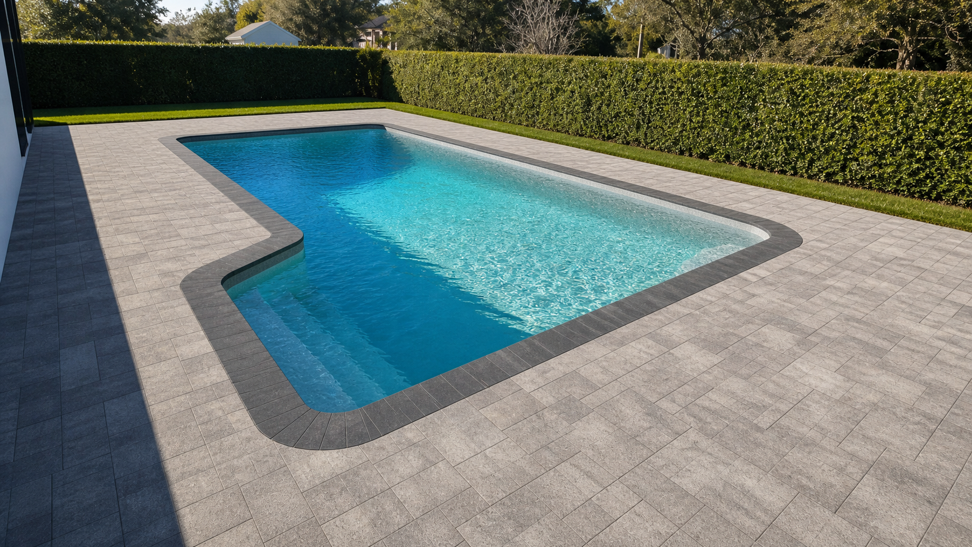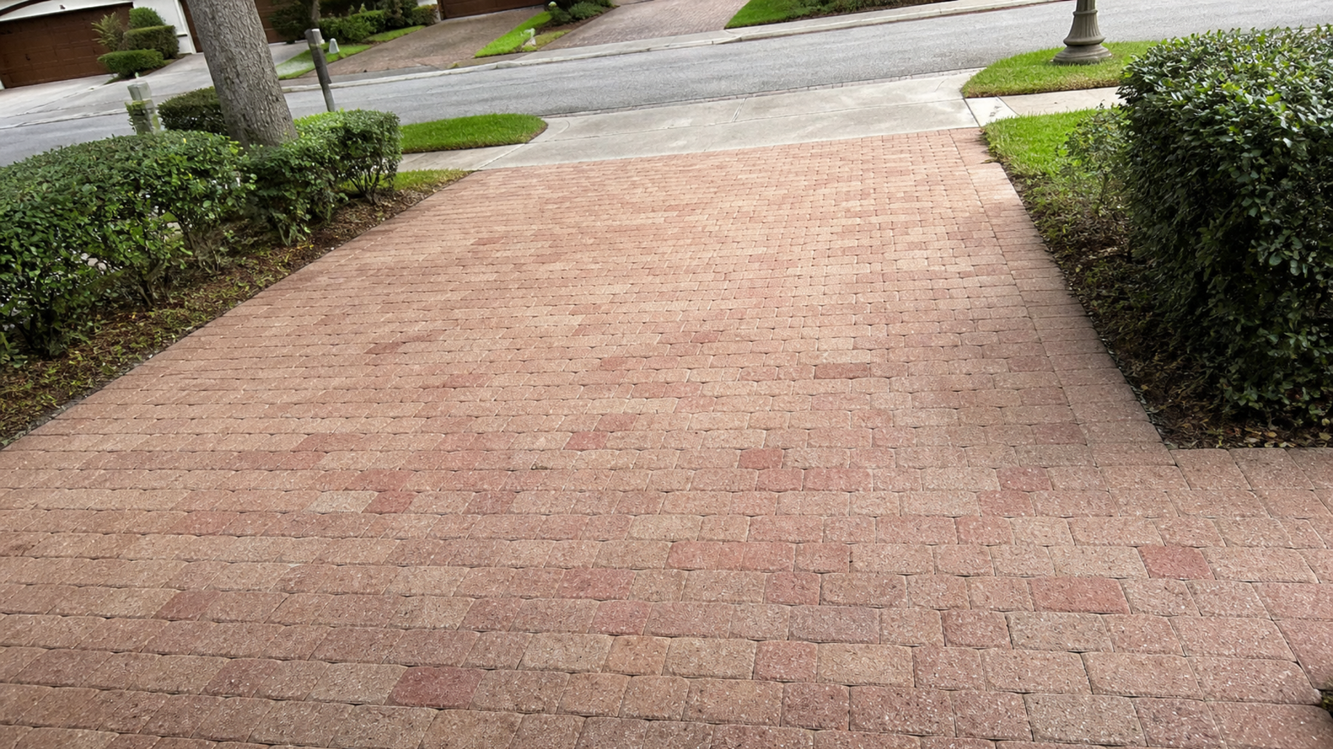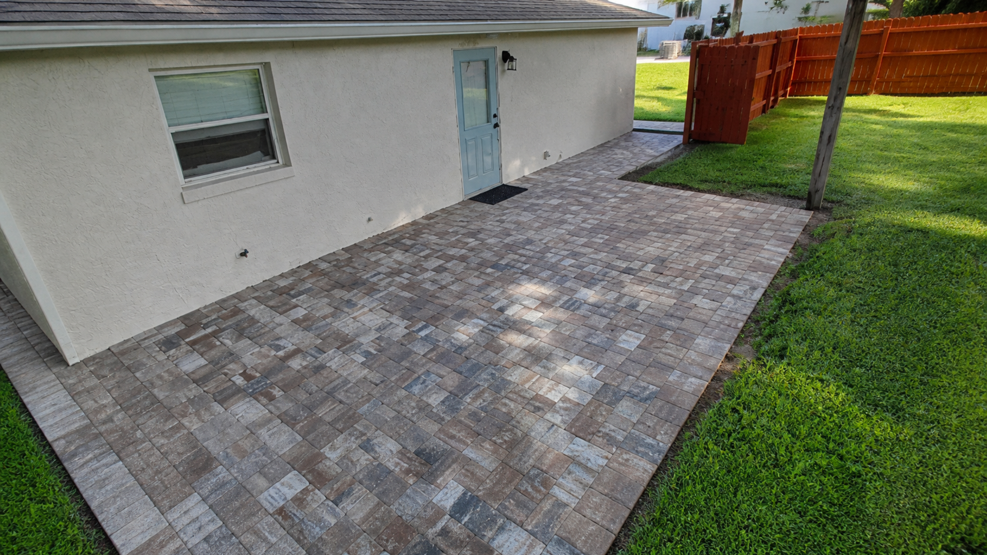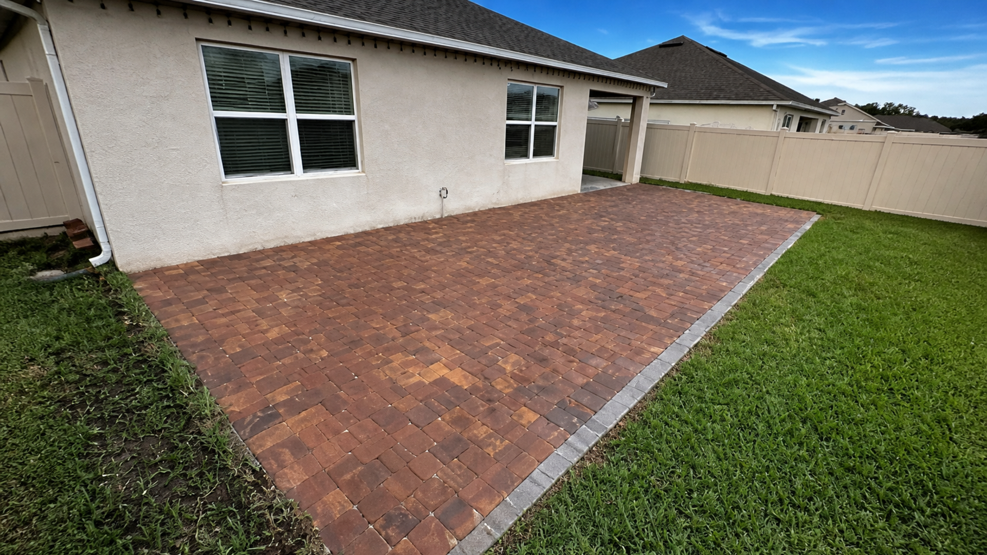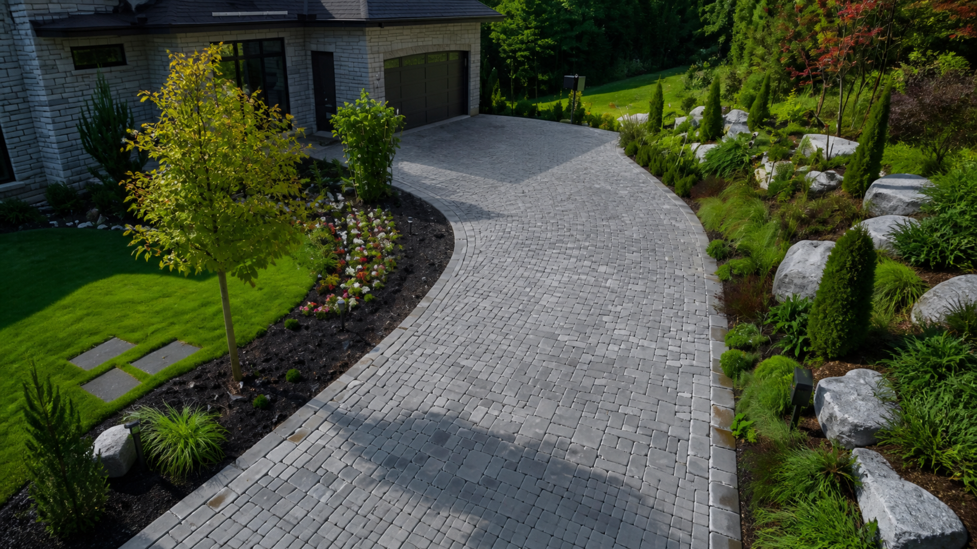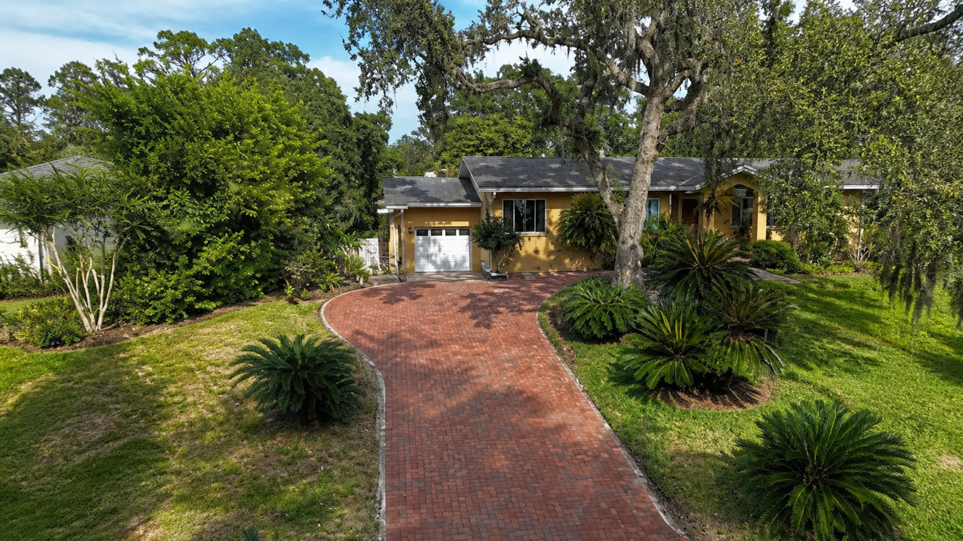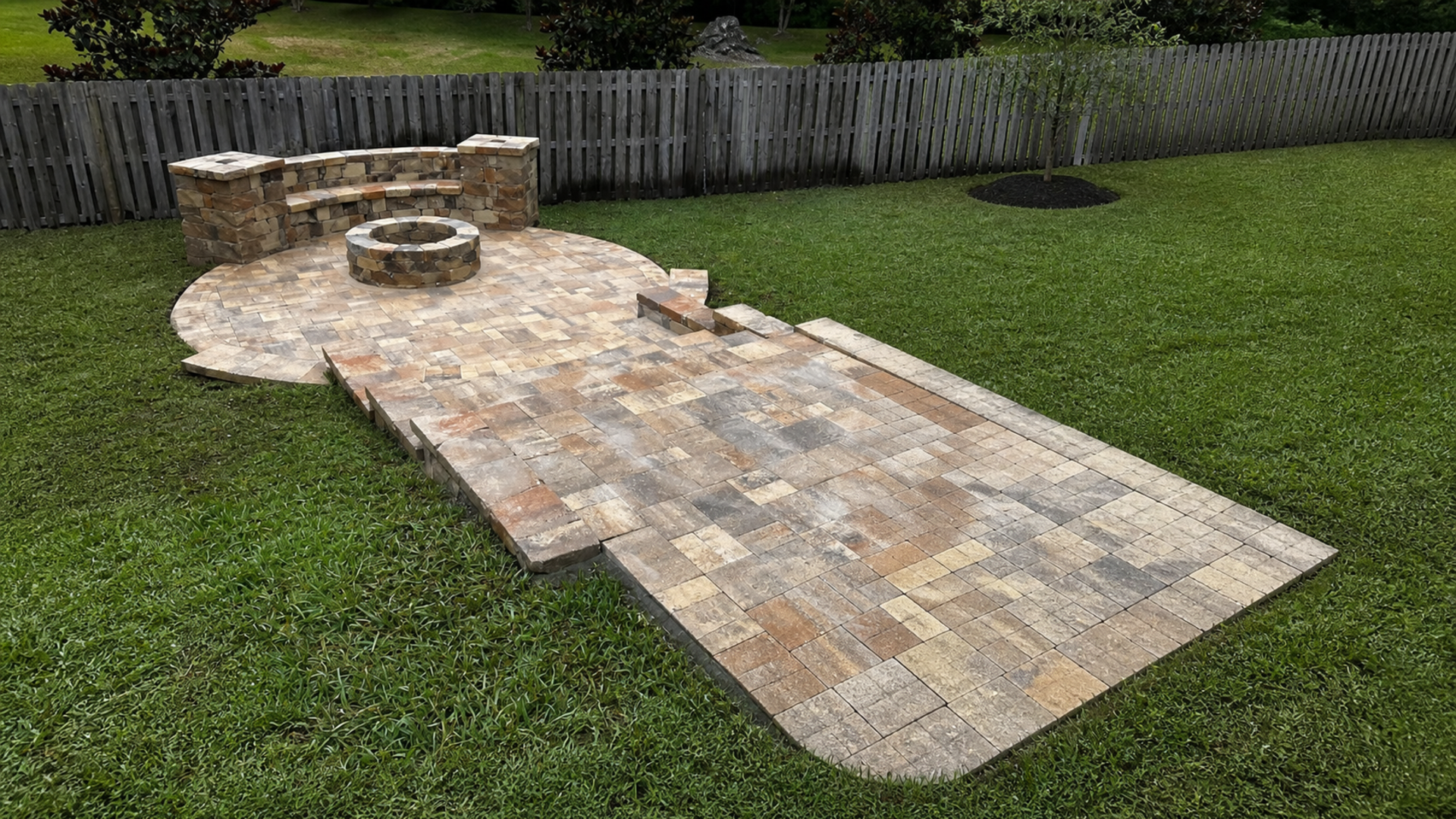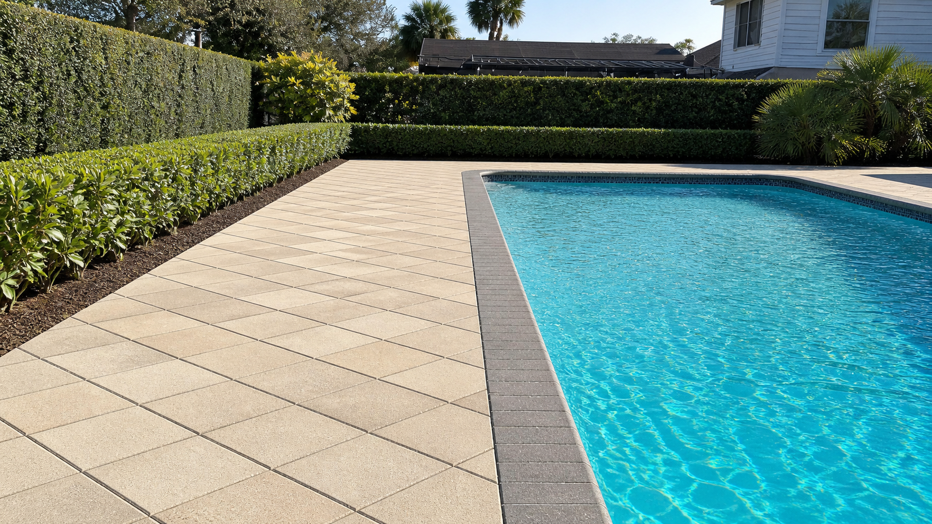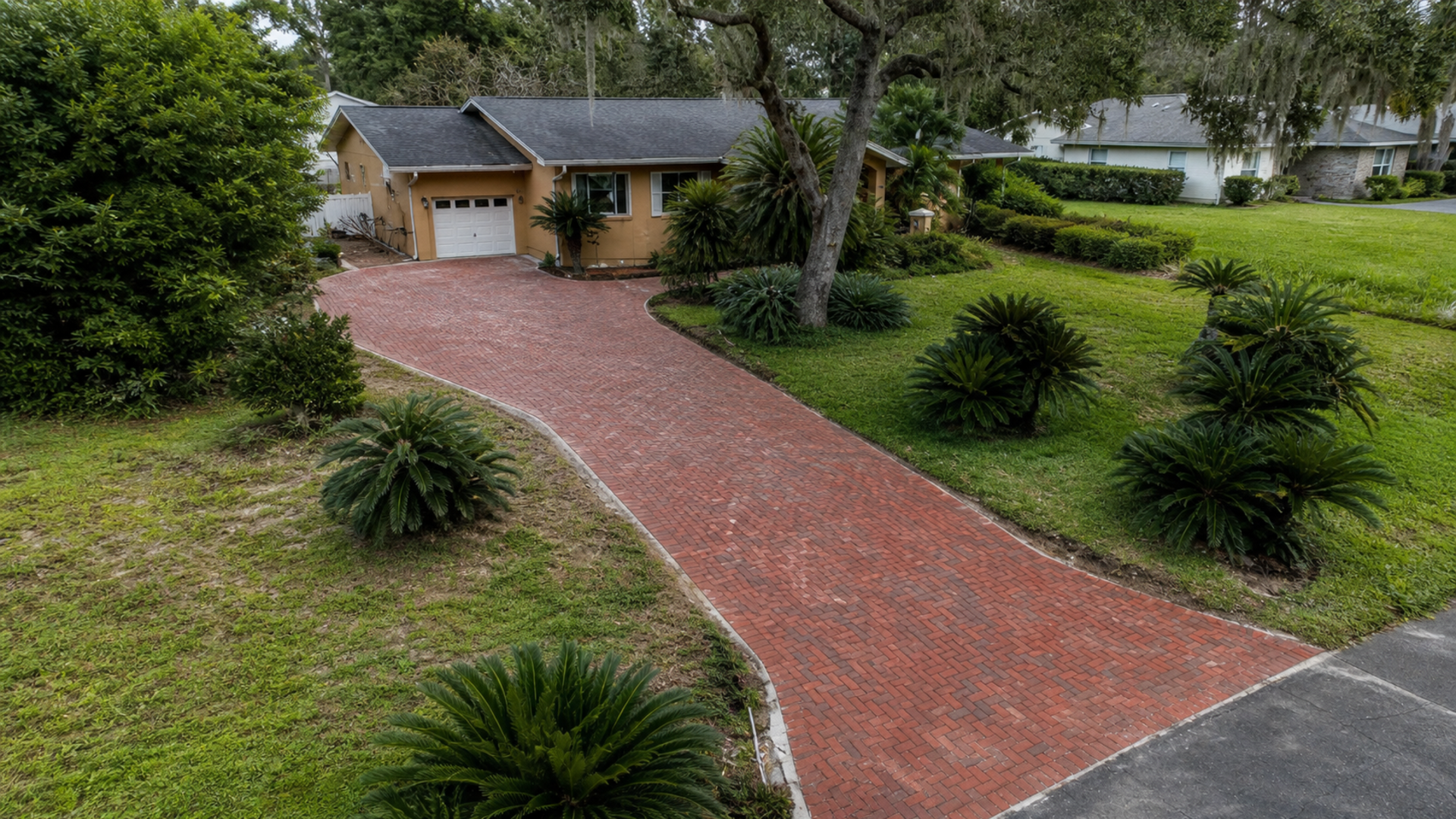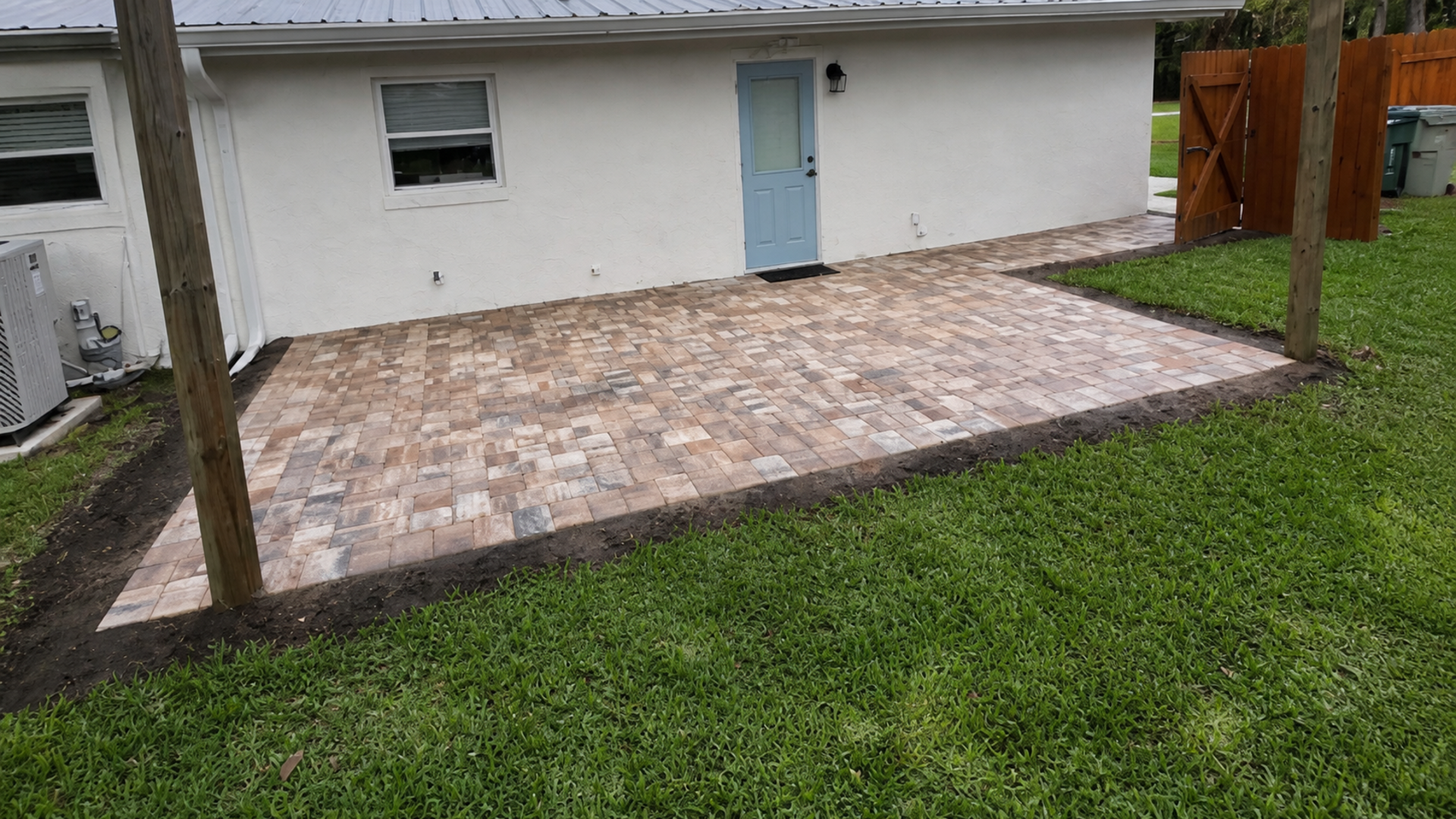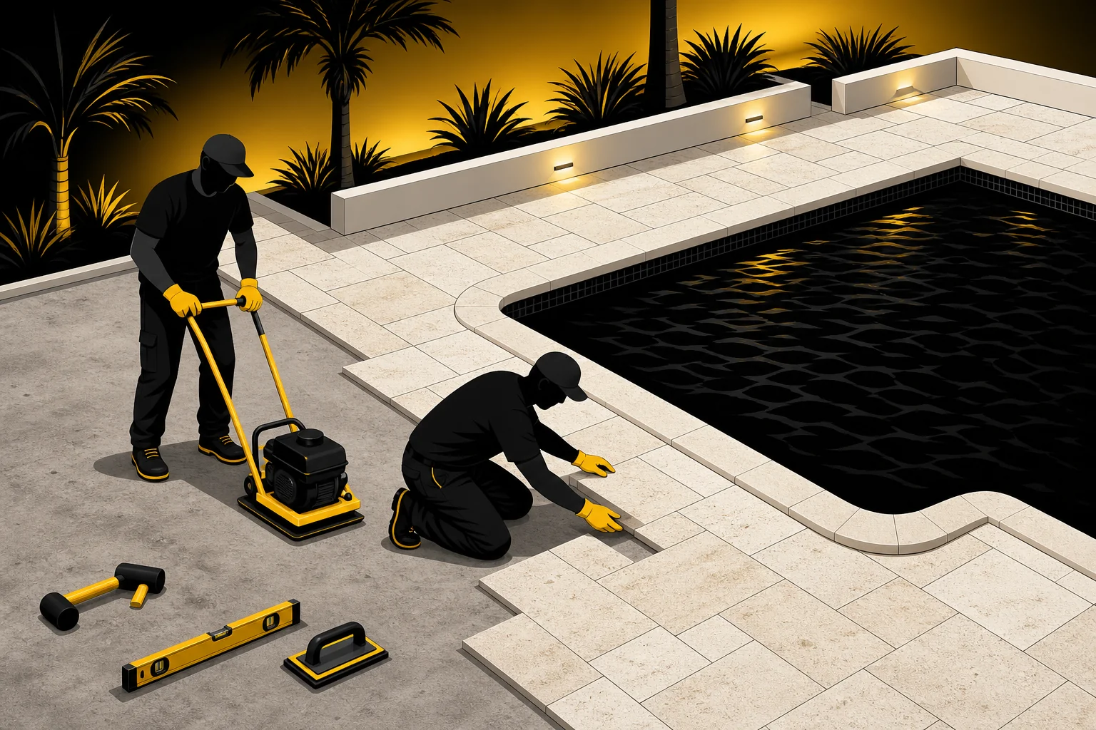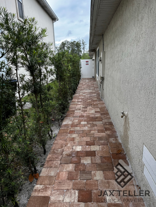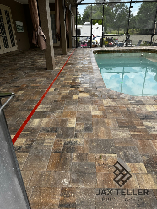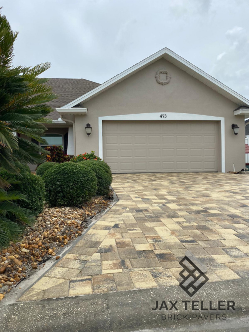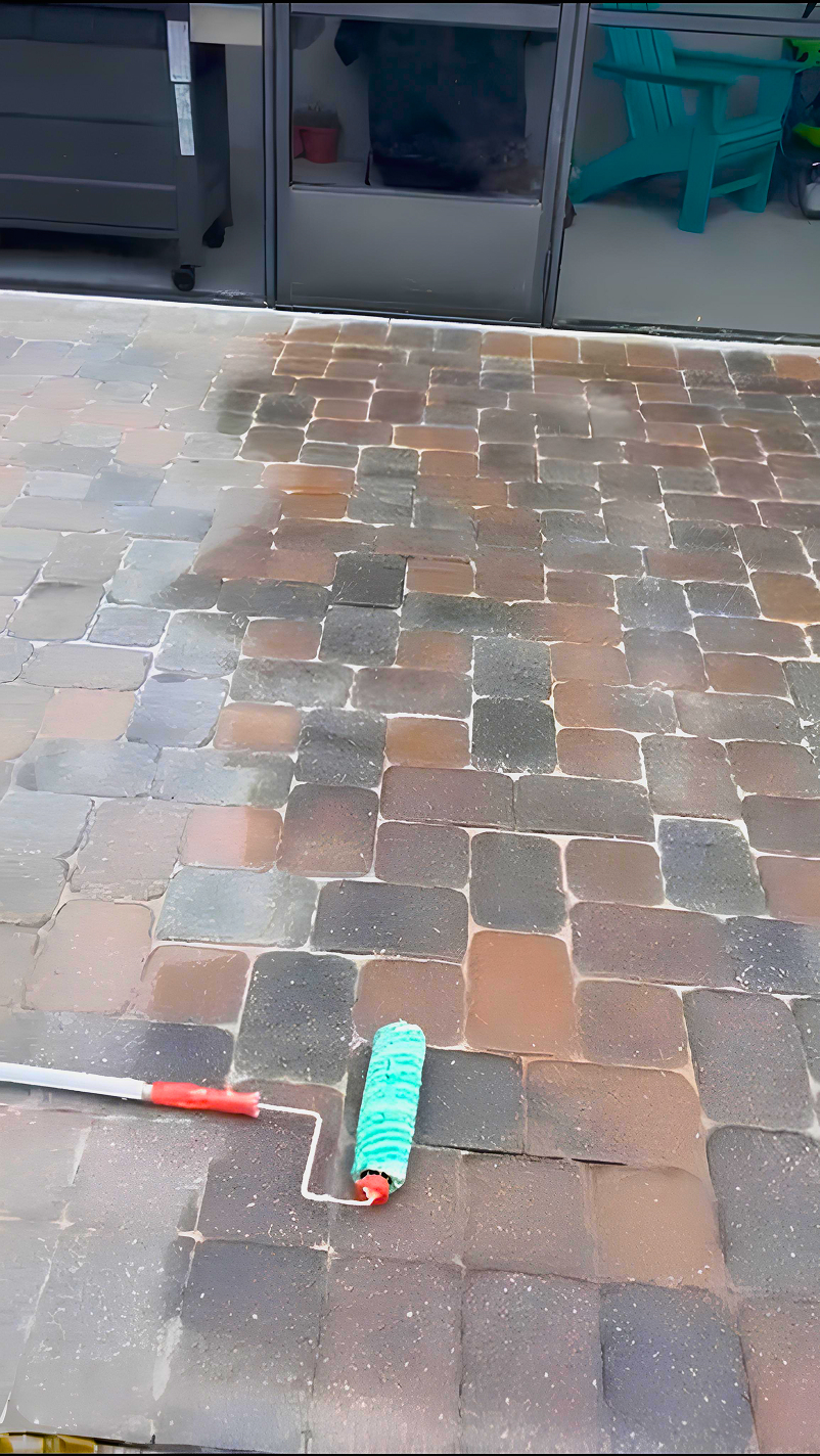

Travertine paver color variation is one of natural stone’s most useful design qualities when a project defines the range before installation. The full palette still matters. Cream, ivory, beige, walnut, silver, and subtle mineral markings can connect a Florida home to its roof, stucco, coping, landscape, and outdoor furnishings. Visual balance remains the goal. However, unmanaged distribution can create patches that look accidental rather than organic.
The solution is not to demand identical pieces. Instead, homeowners and installers can build a project-specific palette, approve realistic proportions, and review how tones move across the completed field. That relationship needs field review. As a result, variation becomes a composition tool rather than a delivery-day surprise.
Travertine paver color variation should be approved as a range
A single showroom piece proves only that one appearance can occur. Therefore, it cannot communicate the frequency of lighter, darker, warmer, cooler, quieter, or more figured units in a shipment. A meaningful review needs enough pieces to show relationships and outliers.
Photographs help with early direction, yet cameras and displays alter color. In addition, indoor lighting can make warm stone look yellow or flatten subtle gray undertones. Final approval should use physical material outdoors, ideally near the surfaces it must coordinate with.
Natural variation does not eliminate specification. On the contrary, it makes shared language more important. The project team should distinguish acceptable range, limited accent pieces, and clearly unacceptable characteristics without pretending every unit will match a reference image. Clear documentation helps here.
Travertine paver color variation needs a representative sample
A representative sample combines several full-size pieces from the proposed product, finish, size mix, and source when available. Consequently, homeowners can assess both individual character and group behavior. One small chip cannot show how markings cross a large-format piece or how adjacent tones influence each other.
The sample should remain an approval reference rather than a promise of exact duplication. Because natural shipments change, the field may contain different markings within the accepted range. Clear documentation helps everyone remember the design intent when installation begins.
Build a sample board around the house
A project-specific board places travertine beside the permanent exterior palette. For example, include stucco paint, trim, roof material, coping, waterline tile, door finish, metal accents, and significant adjacent paving. Therefore, the stone is judged as part of the property rather than as an isolated attractive object.
Large fixed surfaces deserve priority over movable accessories. In particular, a roof or pool interior will influence the space longer than cushions or planters. Furniture and textiles can refine the palette later, while the hardscape should first belong to the architecture.
Use a neutral backing so the sample board does not borrow color from a bright table or lawn. Then, place it where the deck or patio will sit and view it under changing daylight. As a result, undertones that seemed invisible indoors become easier to compare.
What belongs on the sample board
- Several travertine pieces representing light, medium, dark, and figured portions of the range
- The proposed finish and edge treatment
- Primary stucco or siding color plus trim
- Roofing color and dominant undertone
- Pool coping, waterline tile, and interior finish when relevant
- Adjacent pavers, concrete, wood, or composite decking
- Permanent metal finishes on doors, railings, or enclosures
- A restrained reference for furniture or outdoor cabinetry
This board supports decisions throughout procurement and installation. Moreover, it provides a clearer record than a list of color names, which may mean different things to different suppliers or homeowners. Natural movement should stay controlled.
Read undertones before choosing blend ratios
Undertone is the subtle color direction beneath the overall lightness or darkness. Therefore, two beige stones can behave very differently beside a cool white wall or a terracotta roof. One may bridge the materials, while the other makes both look disconnected.
Warm Florida architecture may support cream, sand, light walnut, and restrained gold movement. In contrast, a contemporary house with cooler gray trim may benefit from ivory and soft silver notes. These are starting observations, not formulas; actual materials under site light should decide.
Blend ratios turn preference into an installation brief
A homeowner may say the desired deck should feel mostly light with occasional warm movement. However, the crew needs a more observable instruction. A blend brief can define a dominant quiet range, a supporting middle range, and a limited accent range without claiming that natural crates contain exact factory-controlled percentages. The complete assembly still matters.
The ratio should reflect the available material, approved sample, and project scale. For example, one distinctive piece in a small landing may command attention, while the same piece disappears across a broad terrace. That distinction guides the next step. Therefore, the team should test distribution in an area large enough to show the intended rhythm.
Blend instructions can use relative language supported by photographs of the mockup. In addition, the team can mark pieces that should serve as rare accents or remain outside the approved visual range. This approach respects natural supply while providing meaningful field control.
A practical three-part blend brief
- Dominant range: The quiet background tones that should appear throughout every visible zone.
- Supporting range: Related warmer, cooler, lighter, or deeper pieces that create natural movement.
- Accent range: More distinctive markings or colors used selectively where they will enrich, not interrupt, the field.
This hierarchy gives installers a visual purpose for each piece. Consequently, they can distribute material based on the whole field rather than place the next stone solely because it fits the opening. The broader composition remains important.
Coordinate the roof without matching it literally
Roofing occupies a large visual area and often sets the property’s warm or cool direction. Therefore, travertine should acknowledge its undertone without copying its strongest color. A literal match can make the exterior monotonous, while a related neutral creates continuity with more depth.
View the roof and sample from normal ground positions. In particular, a roofing sample held beside a paver may not represent how the installed roof looks under sky reflection and distance. The real elevation provides the best context whenever it is available.
If roof replacement is planned, document both current and future palettes. As a result, the hardscape can bridge project phases rather than lock the home into a color relationship that will soon disappear. Scale changes the visual effect. A restrained stone blend usually offers more flexibility than a narrow dramatic match.
Coping can unify or fragment the field
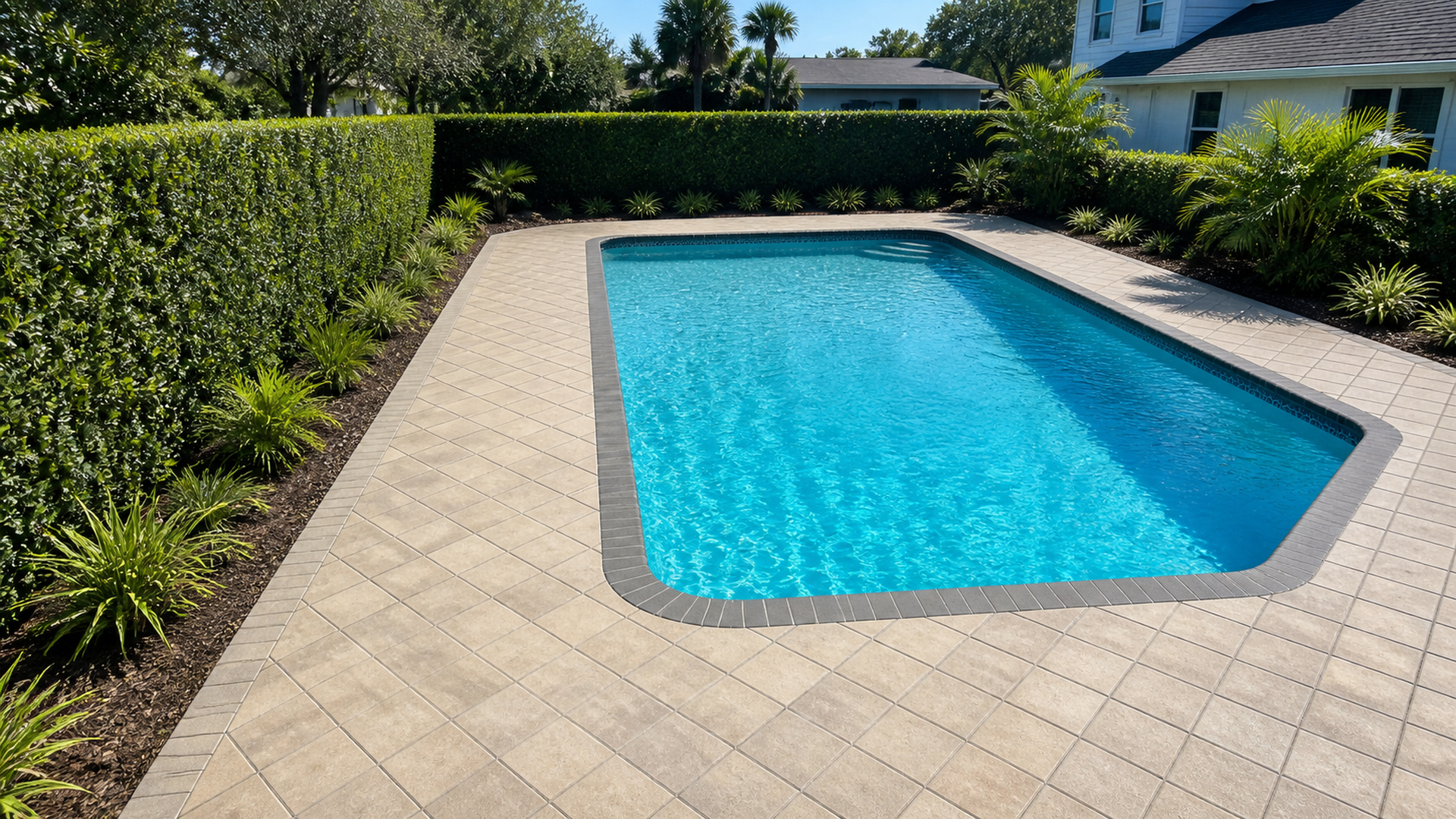
Pool coping forms a continuous edge around the water and therefore carries more visual weight than its width suggests. If every coping unit comes from one pale tone while the deck contains broad warm movement, the edge may look detached. Consequently, coping and field ranges should be approved together.
Exact matching is not always necessary or desirable. Instead, the coping can use a quieter selection from the same family or a coordinated range that frames the pool gently. The approved range remains the guide. Edge profile, finish, joint rhythm, and waterline materials also affect how color reads.
Steps and vertical faces need the same coordination. For example, a riser cut from a heavily marked piece may appear much stronger than it did lying flat. Therefore, installers should review high-visibility vertical applications before committing distinctive units.
Pattern and unit size change the perception of color
Large-format pieces display more uninterrupted stone character. As a result, veining, clouding, and tone shifts may look more prominent than they do in smaller units. A mixed-size pattern creates additional joints and relationships that can distribute visual weight differently.
Pattern repeats also influence where the eye travels. For instance, clustering dark large units along one repeat line can create an unintended stripe. Consequently, color distribution should cross the pattern rather than follow size or crate sequence mechanically.
Borders can stabilize the palette by framing the field with a consistent related tone. However, a strongly contrasting border may overpower subtle natural movement. The project should decide whether the border acts as a quiet boundary or a deliberate graphic feature.
Crate mixing prevents visible islands
Natural stone crates can contain local concentrations of tone or marking. Therefore, installing one crate completely before opening another may reproduce those concentrations as rectangular zones on the deck. Drawing from multiple available crates helps distribute the shipment’s range.
Staging space must support that approach. In addition, crews need a safe way to view, sort lightly, and protect pieces without creating confusion or damage. The logistics plan should account for access, pallet placement, weather, and the order in which zones will be installed.
Mixing does not mean creating random chaos. Instead, installers compare nearby pieces, scan the broader field, and adjust before setting a strong cluster. A designated reviewer should understand who can request a pause when the distribution begins to drift.
Review from three distances
- Close range: Check surface character, edges, joints, and neighboring pieces.
- Room or patio range: Look for pairs, clusters, streaks, and abrupt changes across a functional zone.
- Property range: Confirm that the full field relates to the house, roof, pool, and landscape.
Each distance reveals a different problem. Therefore, a field that looks balanced from the installation line may show a large patch from the house. Regular distance reviews make correction possible before surrounding work locks the units in place.
Mockups define the acceptable visual language
A useful mockup includes the actual pattern, joint approach, size mix, finish, border, and representative color range. Consequently, it tests relationships that loose samples cannot show. The team can discuss whether movement feels balanced and whether distinctive pieces need broader separation.
Place the mockup in relevant light and view it beside the intended architecture. Moreover, photograph it without heavy filtering and record which pieces represent dominant, supporting, and accent ranges. The approved mockup can then guide field conversations.
A mockup still cannot predict every crate. However, it establishes principles for adapting to the received material. If the shipment differs substantially from the approved range, work can pause for a documented review instead of forcing a mismatched result. That sequence keeps decisions practical.
Know when to pause installation
A pause is appropriate when the field shows large tonal islands, repeated strong markings, an unexpected dominant undertone, or material outside the documented range. Context determines the final appearance. Therefore, the project should name the person who can review and authorize the next step. Waiting until completion makes adjustment far more disruptive.
Review should distinguish normal variation from a genuine mismatch. For example, several isolated warm pieces may fit the accent plan, while an entire new pallet may shift the project toward a different color family. The approved board and mockup keep that decision evidence-based.
Any sorting should consider usable material and project scope. In addition, homeowners should understand that highly restrictive selection can affect yield, procurement, schedule, and visual authenticity. The goal is controlled composition, not the elimination of natural character.
Color-control checklist from selection to installation
- Context: Gather roof, wall, trim, coping, pool, and adjacent paving references.
- Range: Review multiple full-size pieces outdoors rather than one chip.
- Hierarchy: Define dominant, supporting, and accent tone families.
- Mockup: Build the actual pattern and size mix under relevant light.
- Documentation: Photograph approvals and note what variation remains acceptable.
- Delivery: Compare received material with the approved range before broad installation.
- Staging: Make multiple crates accessible for controlled mixing.
- Distribution: Avoid clusters, stripes, crate blocks, and strong vertical-face surprises.
- Review: Inspect close, midrange, and property-wide views during progress.
- Pause point: Establish who decides when the field departs from the brief.
A travertine paver color variation checklist connects design intent to jobsite action. Furthermore, it helps homeowners evaluate a stone proposal based on selection and blending process, not merely a trade name or edited portfolio image. Outdoor light reveals the difference.
Place color decisions within the August travertine cluster
For an existing concrete pool surround, first review the practical guide to travertine pool deck remodeling benefits. In particular, it explains how removal, overlay constraints, drainage, transitions, and phased work establish the canvas. Color planning should follow a constructible surface and confirmed edge geometry.
For a pool area with intense daylight, also read the guide to low-glare travertine pavers in Florida. Consequently, finish, value range, sun orientation, and shade can join the same sample board as color variation. A controlled blend should create depth without producing harsh contrast from key views.
Build a property-specific palette
JaxTeller Brick Pavers’ project portfolio can help homeowners discuss material relationships and the level of tonal movement they prefer. Therefore, the next step is not copying another property exactly; it is translating useful references into a board and blend brief for the current architecture. The practical difference is important.
The Natural Stone Institute provides authoritative education about natural stone. In addition, selection and installation decisions should rely on the actual material, supplier information, project conditions, and qualified professionals because natural products and site requirements vary. Field review protects the result.
Frequently asked questions
Can I order travertine that has no color variation?
Natural travertine inherently varies. Therefore, selection should focus on an acceptable and useful range rather than perfect identity. A representative sample, documented blend brief, and active field review provide more realistic control.
Should installers sort every stone by color?
They should manage distribution, but excessive sorting can create waste and artificial uniformity. Instead, crews can draw from multiple crates, use the approved hierarchy, and reserve only genuinely distinctive or out-of-range pieces for review. The scope should state that clearly.
How large should the mockup be?
It should be large enough to show the proposed pattern, size relationships, joints, and several tone families together. Consequently, a tiny arrangement of identical pieces is less useful than a field that demonstrates actual visual rhythm.
Can a roof photo replace a roofing sample?
A photo can support planning, yet exposure and display settings change color. Therefore, view the stone against the installed roof from normal sightlines or use an accurate physical reference when possible. Real outdoor light remains essential.
What if a delivered crate looks different from the approved board?
Pause broad installation and compare representative pieces under relevant light. Then, document whether the difference remains within the accepted range or requires supplier and project-team review. Early evaluation preserves more options than correction after completion.
Ready to elevate your outdoor living space? First, build a project-specific travertine color and pattern palette with JaxTeller and explore more completed projects. Then, follow new installations on Instagram and Facebook, or discuss your palette through WhatsApp.
Finally, call +1 407-907-8308, email jaxtellerbrickpavers@gmail.com, or locate JaxTeller through Google Maps. Contact JaxTeller Brick Pavers at +1 407-907-8308 or jaxtellerbrickpavers@gmail.com for your free estimate!