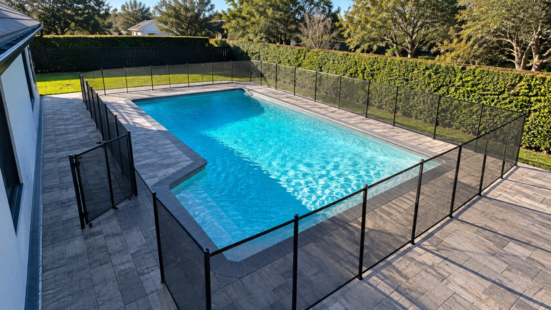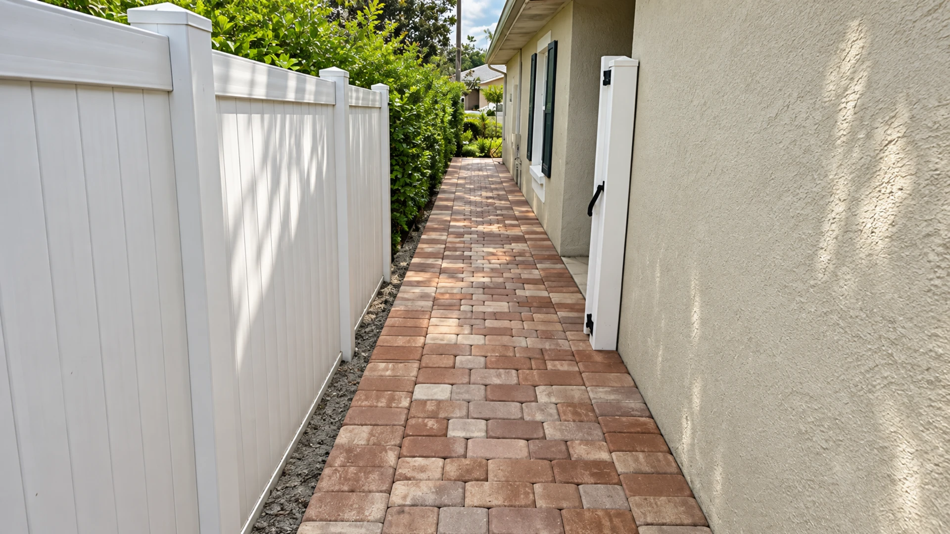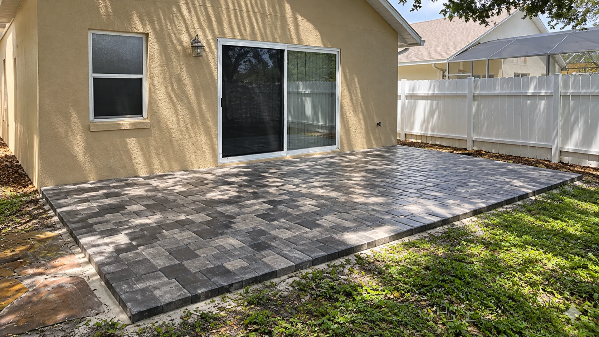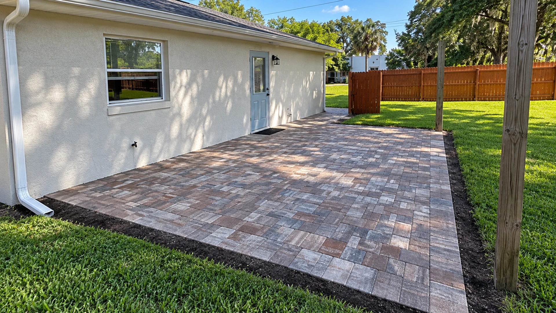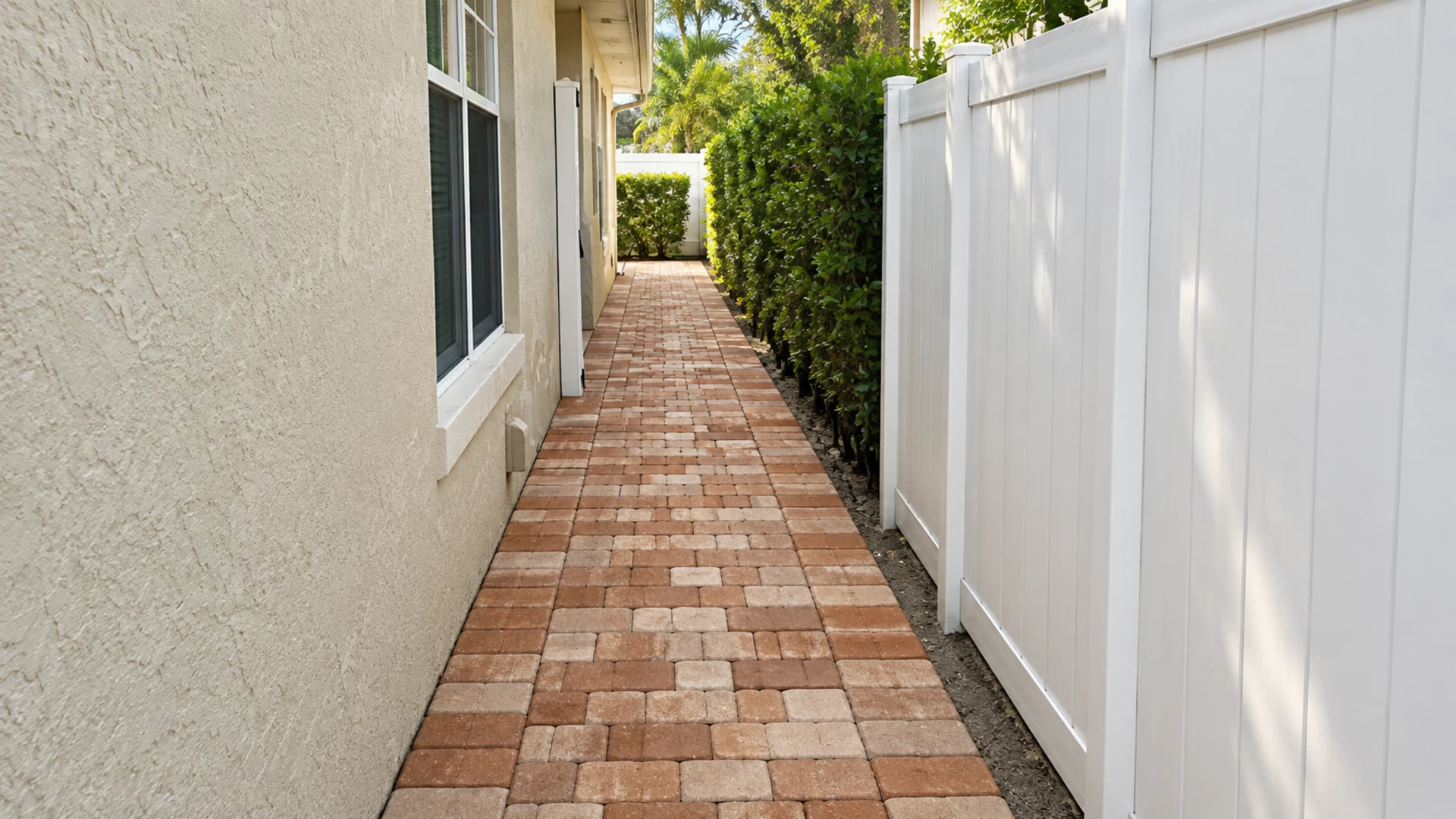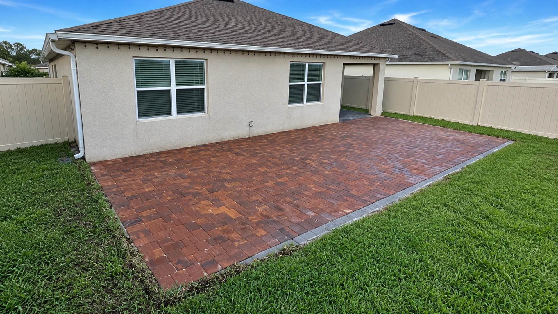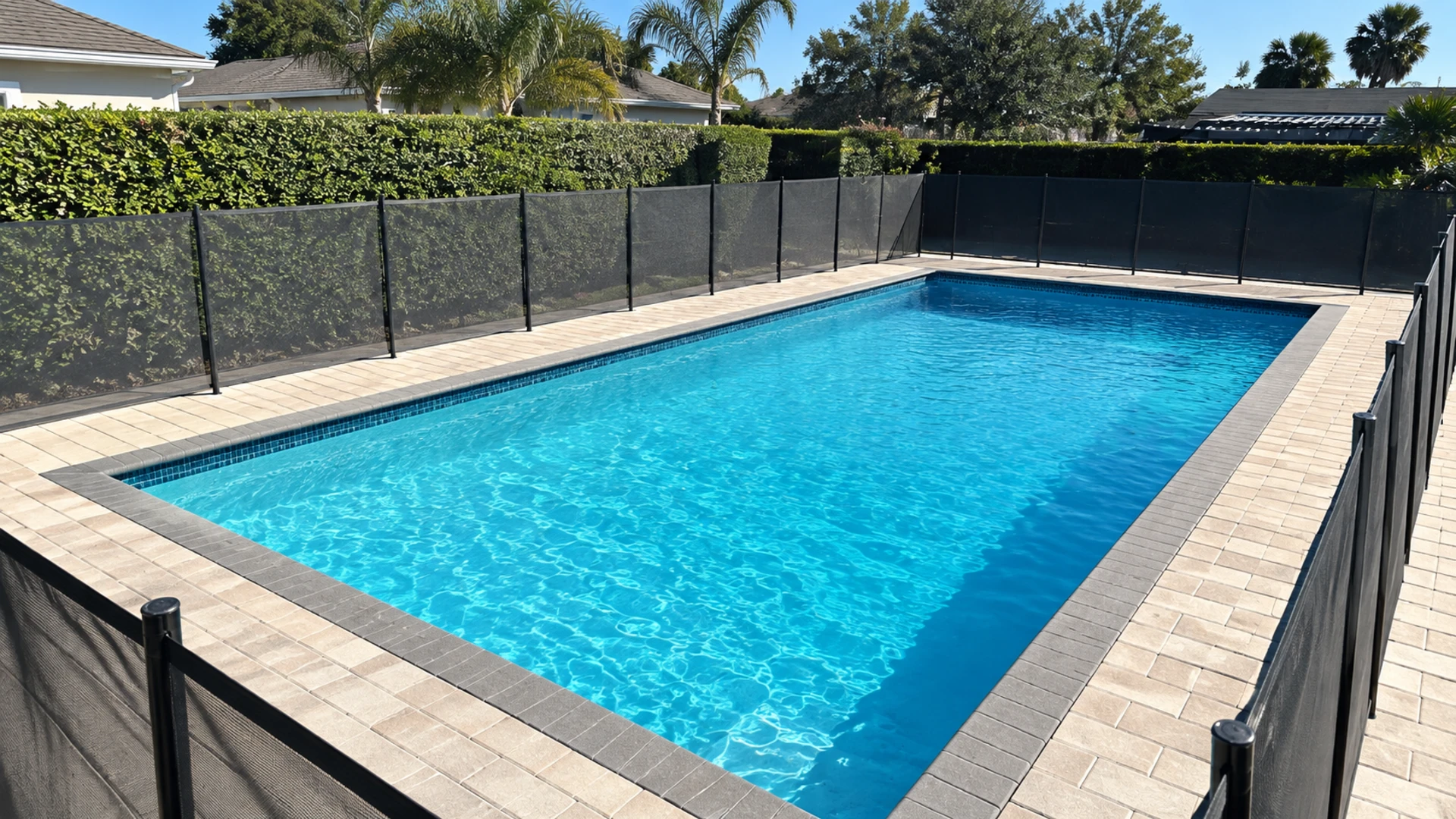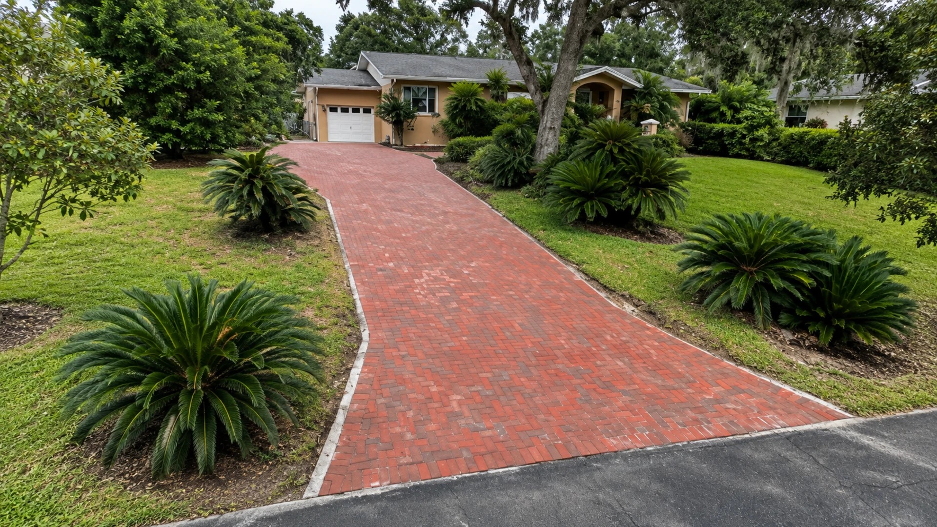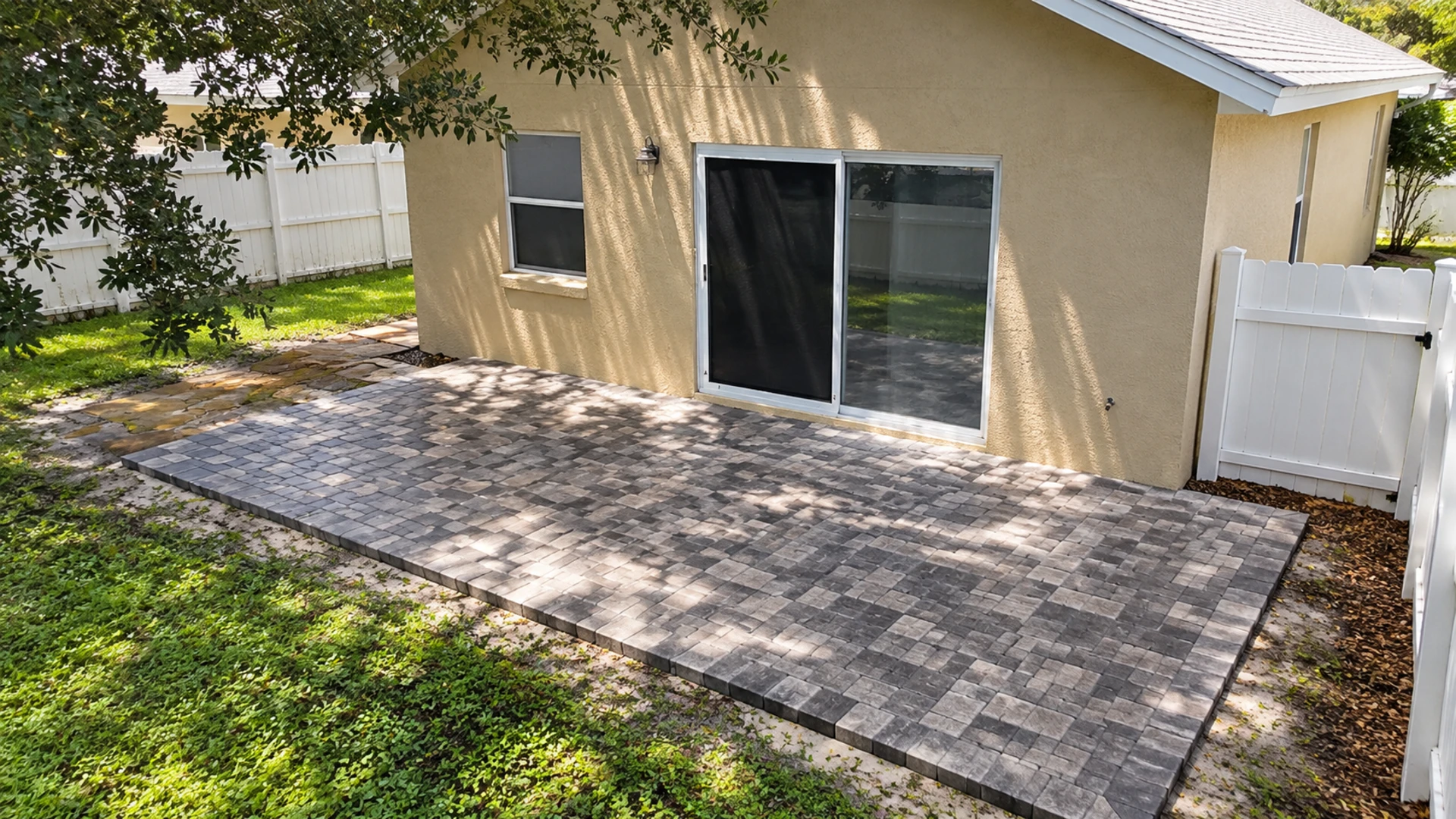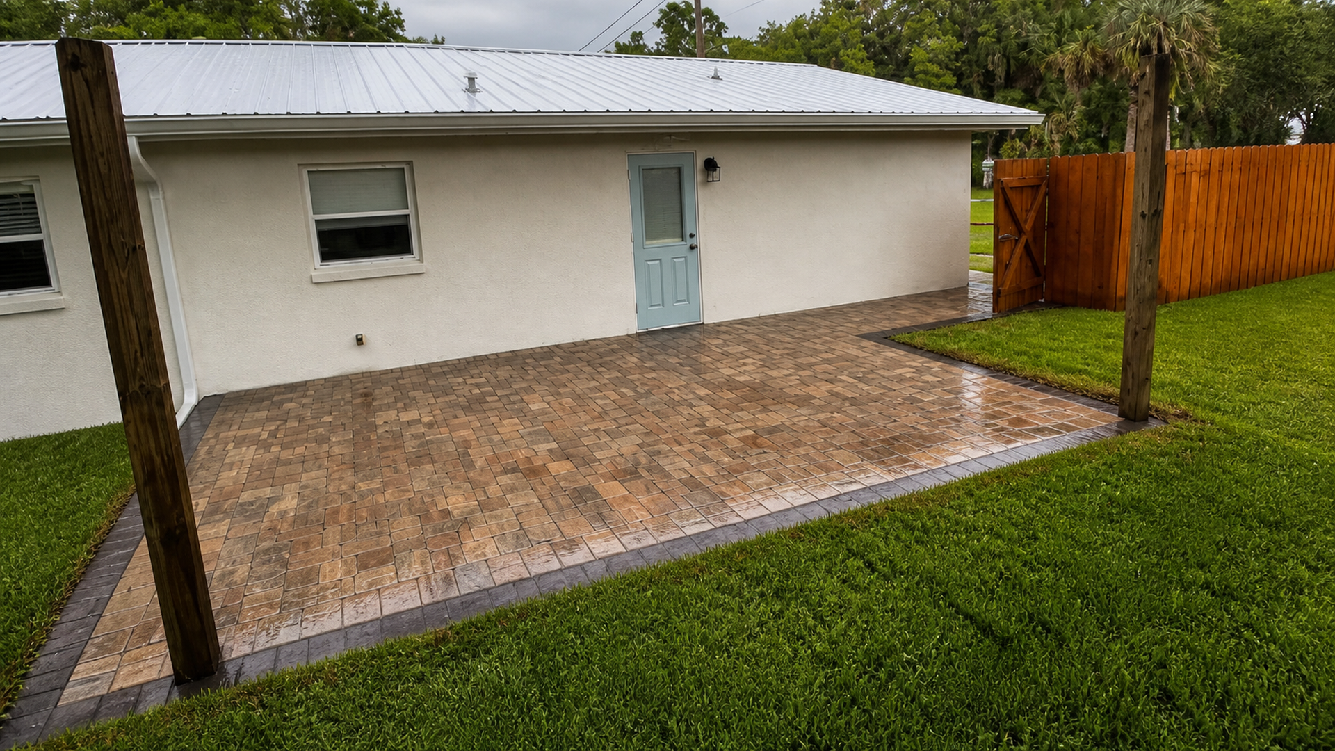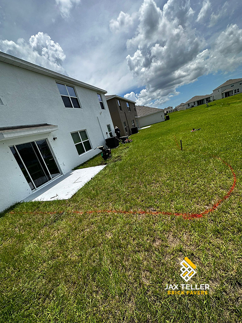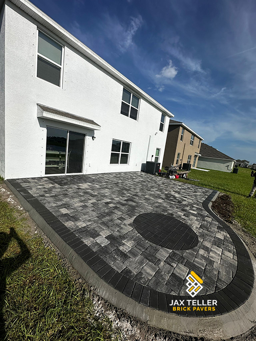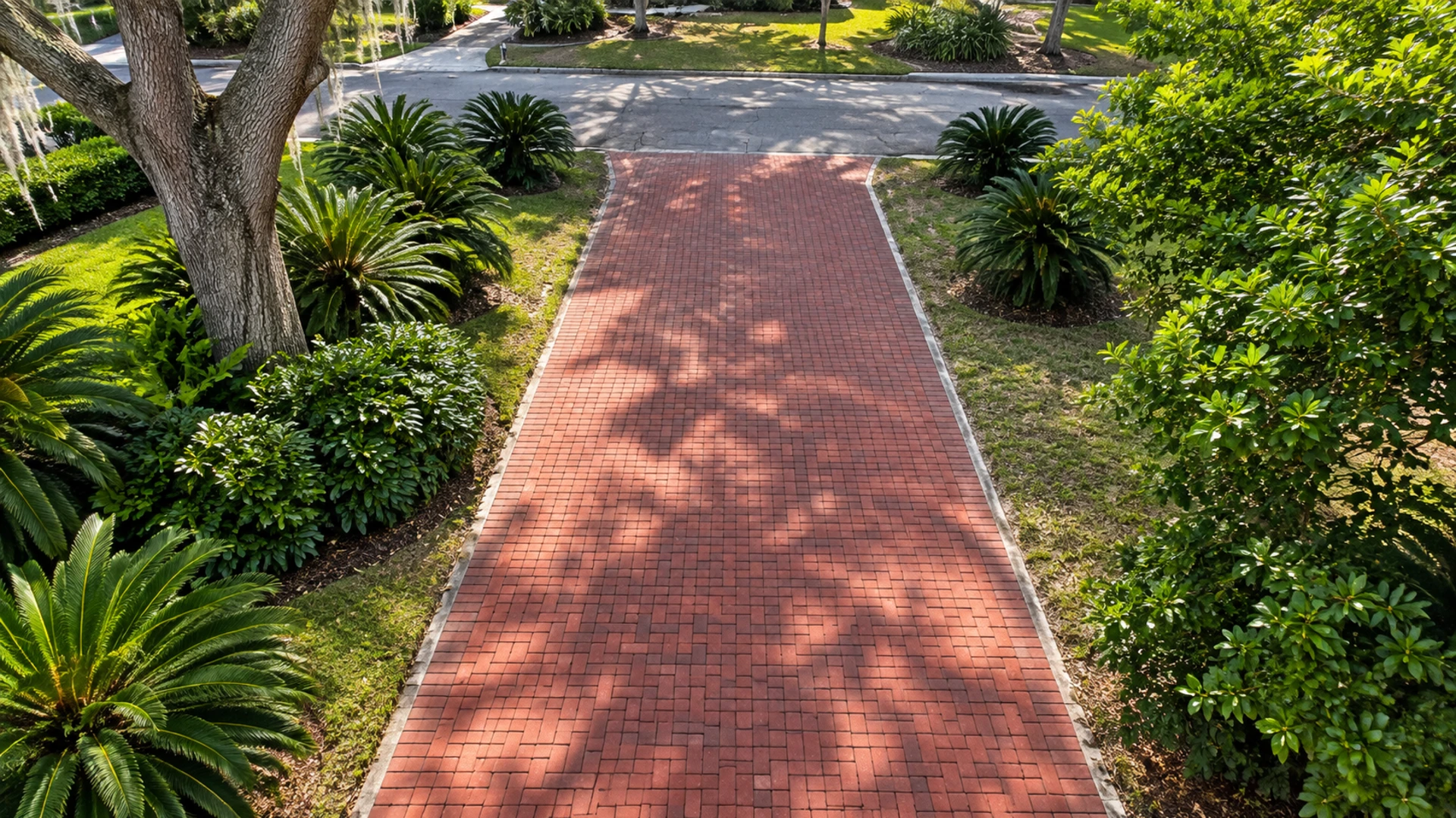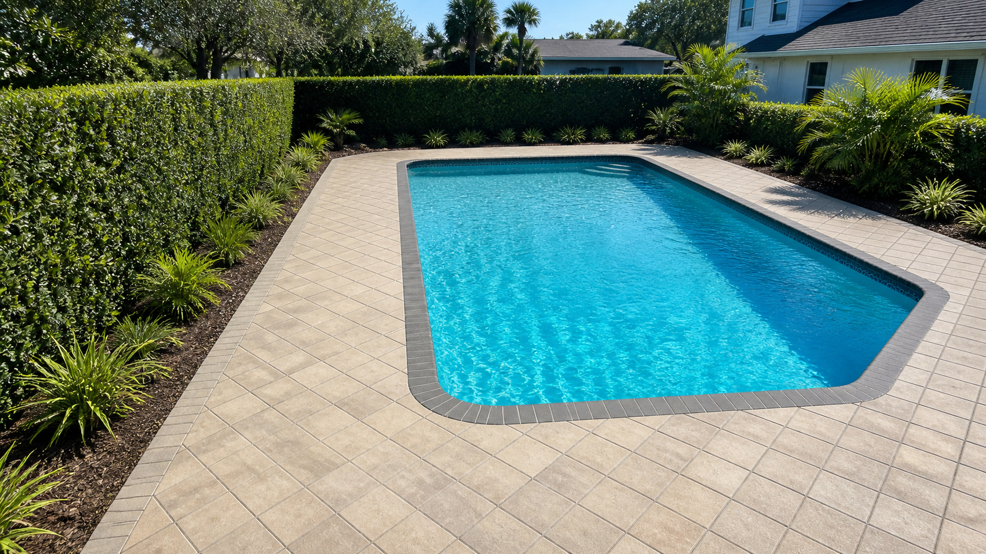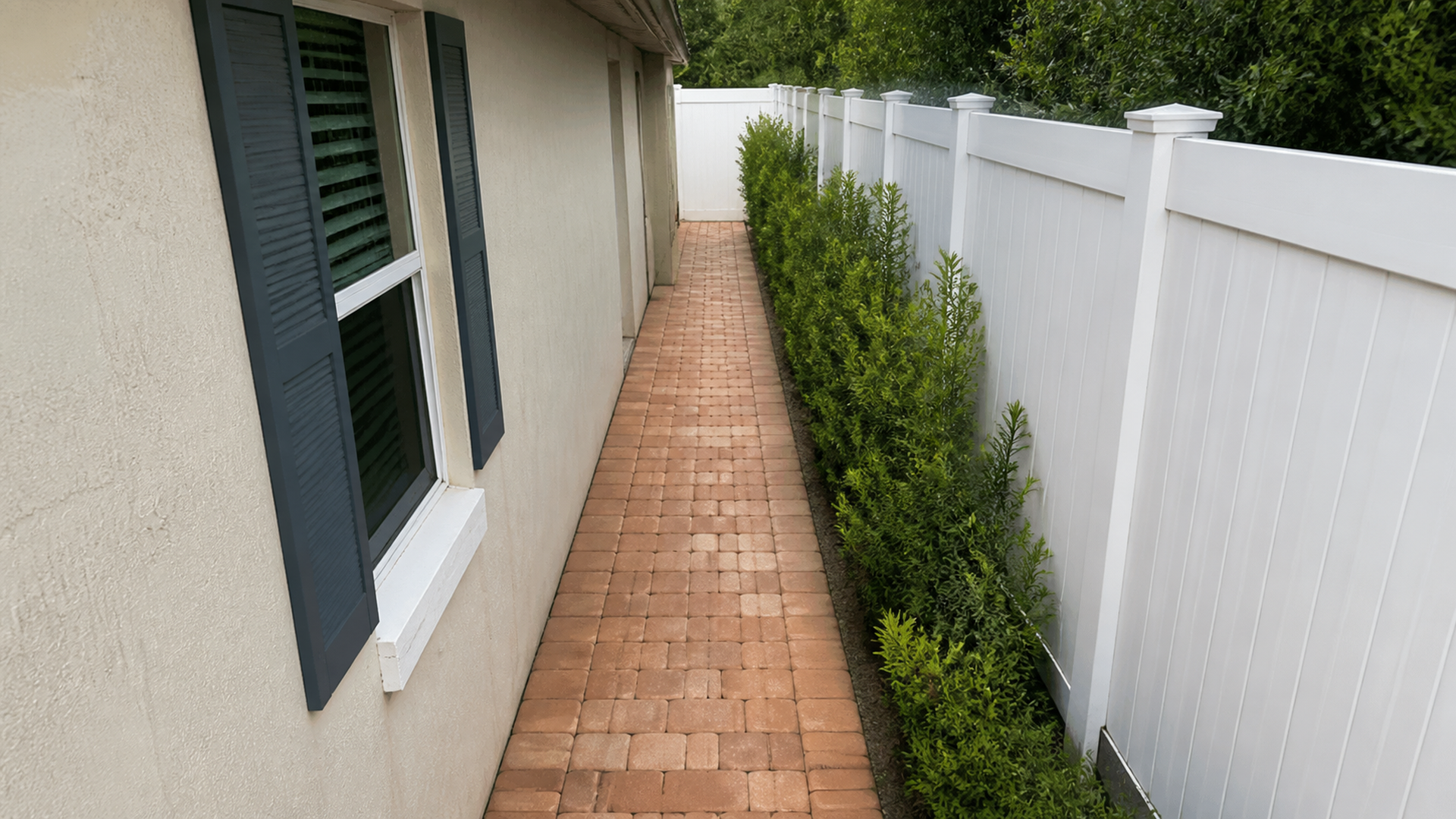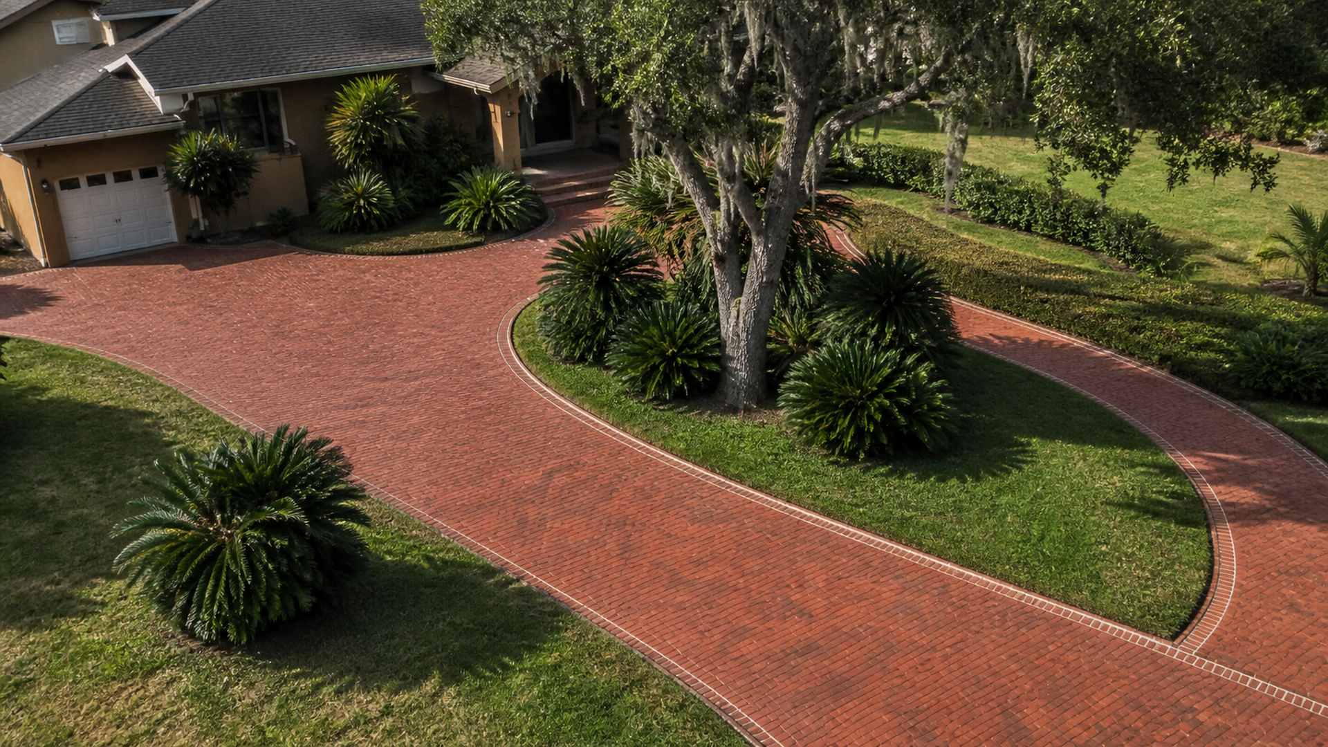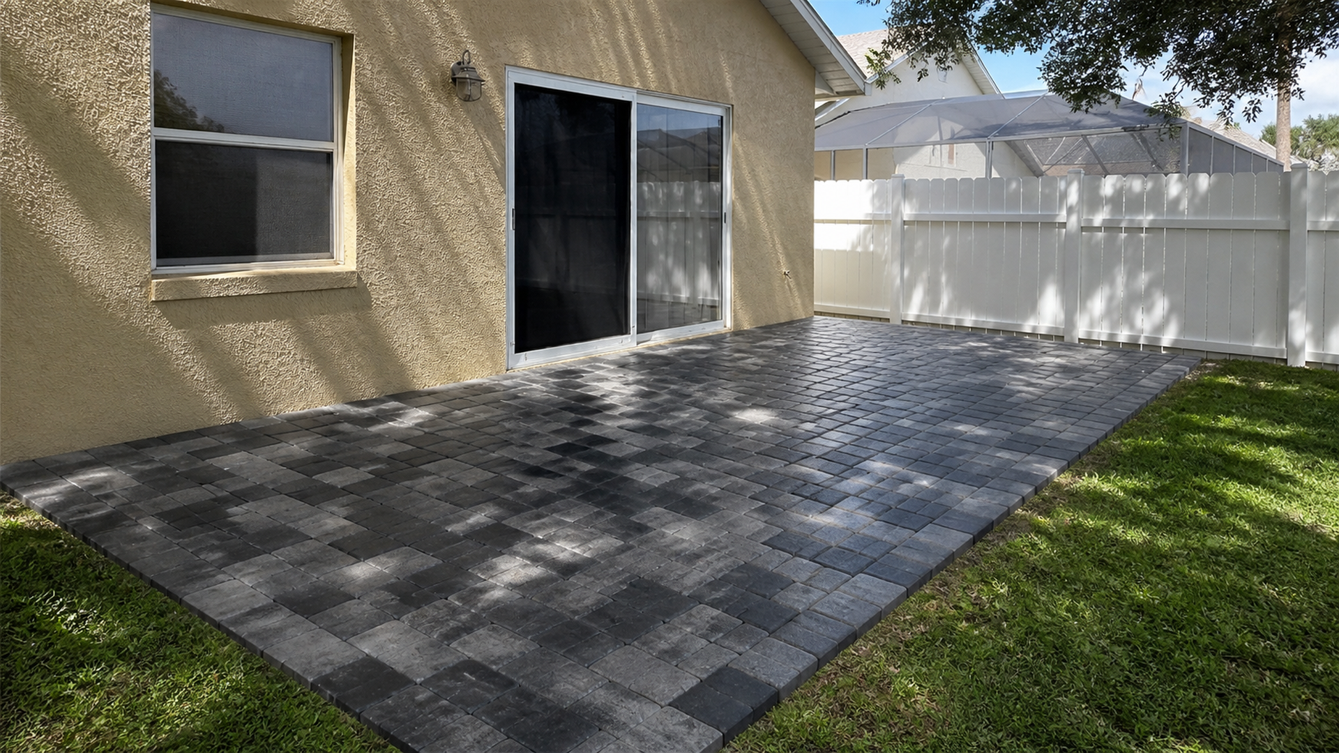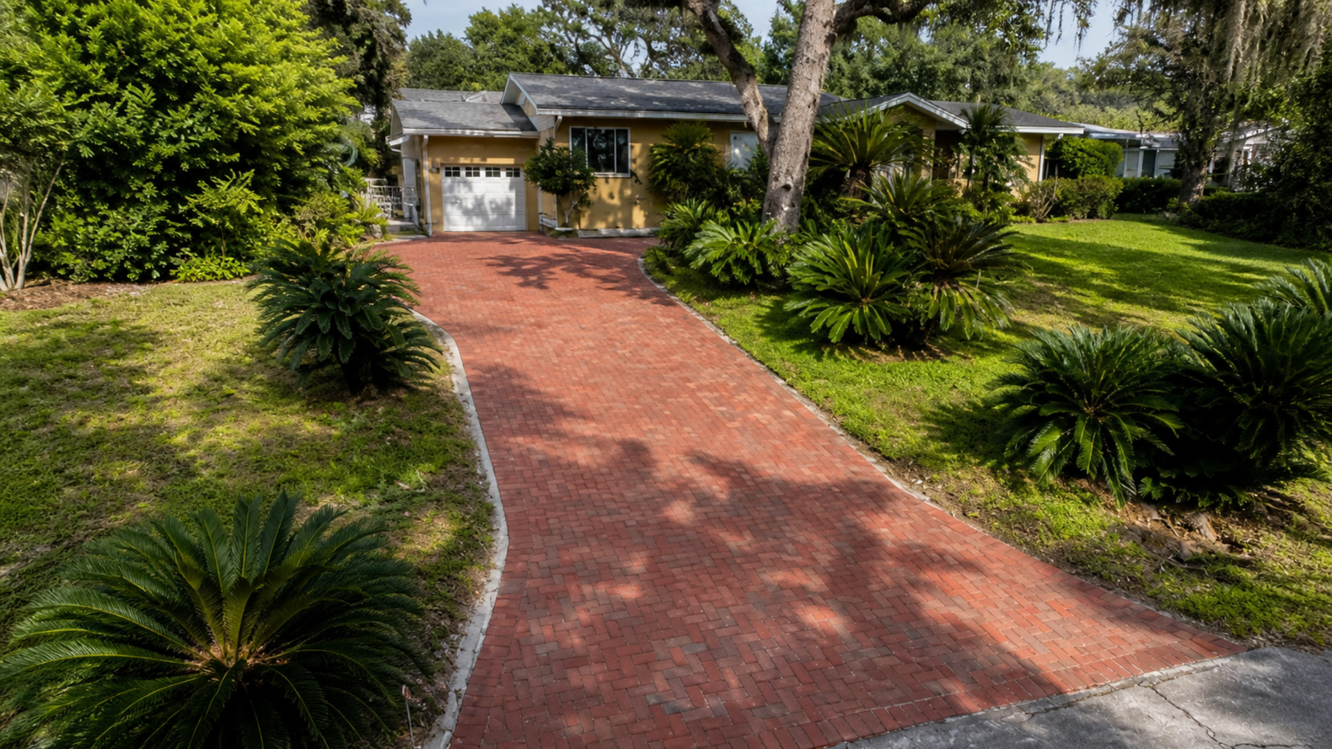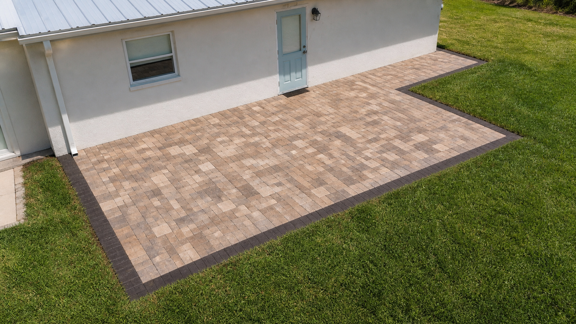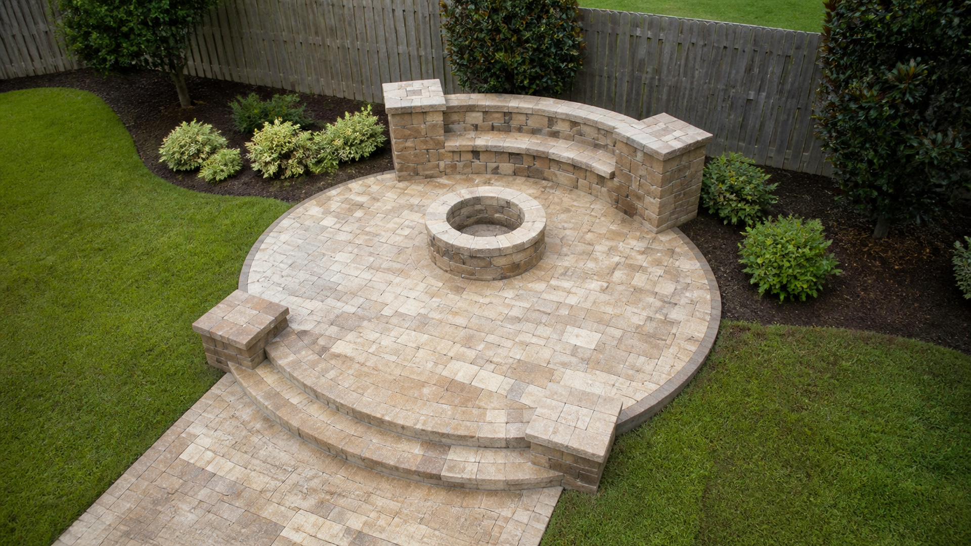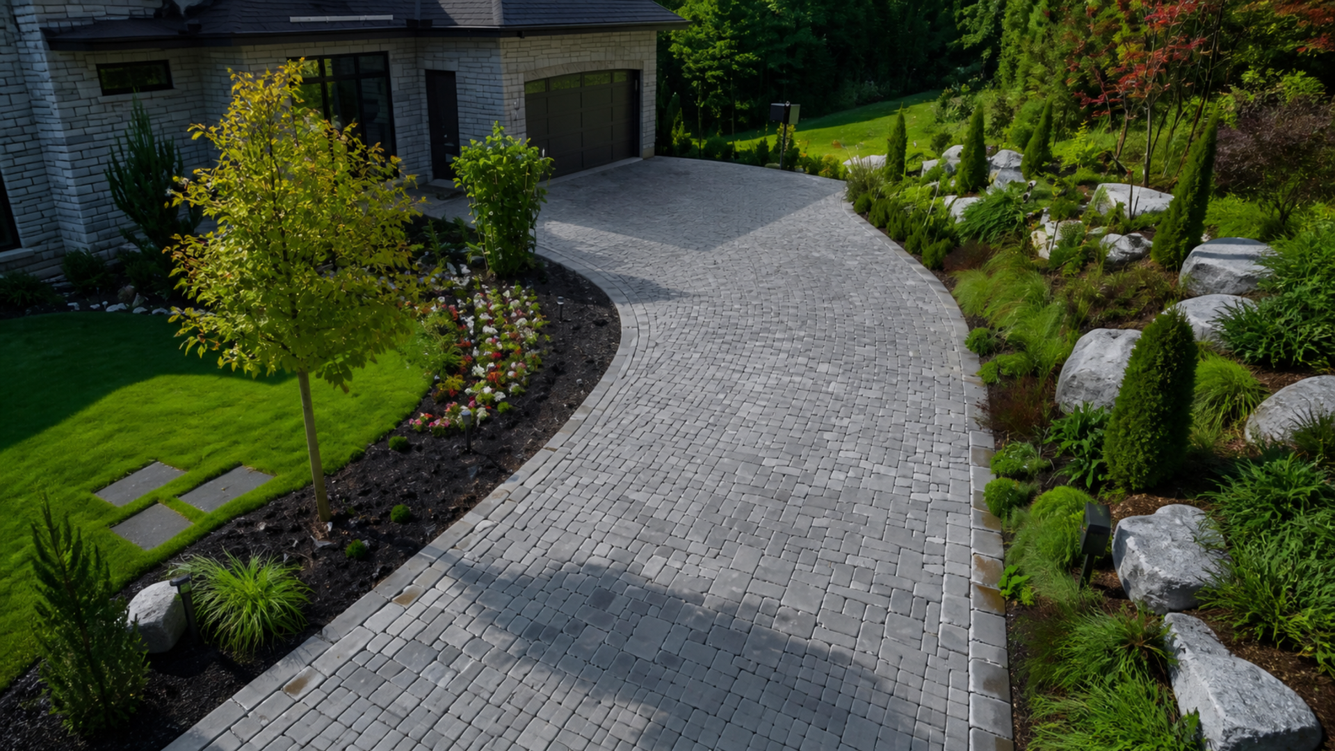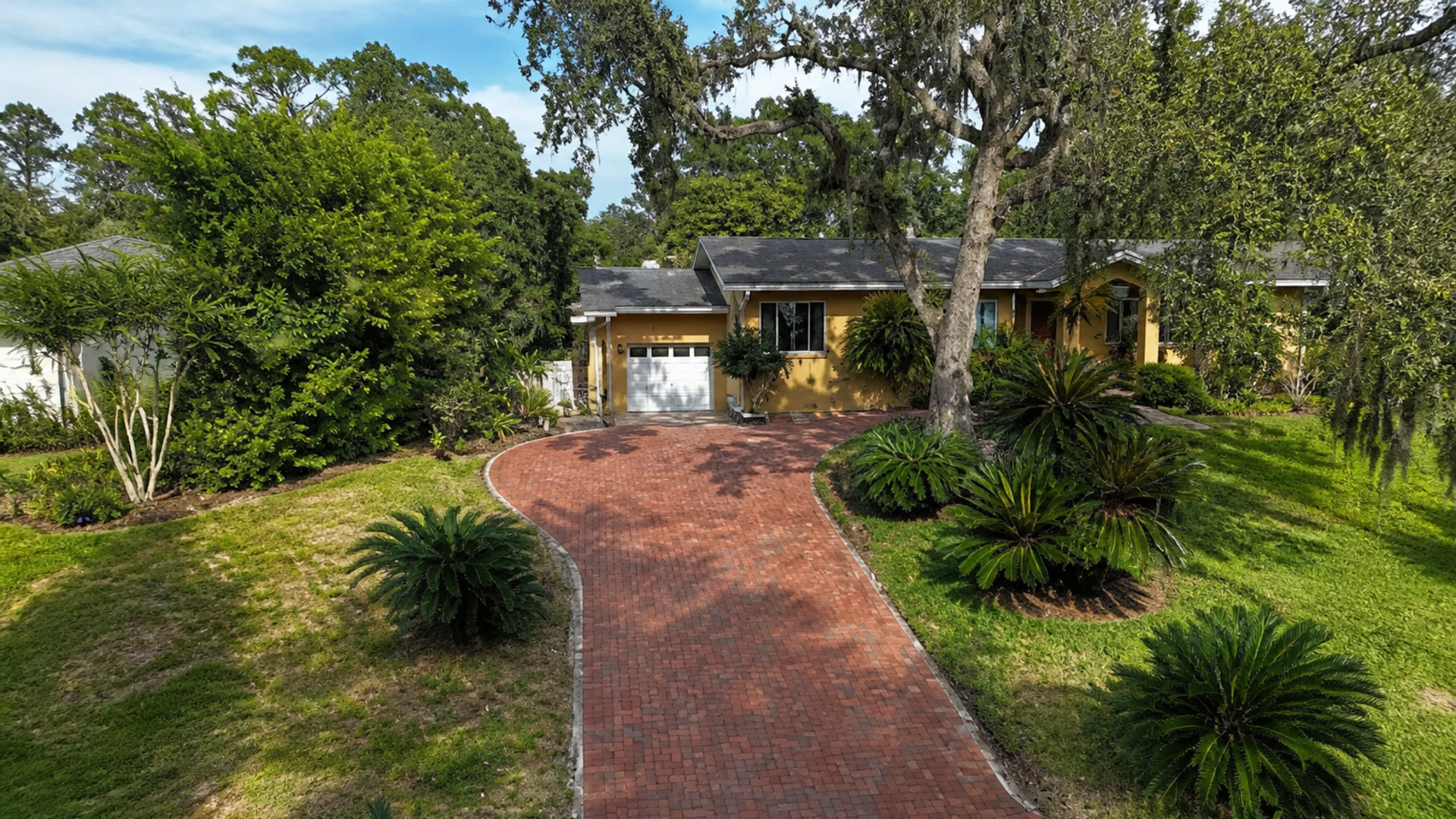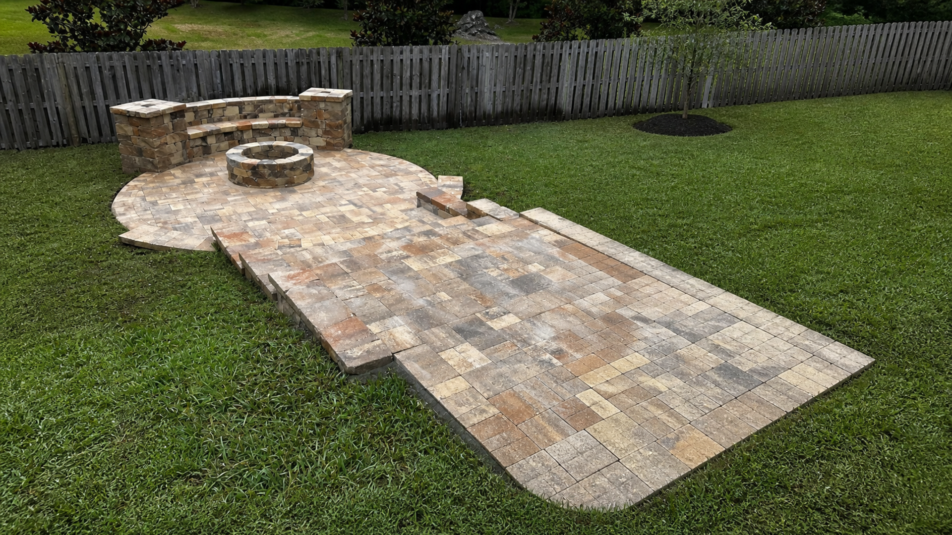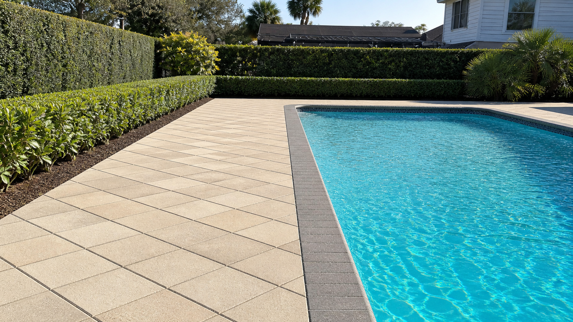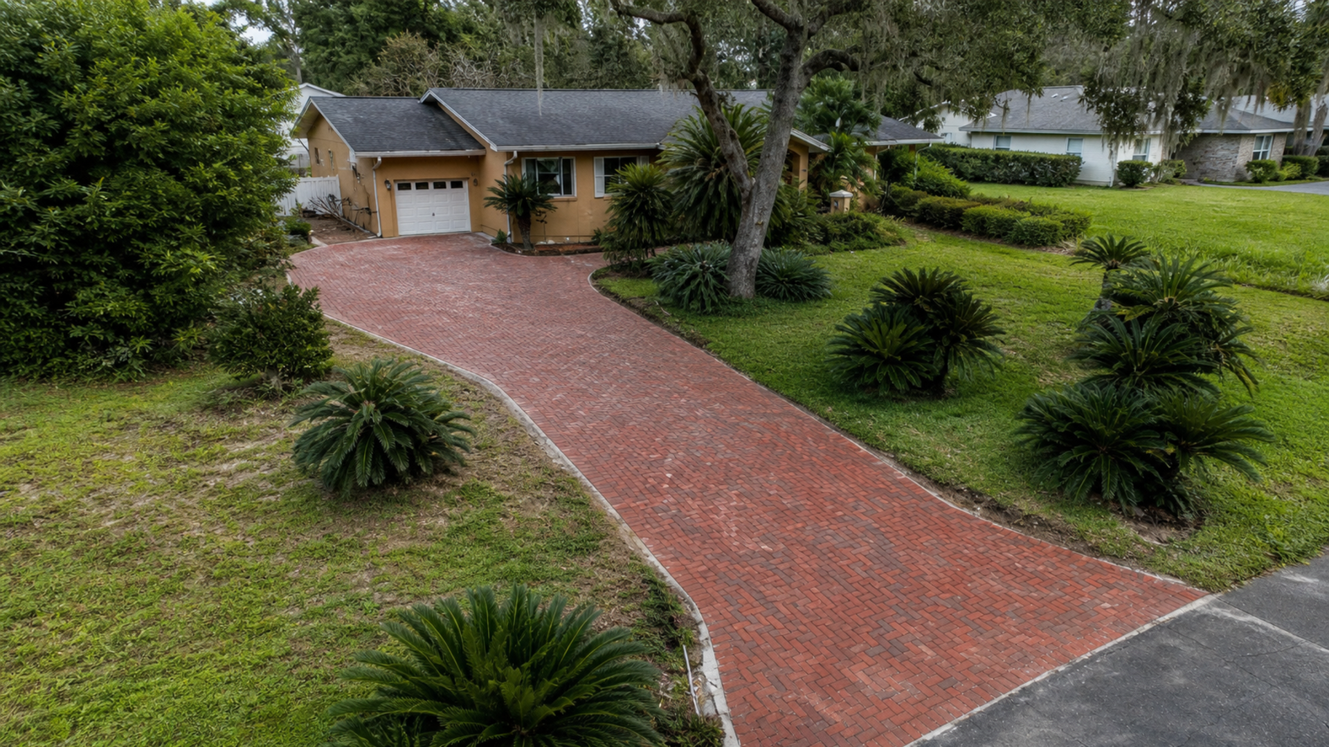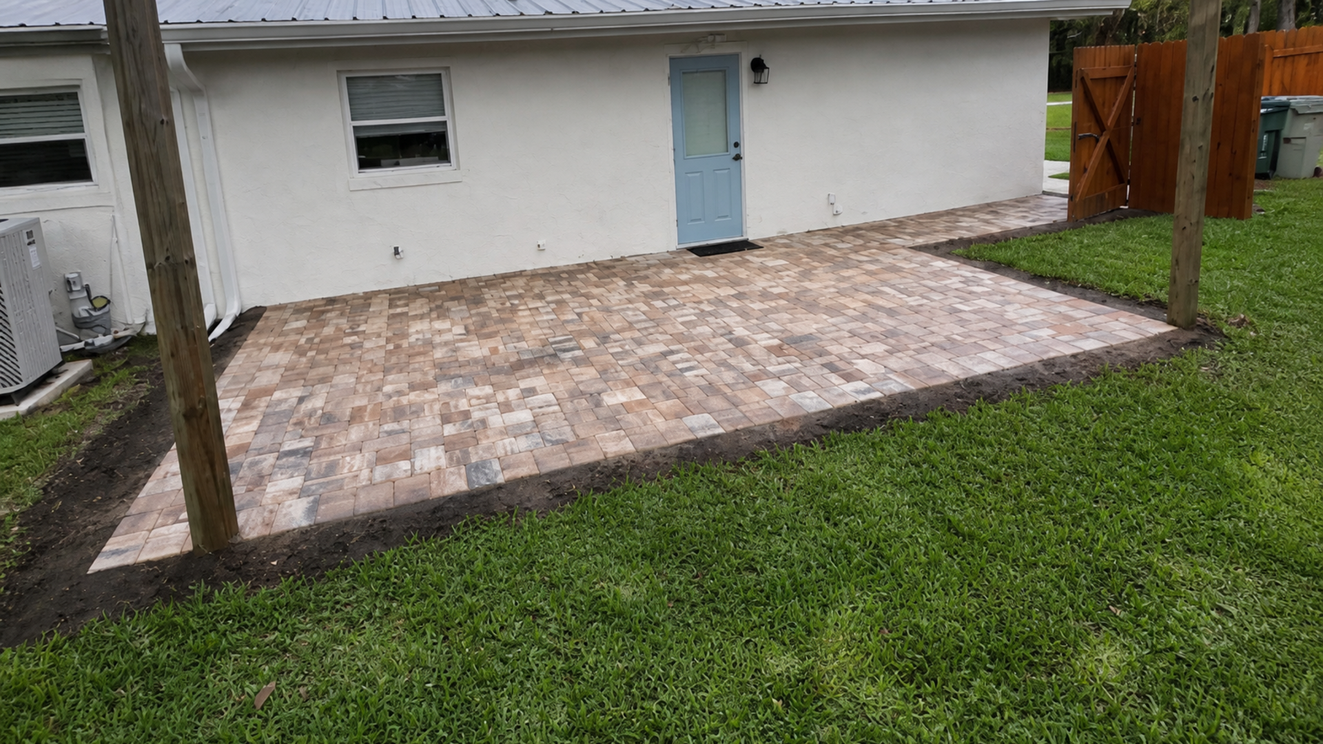
Coastal paver color selection Florida decisions should happen beside the actual house and under the actual sky. In fact, indoor chips and edited photos cannot reproduce Gulf Coast sunlight, roof reflection, stucco undertones, landscape color, or the scale of a completed driveway. A repeatable field process produces a more confident palette.
The goal is not to find a universal coastal color. Instead, the pavers should belong with one specific property’s architecture while remaining practical for its use. That means comparing undertones, brightness, borders, dirt visibility, aging, and batch variation before the order is placed.
Coastal paver color selection Florida starts with fixed finishes
Begin with elements that are unlikely to change during the paving project. The roof, stucco, brick, stone veneer, window frames, exterior doors, and pool finish create the permanent color context. Therefore, list each finish and describe whether it reads warm, cool, muted, bright, red, gold, gray, green, or blue.
Next, separate large surfaces from small accents. A bronze lantern may inspire a border, but it should not outweigh an entire warm roof plane. As a result, the palette responds first to dominant architecture and then uses trim or hardware for controlled contrast.
Read undertones before naming colors
Names such as beige, gray, tan, or ivory cover many undertones. For example, one beige may lean peach while another leans green. When both sit beside the same white stucco, one can feel harmonious and the other unexpectedly muddy. Consequently, compare samples by relationship rather than label.
In addition, look at the mortar, grout, or visible aggregate within existing materials. Small embedded colors can connect a paver blend to the home without an exact match. This subtle bridge often feels more natural than repeating the dominant wall color across the ground.
Decide whether the ground should blend or frame
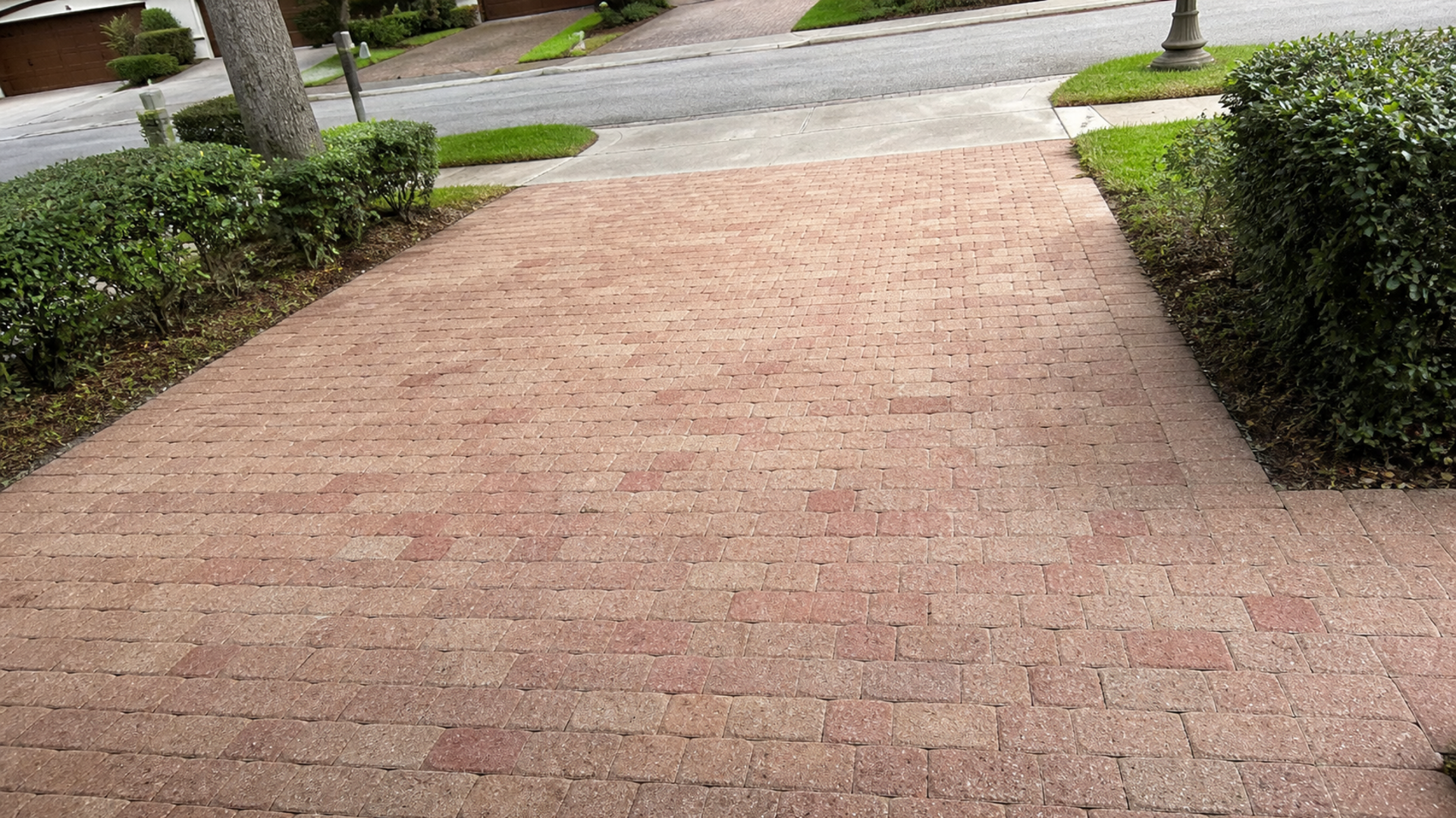
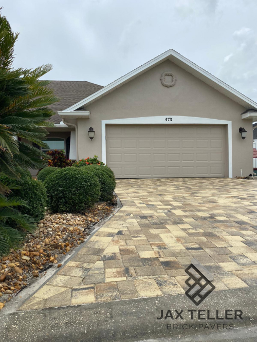
A quiet paver field can extend the architecture visually, while a stronger contrast can frame the building and clarify edges. However, contrast should serve a purpose. A dark driveway against very light stucco may create a bold base, but it can also dominate the front elevation if the area is large.
Therefore, view the proposed ground color as one full plane. Stand across the street for a driveway, inside the main room for a patio, and at the pool entry for a deck. Each viewpoint reveals a different proportion between paving and architecture.
Observe samples through a full day of coastal light
Florida sunlight changes direction, intensity, and color throughout the day. A sample that looks softly cream in morning shade can appear almost white at noon. Later, warm evening light may strengthen gold or red movement. Consequently, one quick viewing cannot represent the installed result.
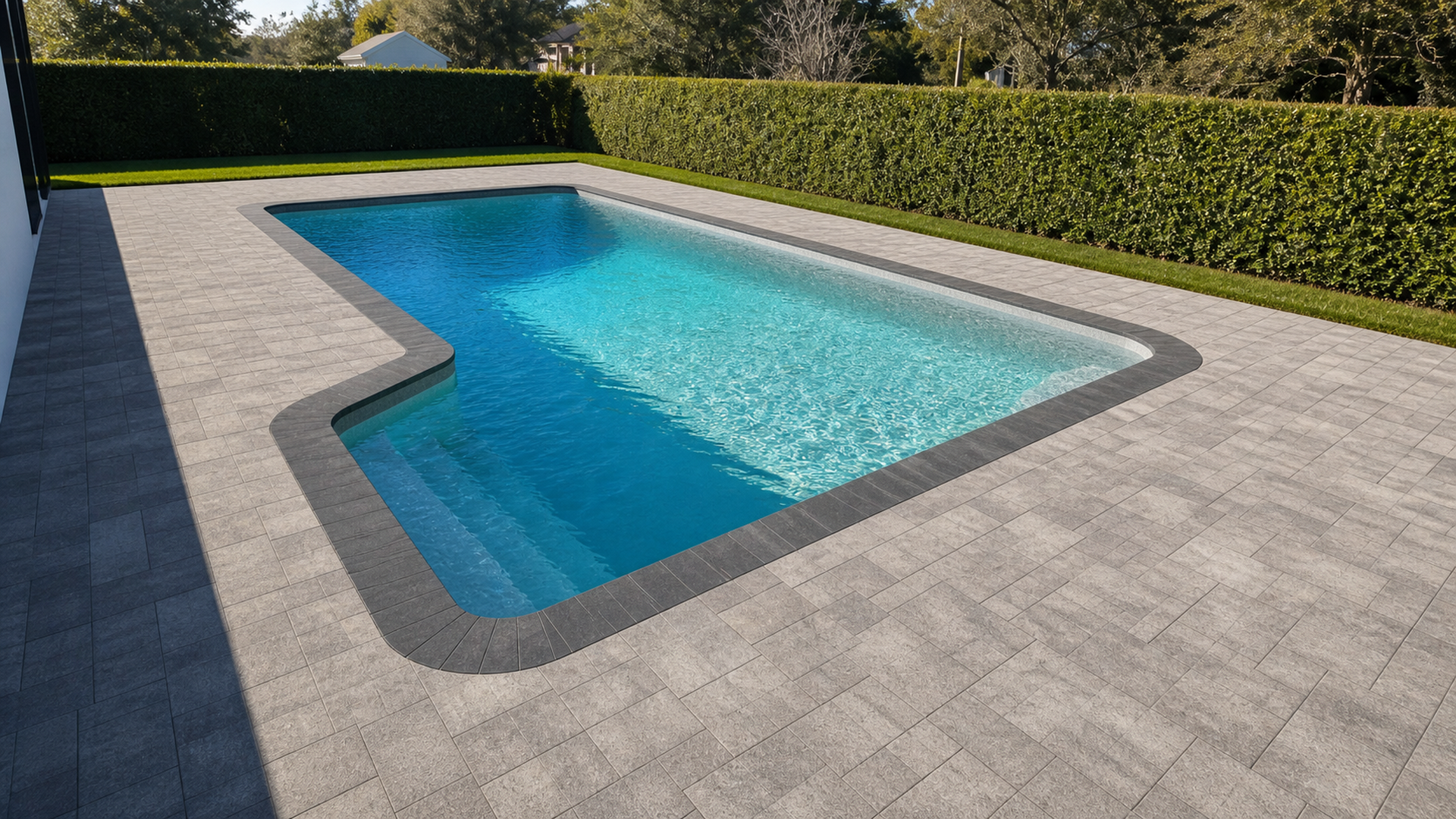
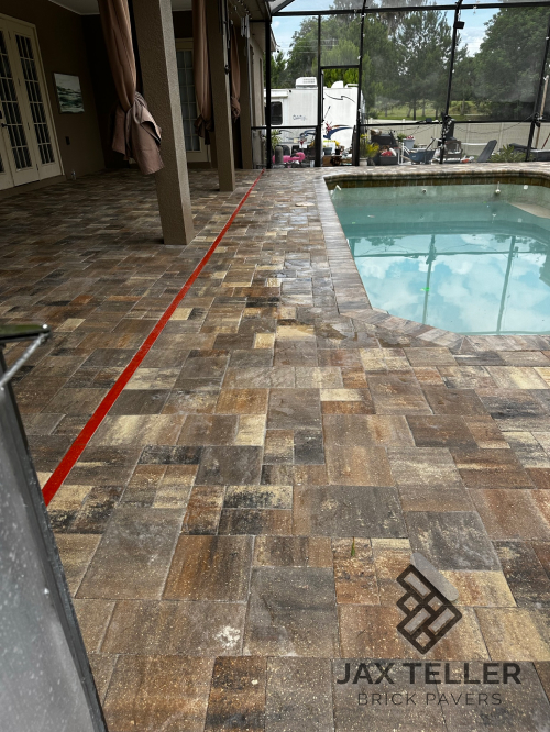
Reflected light matters too. A light wall or pool can brighten nearby pavers. Meanwhile, a covered porch may mute the same blend. For this reason, move duplicate samples into every major zone rather than judging the entire property from the driveway.
Use large panels, not isolated pieces
A single paver displays one part of a blend. By contrast, a larger panel shows shade distribution, joint color, pattern scale, and the frequency of darker or lighter units. The panel should be large enough to stop reading as a handful of objects and begin reading as a surface.
Moreover, arrange candidate pieces in the proposed pattern when possible. Joint direction and module size can change how color moves across the field. A blend with visible variation may feel calm in a long linear layout yet more active in a mixed-size pattern.
Photograph consistently but trust the physical sample
Photos help compare morning, midday, evening, shade, and overcast conditions. However, automatic phone processing can alter brightness and warmth. Include the house in each frame, use similar viewpoints, and treat images as a decision record rather than a color-accurate substitute for the sample.
Additionally, write observations immediately. Notes such as too yellow beside roof or loses border contrast in shade preserve specific observations. They work better than memory after reviewing several similar blends. The aim is to record relationships, not declare one swatch beautiful by itself.
Manage brightness and glare through composition
Very light pavers can create an airy coastal character. However, a large sun-exposed field may look brighter than the small sample suggested. Therefore, evaluate value, which means relative lightness or darkness, across the whole planned area. The answer may involve a balanced mid-light blend rather than the palest available product.
Surface texture and finish also influence how light reads. Still, color selection should not make unsupported promises about temperature or traction. Compare approved full-size samples for the specific product and use, then discuss performance requirements separately with the manufacturer and contractor.
Use shade as a design condition, not a color correction
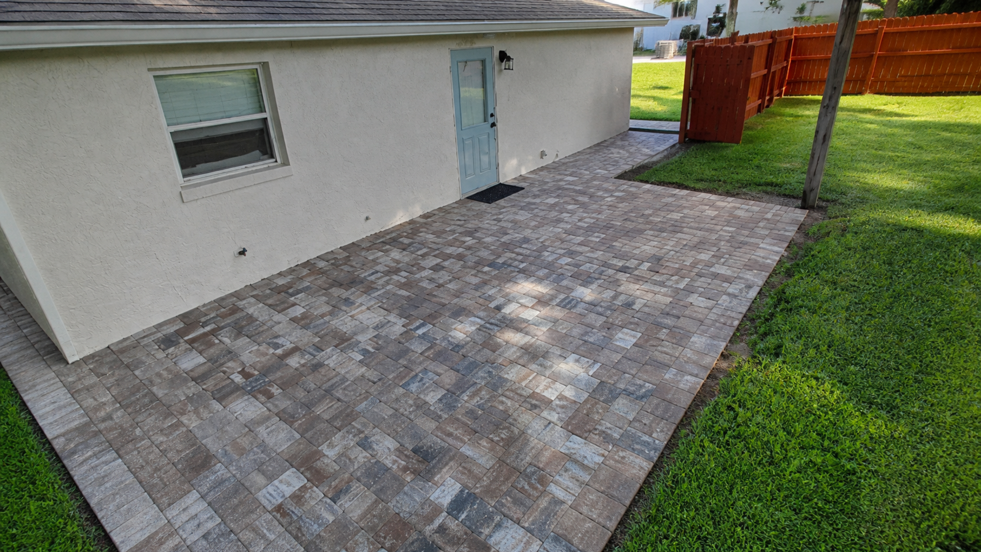
A covered patio and open pool area may make the same paver look like two different colors. Instead of fighting that reality, preview the material in both conditions. A successful blend should remain compatible across the transition even though its apparent brightness changes.
Likewise, consider future shade from palms, trees, screens, and structures. Moving shadows create visual variation over the day. Consequently, a highly busy blend may become more active beneath patterned shade, while a restrained field can provide a calmer background.
Coordinate driveway, patio, entry, and pool without copying
A property can feel connected without using one exact paver everywhere. For example, the driveway may need a concrete paver system suited to vehicular use, while a patio uses another material. A shared undertone, border color, or pattern direction can create continuity across those different applications.
Conversely, exact repetition can flatten the design when every zone has the same scale and border. Therefore, identify one family relationship and let each area respond to its function. The front entry might use a clearer frame, while the backyard field remains quieter around furniture and landscaping.
Assign every border a job
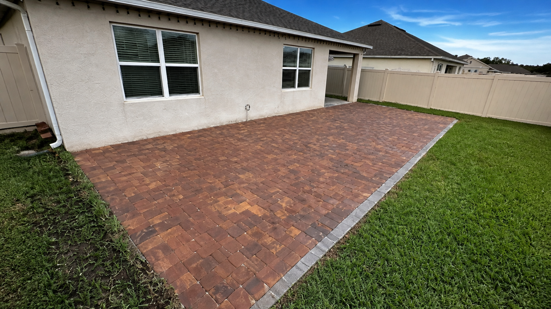
A border may define a driveway edge, clarify a walkway, organize cuts, or connect to dark window frames. If it serves none of those functions, it may be unnecessary. In particular, multiple accent bands can make a coastal palette feel busier than the architecture supports.
Before approving contrast, place border units around a meaningful section of the field sample. One dark piece beside one light piece exaggerates the difference. A larger mockup shows whether the frame remains proportional across the real module.
Let landscaping participate in the palette
Green foliage, silver palms, warm mulch, pale shell, and flowering plants affect how paving color reads. However, seasonal plant color should support rather than control a permanent hardscape choice. Focus on durable landscape elements and the overall level of contrast.
Furthermore, avoid choosing pavers solely to match loose decorative stone that may change later. The house and paving carry greater visual weight. Landscape materials can then bridge the palette with flexible layers that are easier to update.
Consider dirt visibility without chasing camouflage
Driveways collect tire marks, leaf tannins, soil, irrigation residue, and everyday dust. Patios receive food spills, potting soil, and windblown debris. Therefore, examine how candidate colors respond visually to the property’s actual sources rather than asking which color never looks dirty.
Mid-value blends with modest variation may make ordinary debris less visually dominant than a very uniform extreme. Nevertheless, camouflage should not replace appropriate cleaning or drainage. A color that hides sediment can also delay recognition of an erosion or runoff problem.
Run a controlled sample test
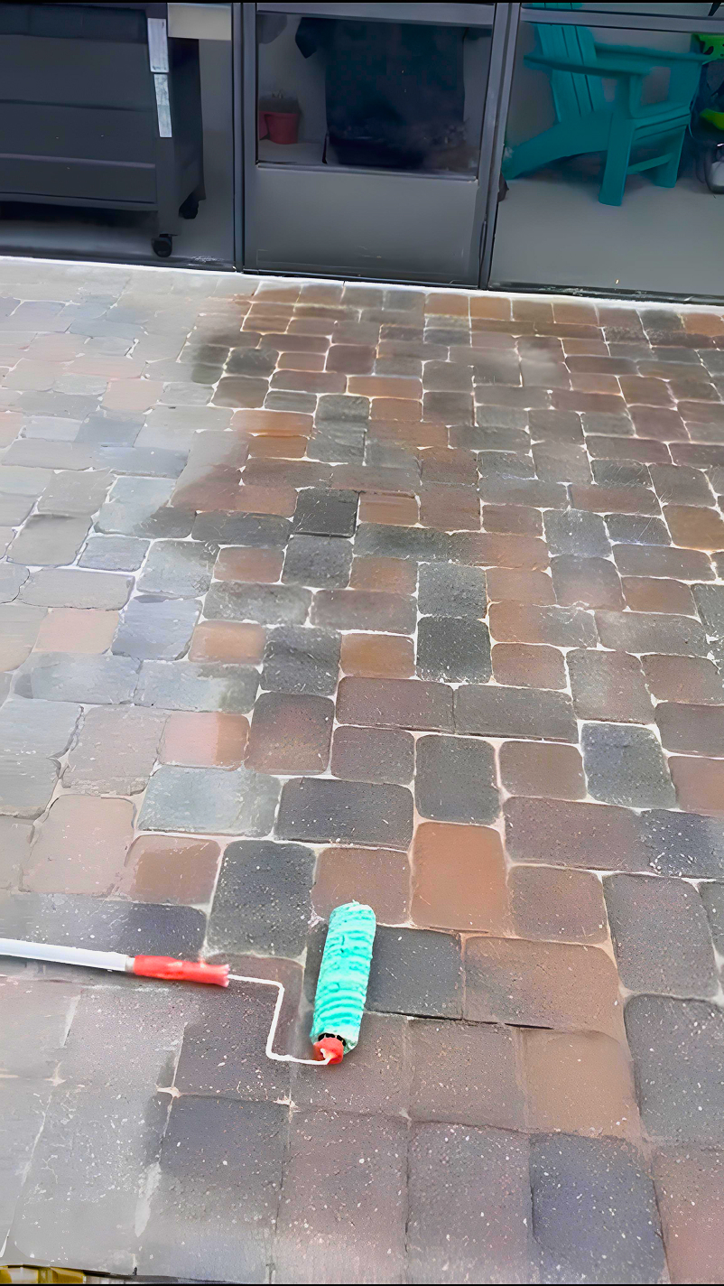
With the supplier’s permission and guidance, compare how sample pieces look dry and after ordinary clean water. This test can reveal temporary darkening and contrast within the blend. However, do not apply household chemicals, oils, or unapproved sealers to borrowed samples.
Then place the dry samples near irrigation and planting zones without leaving them where they create a trip hazard. Observe normal airborne dust and landscape context over several days. As a result, the decision includes real surroundings while preserving the sample condition.
Plan for batch variation and natural visual change
Manufactured paver batches can vary, and natural materials vary within the same supply. In addition, exposure, cleaning, joint material, and surrounding landscape can change how a field appears over time. A responsible selection process accepts that the completed surface will not remain identical to a catalog image.
Accordingly, confirm the product and available range before installation, then review how crews will distribute variation. Opening material from the planned supply and blending across the field can prevent isolated patches. The exact method should follow manufacturer guidance and the contractor’s approved installation plan.
Coastal paver color selection Florida needs a reserve strategy
Coastal paver color selection Florida planning should include representative spare units from the installed batch. Store more than one shade when the product contains a blend, and keep labels or purchase records. Consequently, a future localized repair has a better starting set, although a perfect match cannot be guaranteed.
For phased projects, do not assume a later order will match the first field. Instead, design a border or transition where a complementary batch can begin honestly. This turns variation into part of the plan rather than a surprise at the property line between phases.
A repeatable on-site sample process
- Inventory the roof, walls, trim, doors, masonry, pool, and fixed landscape materials.
- Choose a small group of candidates based on undertone relationships, not product names.
- Build or request large panels that show the real blend, joints, and proposed pattern.
- Place samples in the driveway, entry, open patio, covered area, and pool zone as relevant.
- Observe morning, midday, evening, shade, and overcast conditions from key viewpoints.
- Mock up the proposed border at a realistic proportion around the field.
- Record brightness, undertone, contrast, dirt visibility, and architectural fit in consistent photos and notes.
- Confirm batch expectations, blending method, reserve units, and phase transitions before ordering.
Use a simple comparison card
- Architecture: Supports roof, stucco, trim, and permanent masonry.
- Sun: Comfortable apparent brightness across the largest exposed field.
- Shade: Remains compatible under a porch, screen, or mature landscape.
- Scale: Blend and pattern feel balanced across the actual project area.
- Border: Clarifies an edge or zone without overpowering the field.
- Use: Makes ordinary debris visible enough to maintain without dominating the view.
- Future: Allows realistic batch variation, reserve material, and planned phases.
The Masonry & Hardscapes Association provides industry education and resources for hardscape professionals and consumers. Still, product selection and installation must respond to the specific site, manufacturer guidance, and intended application. Use authoritative resources to ask better questions, not to replace a local evaluation.
To compare palettes in the context of completed work, browse JaxTeller’s paver project gallery. Then focus on why a relationship works, such as the undertone connection or border proportion. Copying a color name without the original home’s context may produce a very different result.
Make the final color decision as a group of relationships
Before signing the order, place the preferred field, border, and joint-color expectations together beside the house. Therefore, the approval reflects a composition rather than one favorite unit. Confirm which parts are examples, which are fixed product selections, and where natural or production variation should be expected.
Ask every decision-maker to review the same physical panel in the same locations. In addition, write down the reasons for the choice, such as supports warm roof undertone or maintains a quiet entry. Clear reasoning reduces the temptation to reopen the decision based on a different phone photo later.
Frequently asked questions
What paver color is best for a coastal Florida home?
There is no universal best color. Instead, compare full-size blends with the specific roof, stucco, trim, sunlight, landscape, and project scale to find a coherent relationship.
Should pavers match the stucco exactly?
Usually, an exact match is neither necessary nor reliably achievable. A compatible undertone with controlled contrast often creates more depth. Therefore, judge the surfaces together from normal viewing distances.
Why does my sample look different at noon?
Direct sun, reflected light, shade, and phone-camera processing all change perceived color. Consequently, observe the physical panel through multiple conditions and treat photos only as supporting notes.
Is a dark border always a good coastal accent?
No. A dark frame can clarify geometry, but it can also dominate a large light field. Therefore, mock up the real border proportion and confirm that it serves a design function.
Will a later paver order match my first phase?
A perfect batch match cannot be promised. Accordingly, save representative units and design a deliberate transition so a complementary later supply can look intentional.
Review full-size samples at your home
Ready to upgrade your driveway or patio? Therefore, ask JaxTeller Brick Pavers to review full-size paver samples against your home in real light. You can contact the team, explore completed projects, and follow current installations on Instagram or Facebook.
For direct scheduling, use WhatsApp, call +1 407-907-8308, or email jaxtellerbrickpavers@gmail.com. In addition, find the Largo location on Google Maps. Bring roof, paint, and trim information so the comparison stays grounded in permanent finishes.
Finally, compare the complete palette before placing the material order. Contact JaxTeller Brick Pavers at +1 407-907-8308 or jaxtellerbrickpavers@gmail.com for your free estimate!
Review full-size paver samples against your home on site.